Visual Supply Company is a start-up founded by Joel Flory and Greg Lutze in California in 2011. VSCO launched in 2012. In 2017, VSCO launched a subscription model. As of 2018, Visual Supply Company has $90 million in funding from investors and over 2 million paying members.
Its business model has continuously evolved from an Adobe Lightroom preset to a mobile app photo editing platform to a general community focus. However, during 2018-2020, the business wanted to refocus on its original core: photographers, not just pros, but anyone who wanted to commit to their craft with time, skillset, education, or money—what VSCO calls "Serious Creators."
We partnered to develop a brand strategy through workshops, stakeholder interviews, and a brand audit. We shaped a design brief and started working with foundational elements to keep, discard, or evolve existing assets and principles.
VSCO is a beloved brand, so it was a delicate and thoughtful exercise. The intention was never to do a complete redesign but a brand evolution. We evolved the logo and rethought the usage of its typographic family, designed by Göran Söderström from Letters from Sweden. Everything else, we updated. We built a system from creator to creator, so we had to use and start speaking the same language.
Brand & Design Strategy
We started this partnership by auditing the existing brand, competitors, and adjacent players to develop a comprehensive design brief followed by brand and design strategy from VSCO's new mission statement, "We Nurture Creativity So You Can Make It." From solidifying the brand strategy, we defined the evolved brand language, created an extensive creative tool with in-app and marketing templates, identities for programs and other internal initiatives, and created a vast guidelines document for internal and third-party implementation.
VSCO is more than an app with editing tools or any other social media destination. It is a platform for creative growth. It revolves around three powerful values: QUALITY, TRUST, and CURATION. We had to find a language and a story that would honor its original DNA and bridge the creative flow: from creation to expression.
VSCO puts the creator at the center of its existence. It believes that creativity is of the essence. It reflects all people and cultures and challenges us to be our best selves. The platform gives opportunities for discovery and growth, innovation, and collaboration. It helps creators realize their passion.
Our design story started with the creators' relationship with their cameras and tools: when they are behind or in front of them (sharing the work with the world). This relationship is the foundation for the entire design system.
"Photography trains us to look in and out at the same time, paying closer attention not only to the world around us but also to the quality of our own response to it." —Sophie Howarth
"The camera is an instrument that teaches people to see without a camera." —Dorothea Lange
Symbol & System
We revisited the symbol: its original shape was based on 26-slot outer ring, and a 14-slot inner ring. While the seal had a strong design story behind genetic mapping, codex, and mitosis, it was experiencing performance challenges on screen devices, motion, and smaller contexts. Changing the symbol would have never been a wise option, as we wanted to pay respect to its foundational archeology and DNA. However, we needed to find a solution to optimize it. We reduced the amount cells following its geometry as a design principle from the original guidelines. We added a simplified meaning that could reflect the platform's evolution to its present state: creator at the core of the experience. The inner ring represents their creative process – tools, techniques, creations, and work. The outer ring represents their creative expression – what creators share and their relationships with their community. The symbol represents an interconnected group of dynamics, tools, patterns, and people that feed each other. An ecosystem of creative expression where CREATOR ALWAYS GOES FIRST, and it's at the center of everything.
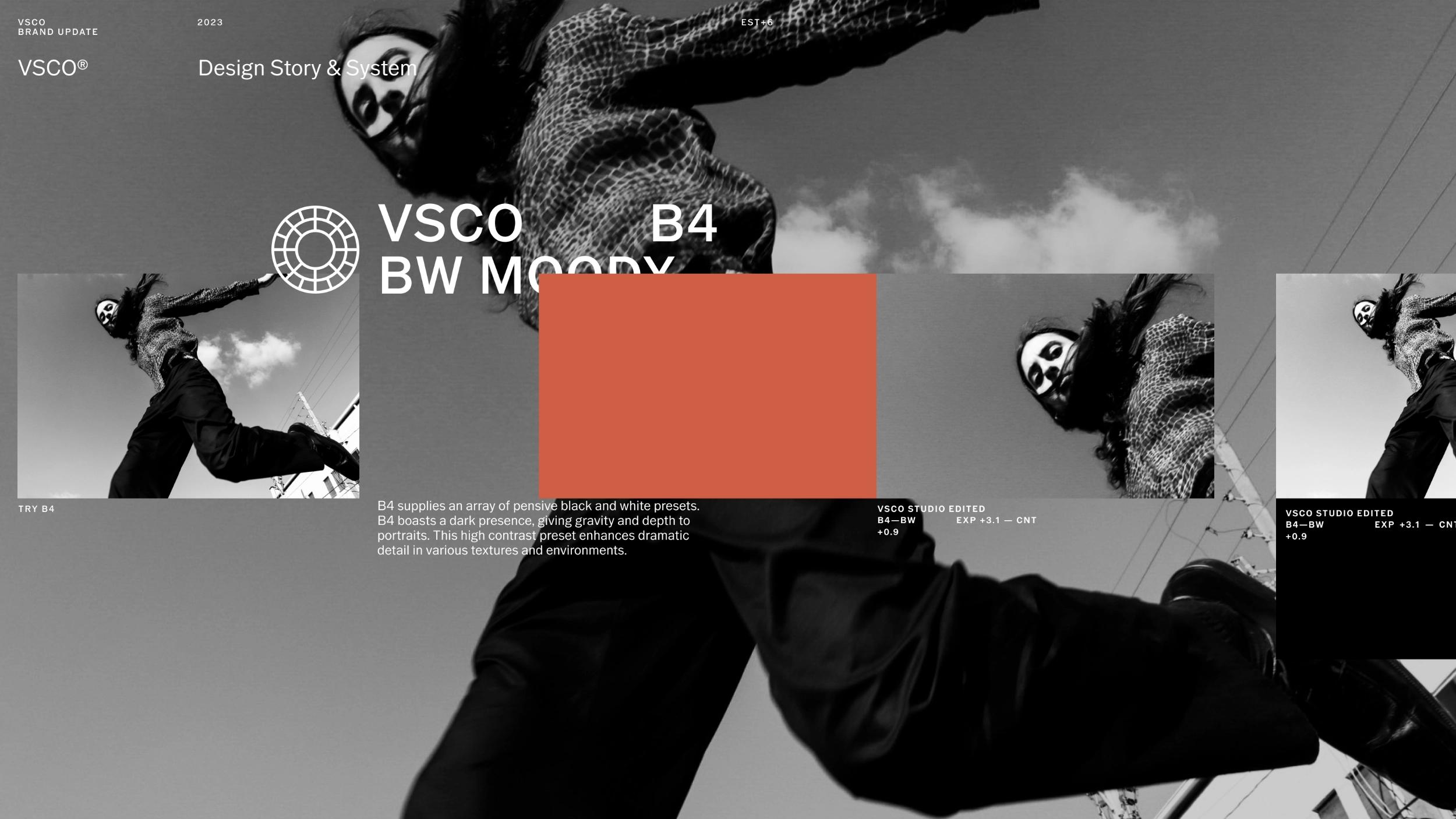
After, we unfolded the rest of the system based in the relationship mentioned with creators and their tools. A black and white symbiosis with a colorful full range in between. The black universe is born from the physical experience of looking through the camera visor. Where everything else disappears, and all that matters is the creative process. On the other hand, we have the output of that process: when creators share their work with the world and their point of view. It is pristine, light, and artwork-oriented gallery-like.
Attribution
Another critical strategic decision was to create an attribution device to bring the new strategy to life. This device would credit VSCO's creators and generate leads for the platform. It is composed of the user's avatar, URL, and username. Its implementation follows the circularity of the wordmark and a contextual simplification (in/out of the platform). Our attribution device serves as a wordmark that puts the creator at the core of the experience.
For VSCO, it was important to leverage member's work and promote them as part of its DNA. An attribution tag is a badge generally used:
— As a signed-off / call to action at the end of our layouts
— Next to the seal as a brand device
— Next to the artwork itself when using multiple images.
thumbnail.webp?w=1875&q=85&fit=max&auto=format)


