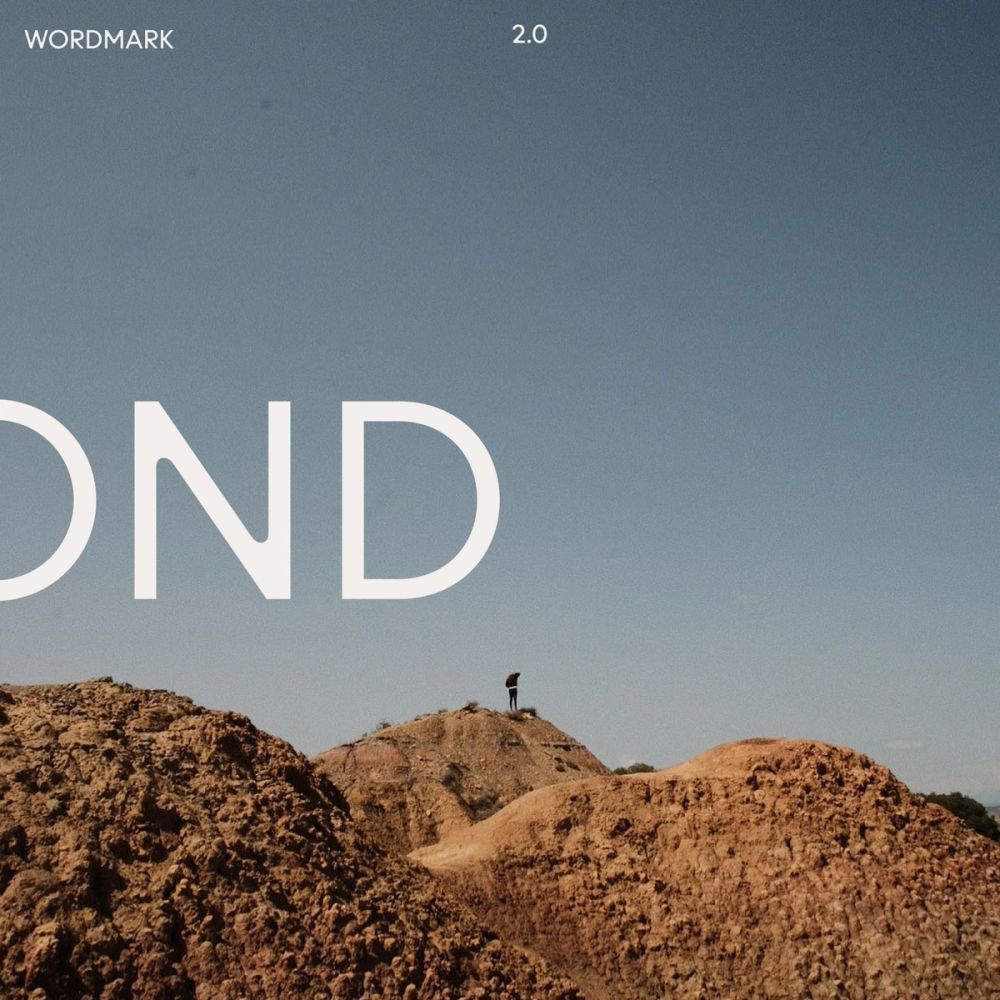
A desert-inspired skincare and lifestyle brand.
NYC EST
WorkAbout BCN +6
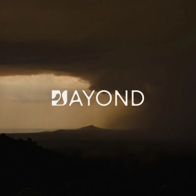
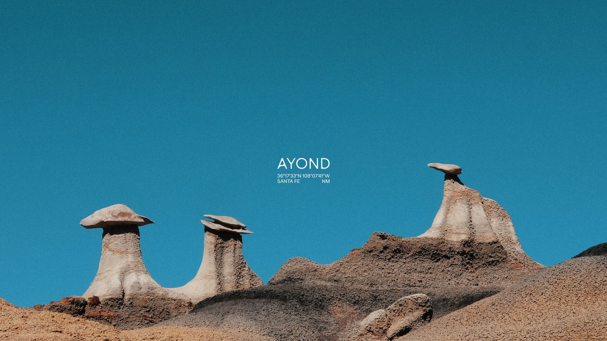
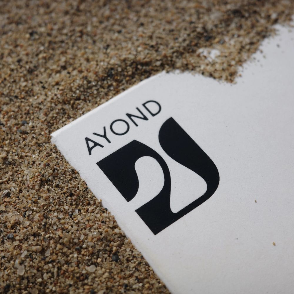
AYOND
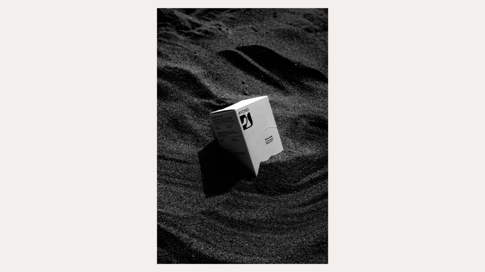
Rebrand & Packaging Design
2023
- Brand platforms
- Brand strategy
- Design Strategy
- Brand Identity
- Packaging design
- Marketing Design
- Brand Guidelines & Creative Toolkits
- Digital Product Design
- Brand Systems
BP0003
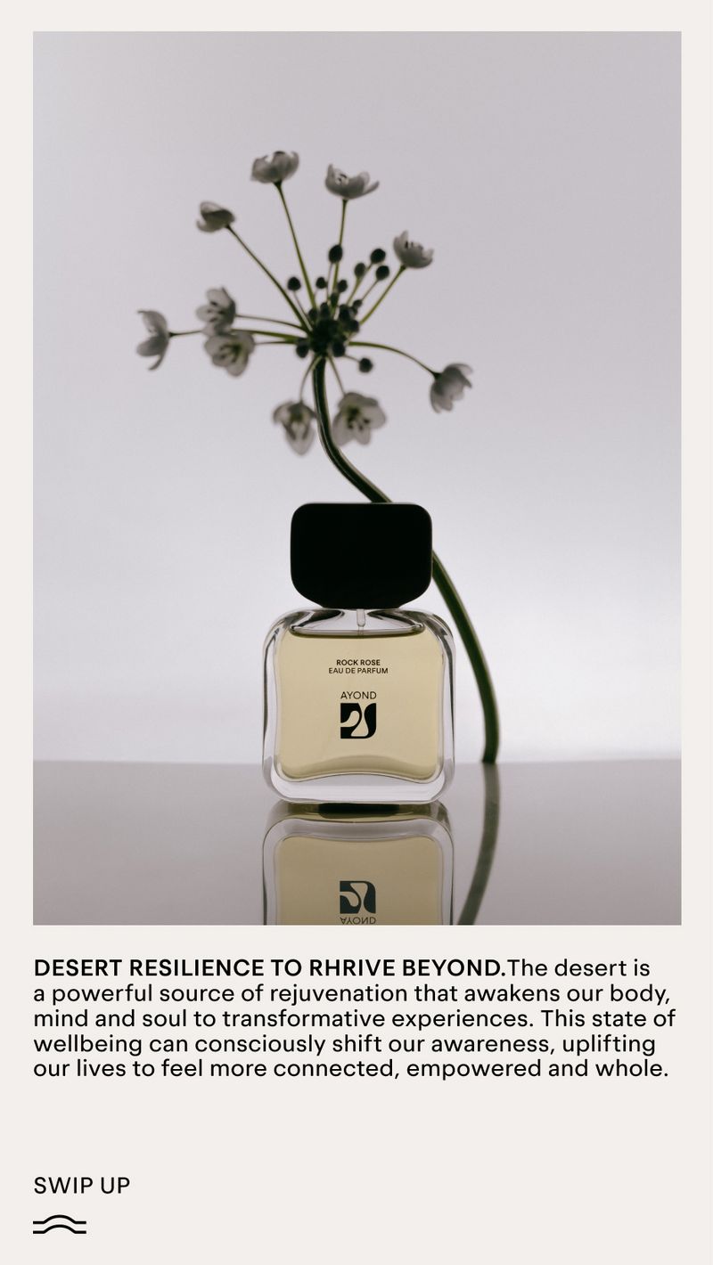
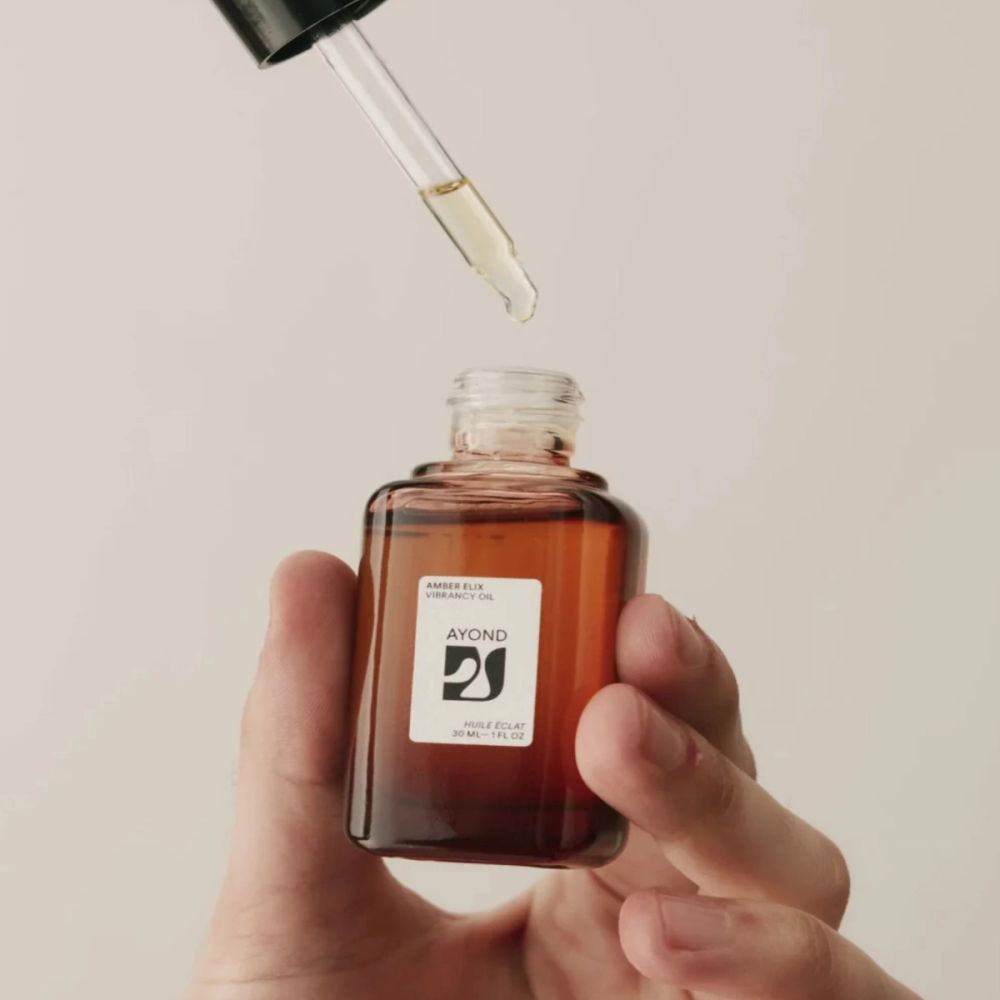
AYOND is a clinically crafted beauty and lifestyle brand that combines powerful skincare actives grown only in the desert with topical nootropics and mood-boosting aromatics to rejuvenate from the inside out. AYOND, a synonym for beyond, encompasses the belief that we must create consciously, inclusively, and sustainably to thrive in a future beyond today. Shani Van Breukelen is an African-American and Dutch fashion alumni from Central Saint Martins, and Porter Yates, is a native of Santa Fe, and a mechanical engineer with a focus on sustainability. They both founded Ayond in 2018.
They shifted from their respective fields after Shani suffered a burn trauma, and the couple started working with plant-based remedies to help heal her skin. Inspired by their experience in the desert, the duo set out to create efficacious skincare that celebrates design without compromising the Earth.
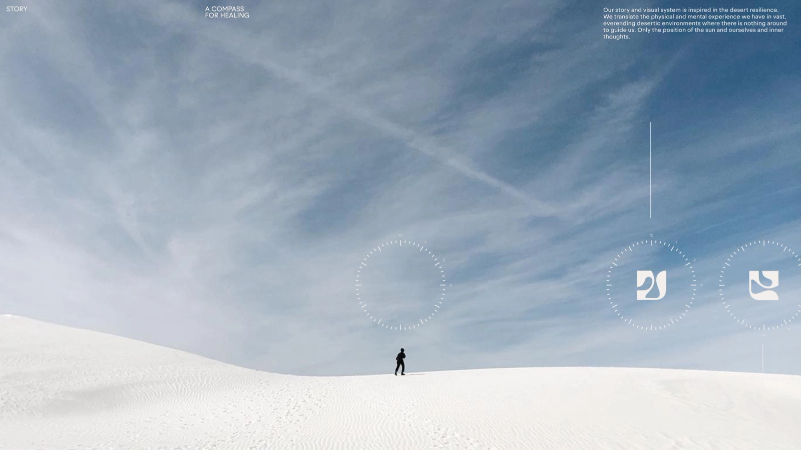
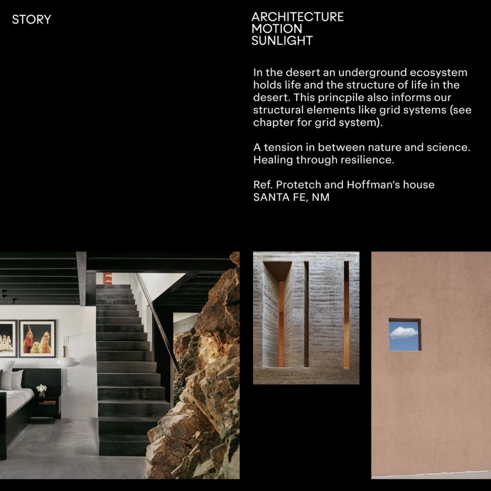
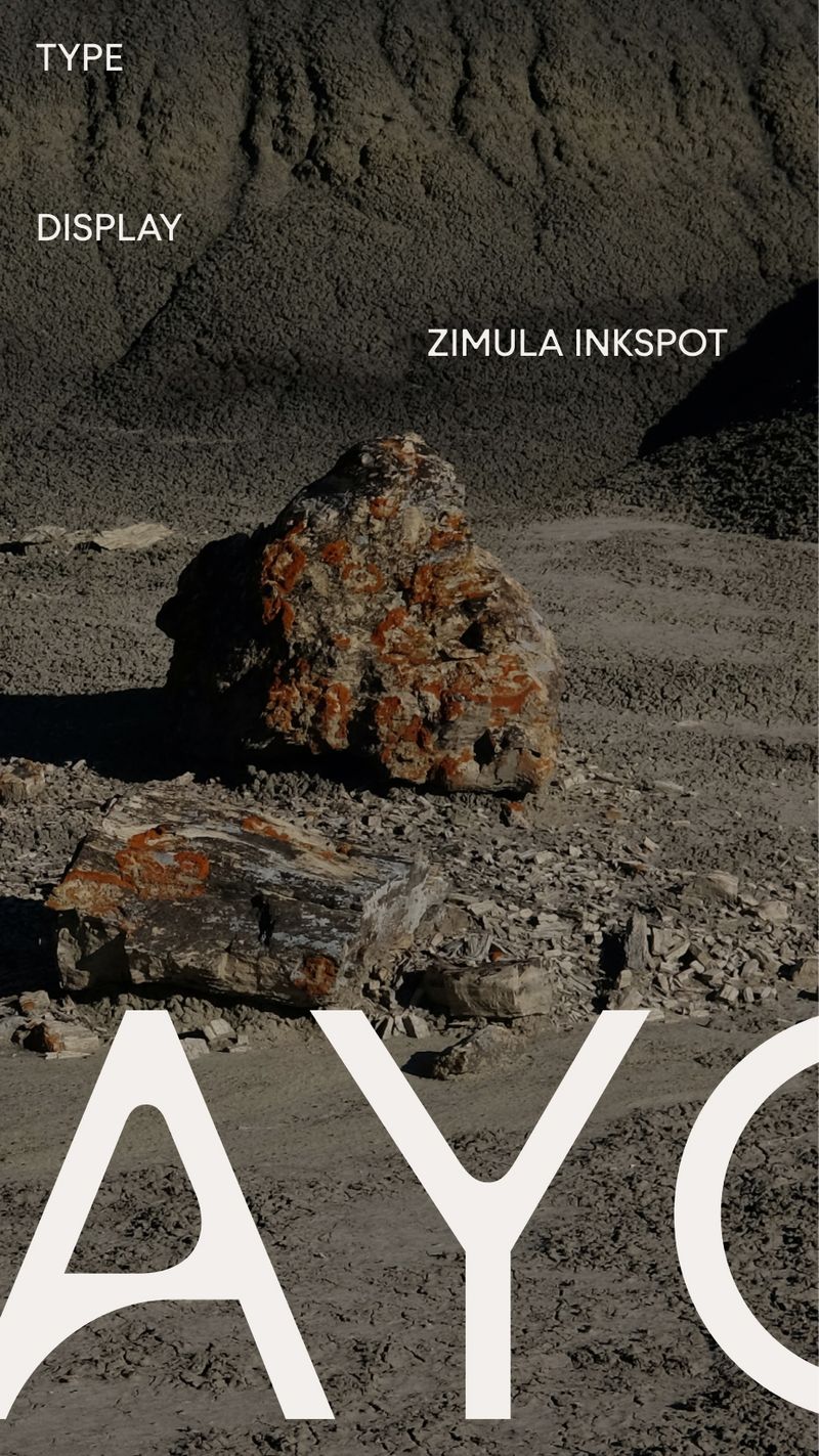
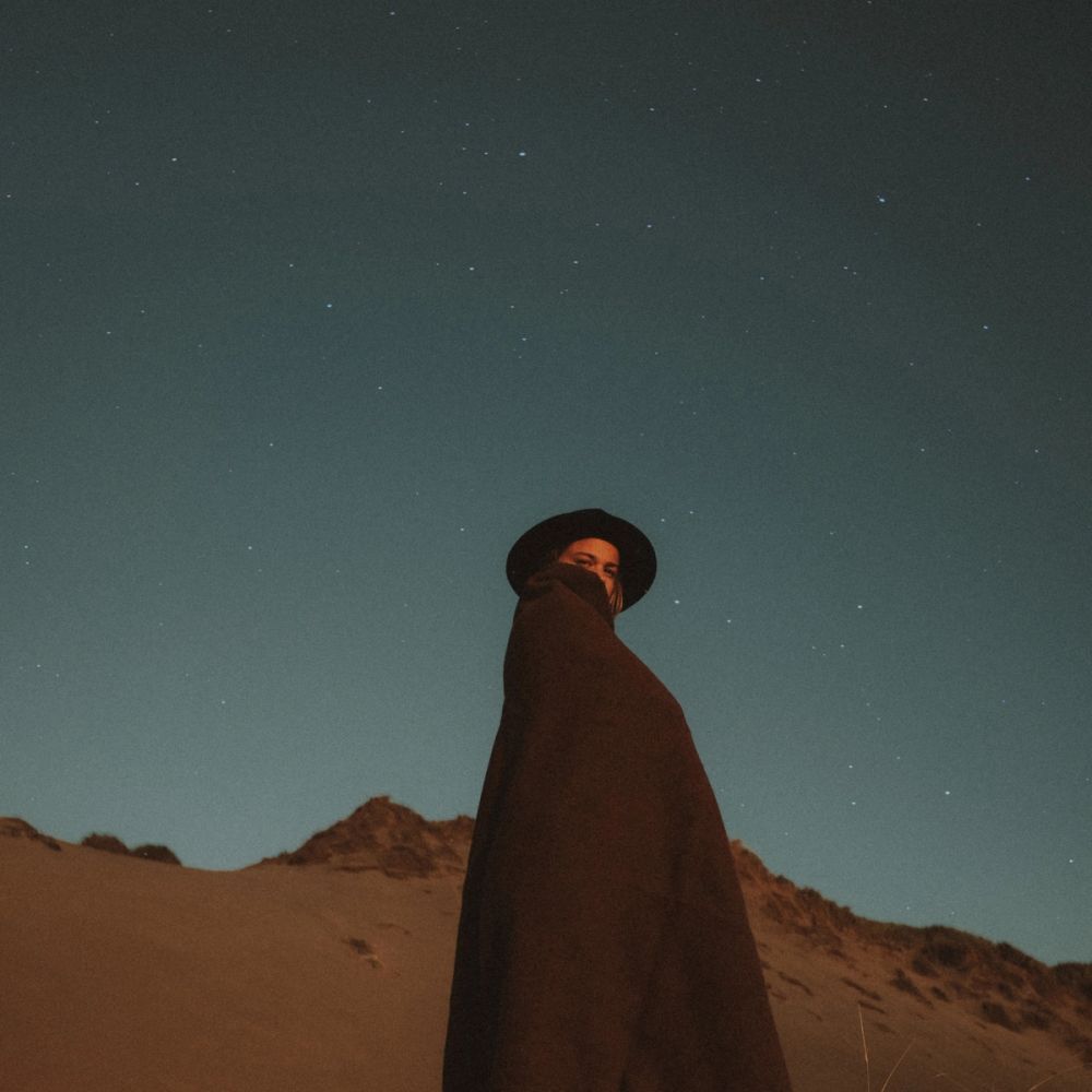
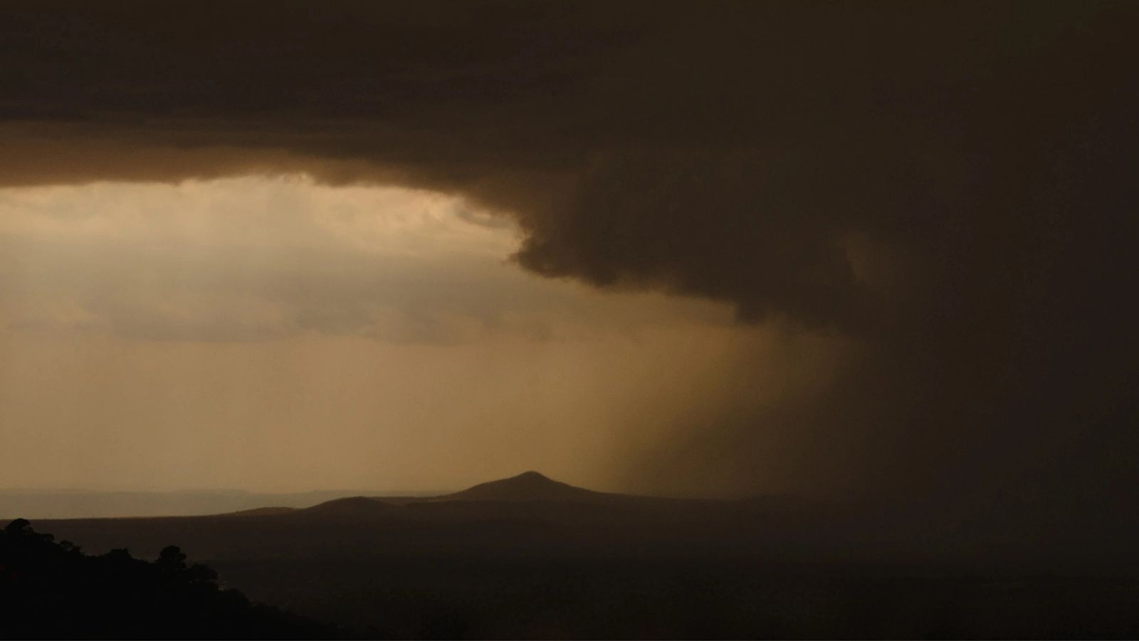
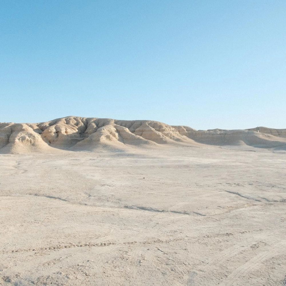
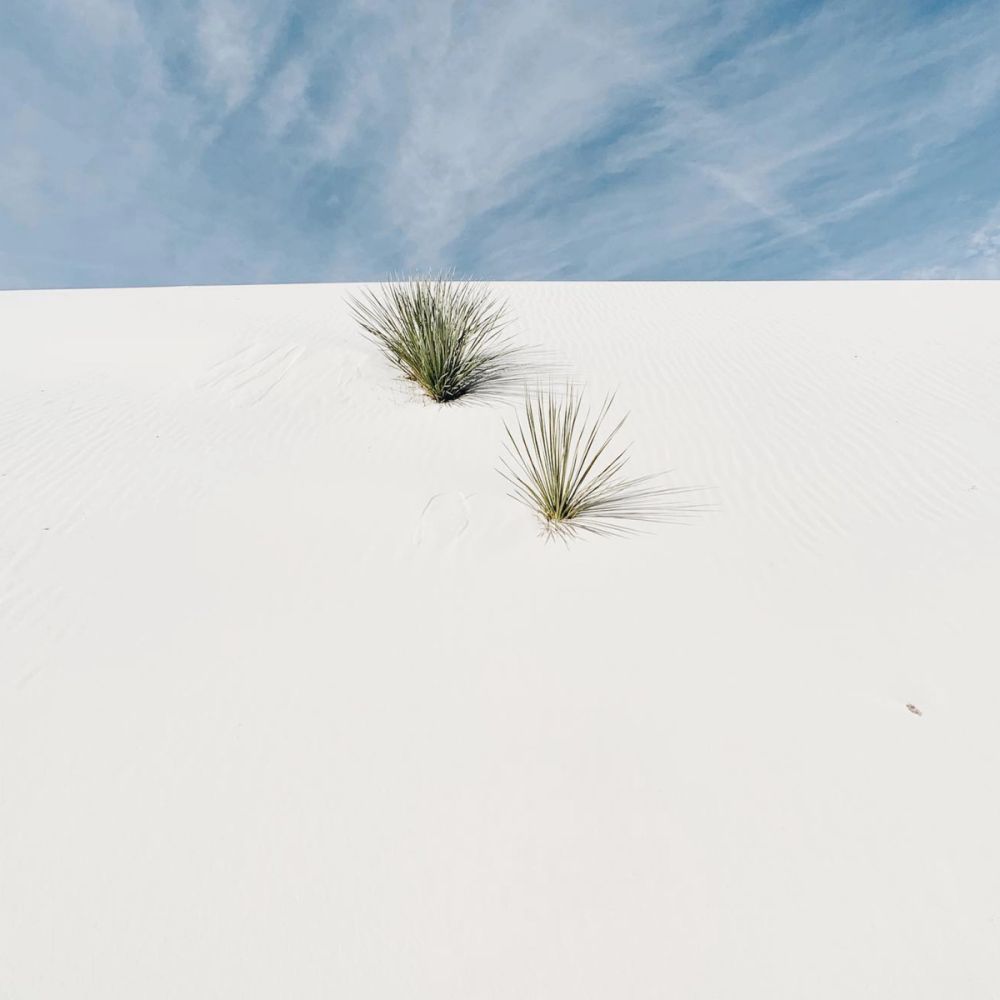
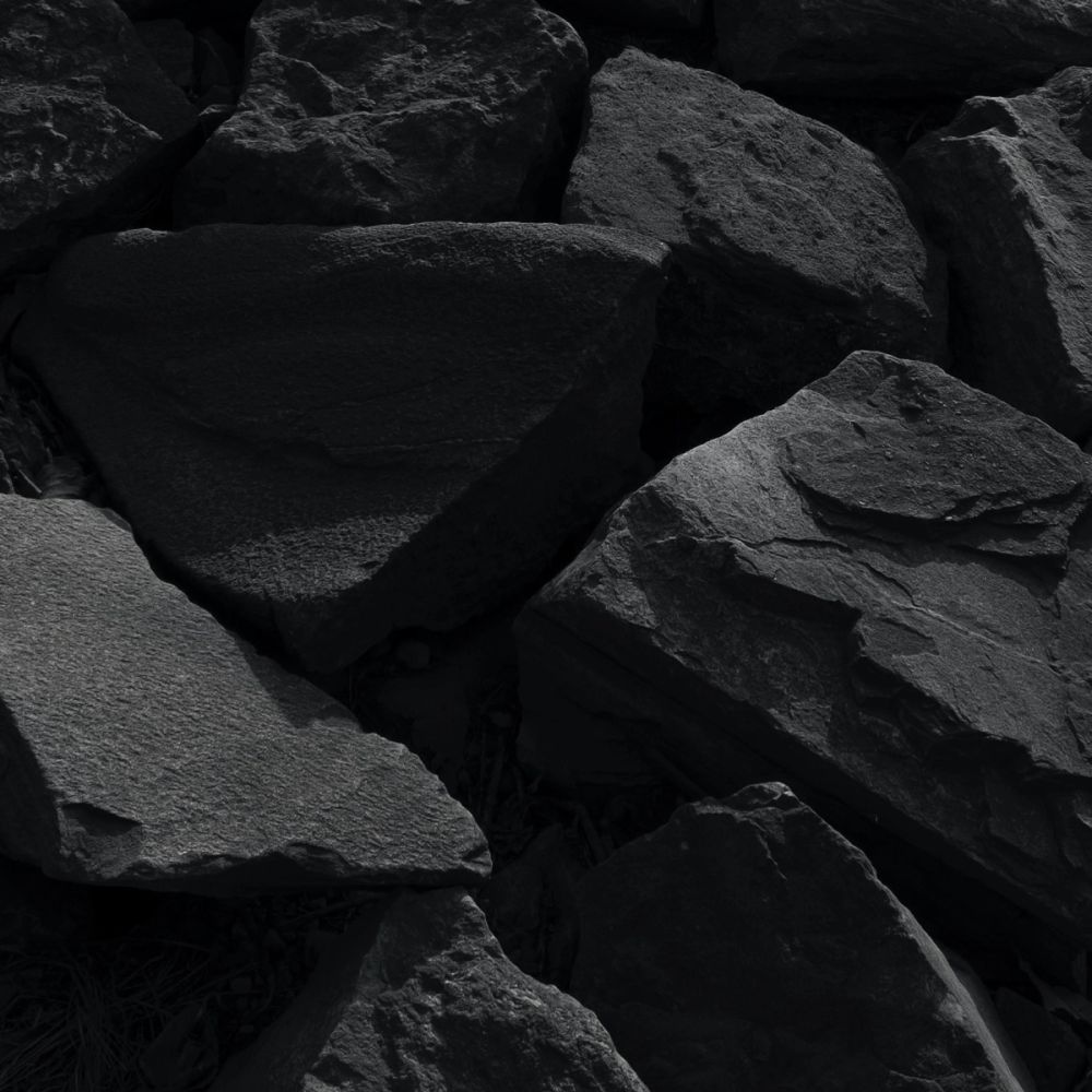
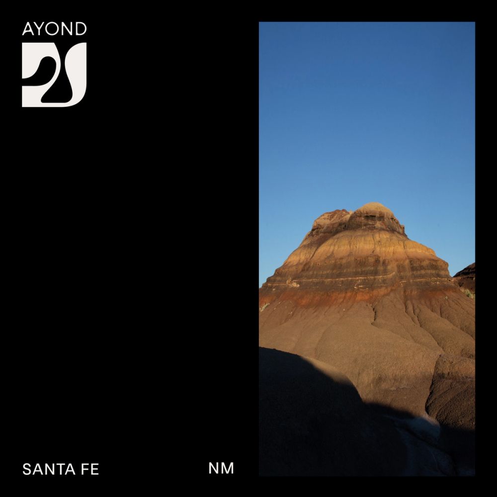
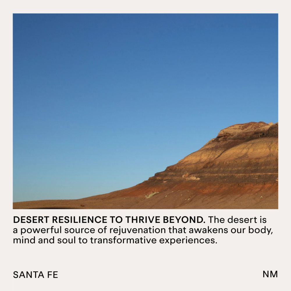
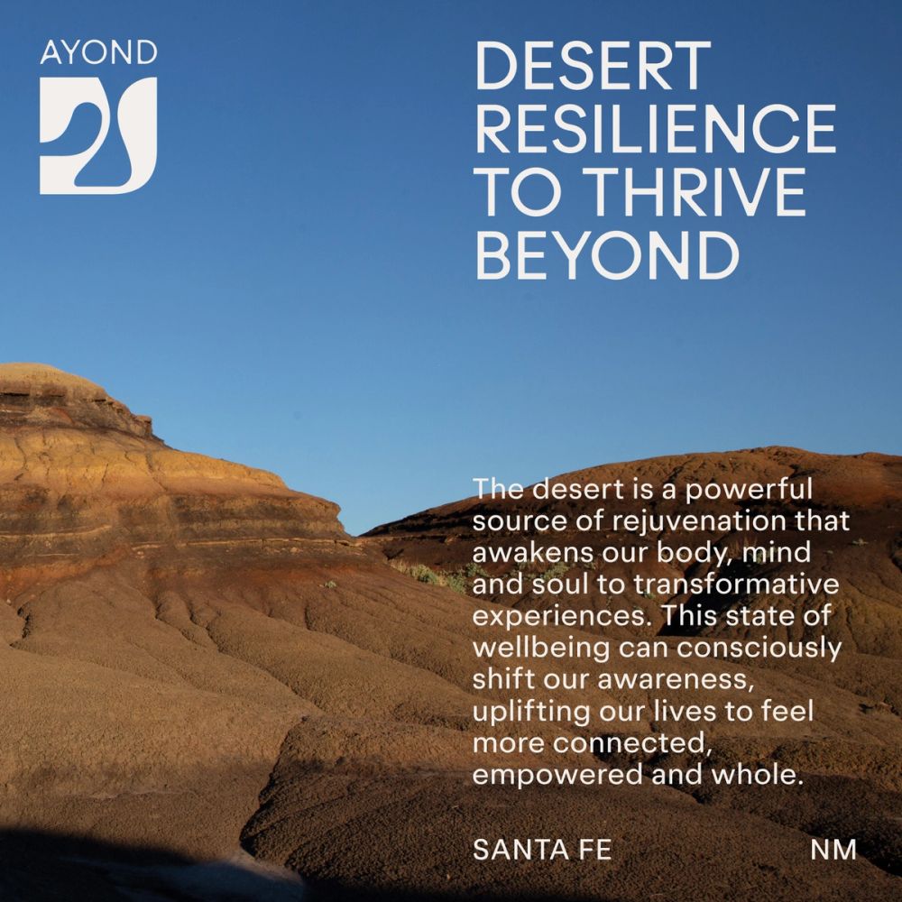
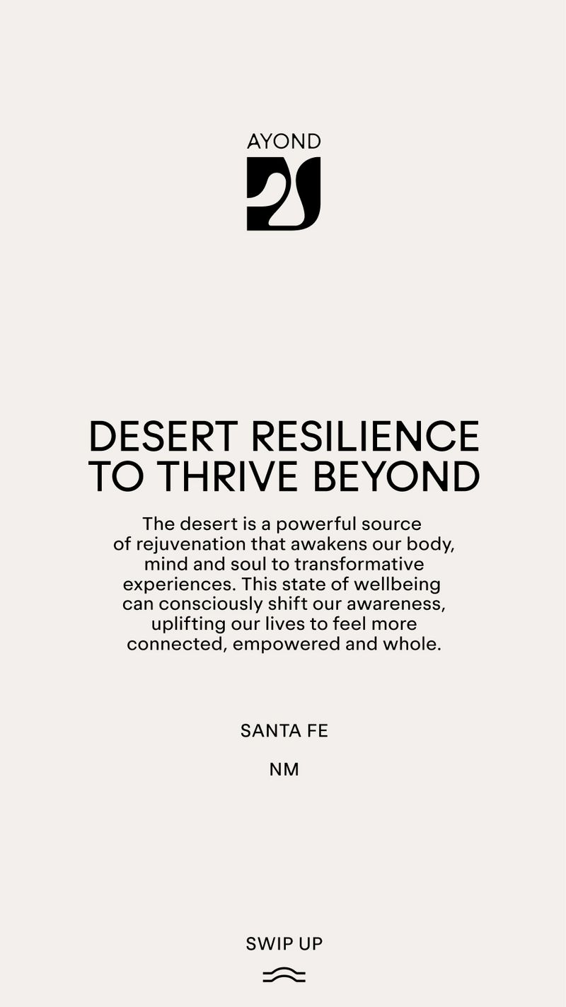
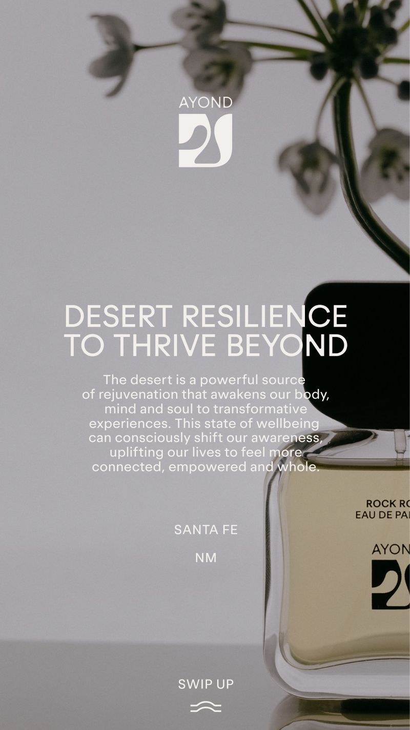
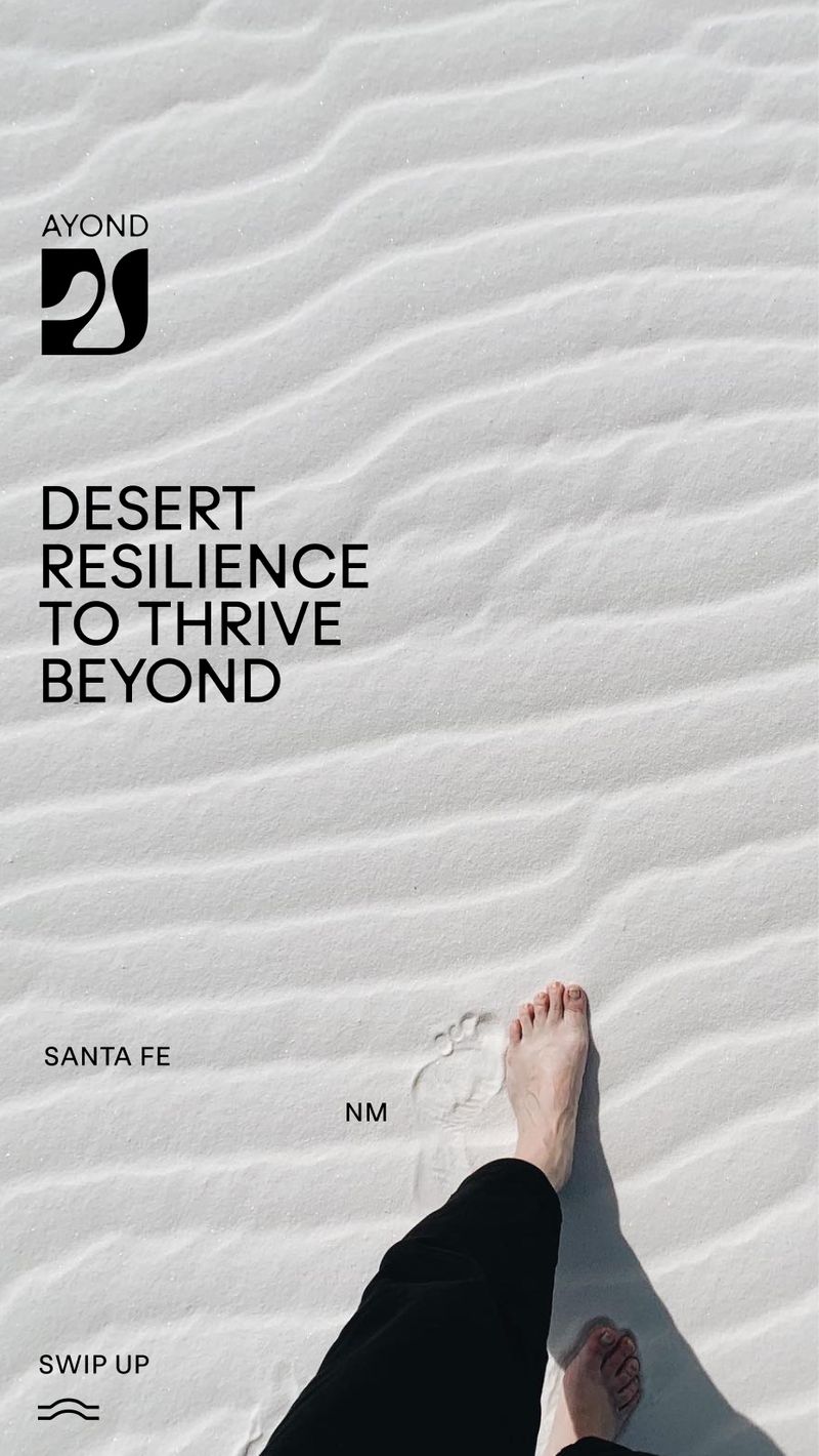
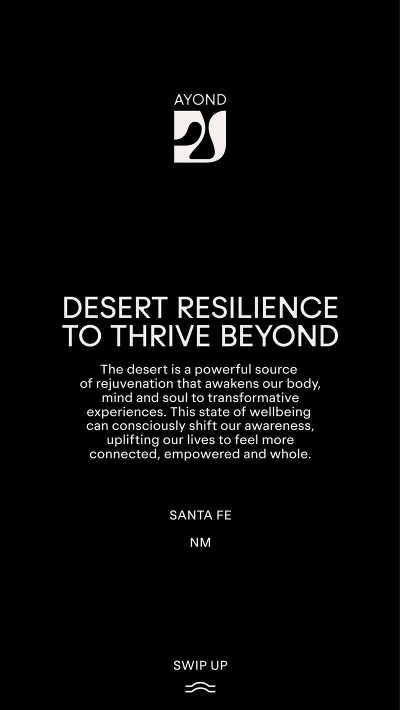
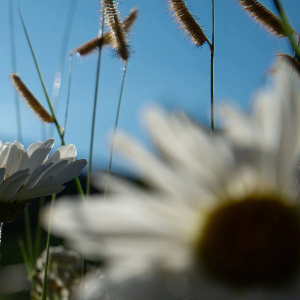
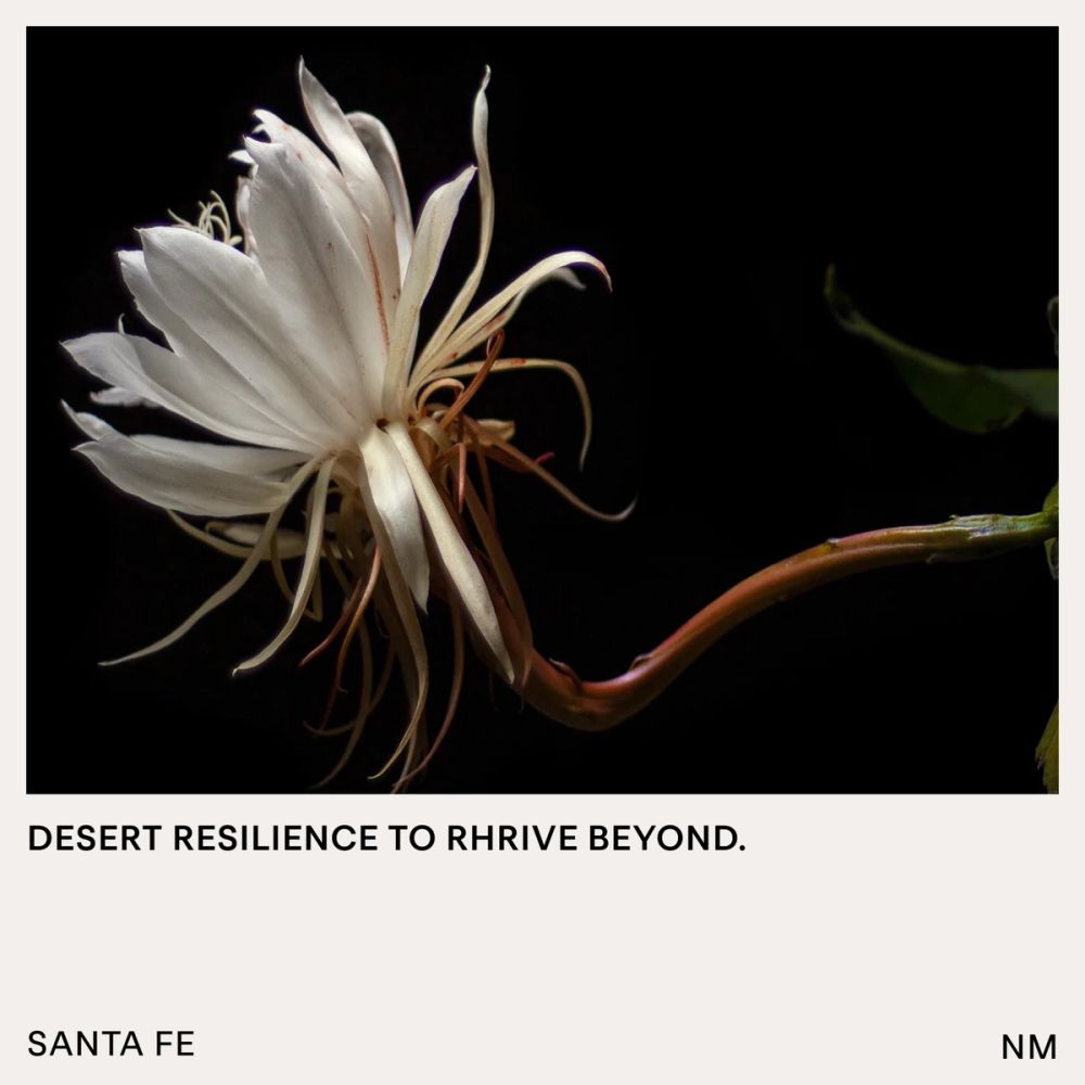
AYOND believes that the desert is a powerful source of rejuvenation that awakens our body, mind, and soul to transformative experiences. This state of well-being consciously shifts our awareness from me to us, uplifting our lives to feel more connected, empowered, and whole. AYOND's visual system is inspired by desert resilience, creating a physical and ethereal space for healing and self-discovery. We wanted to create a metaphor that could translate the physical and mental experiences we encounter in vast, neverending desertic environments. There is nothing around to guide us: only the position of the sun and our inner thoughts and nature.
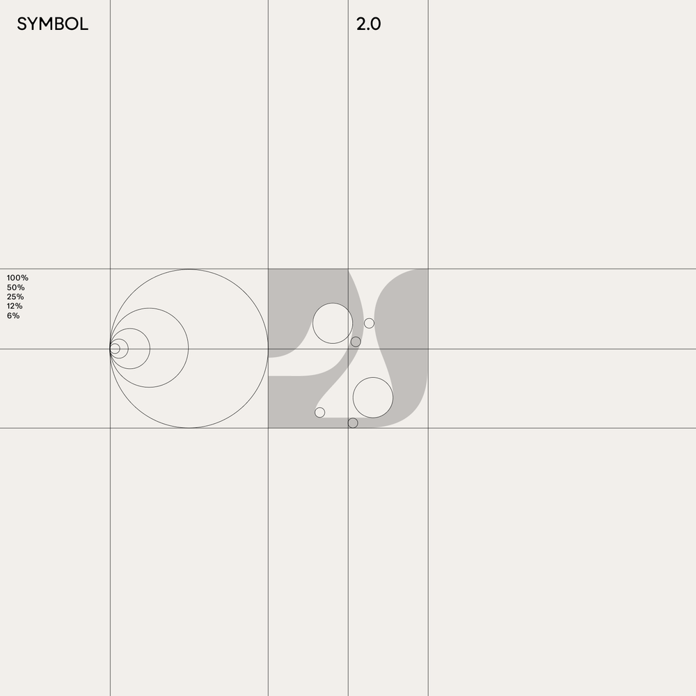
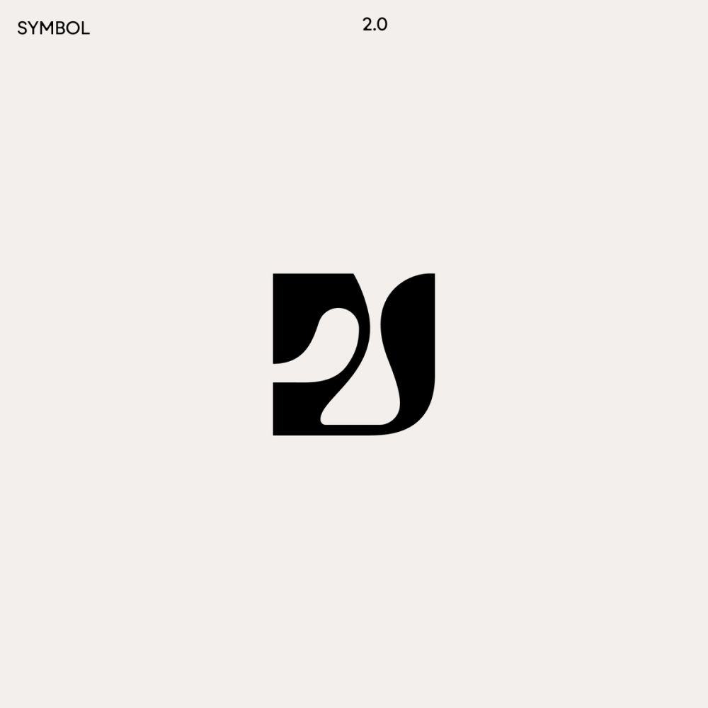
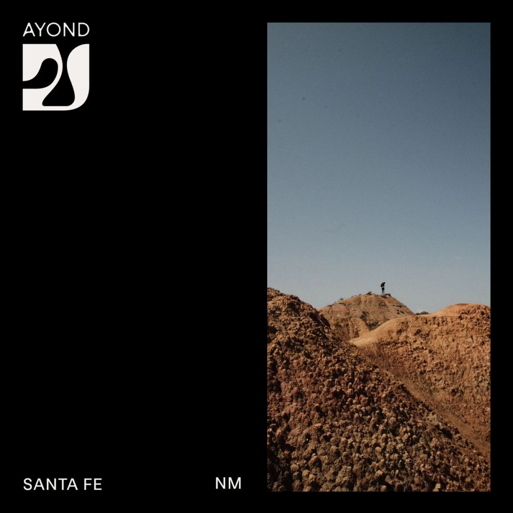
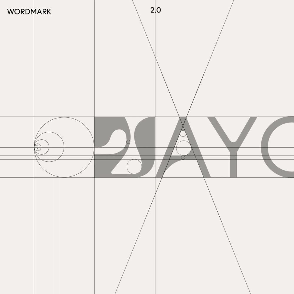
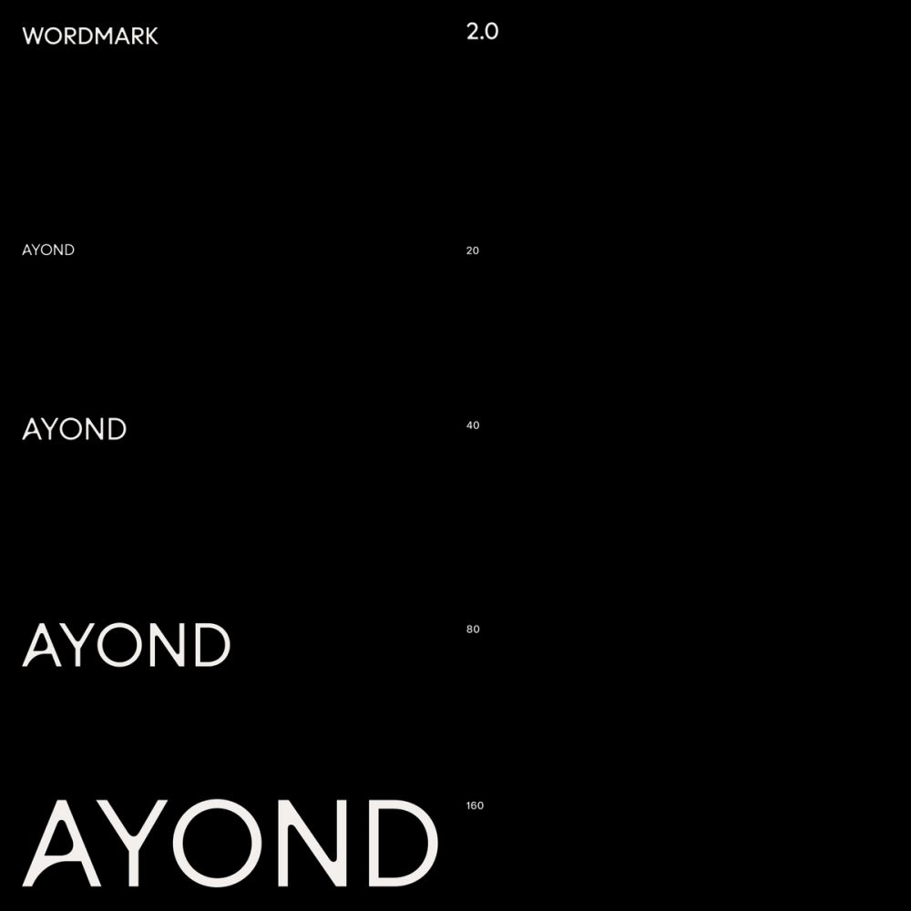
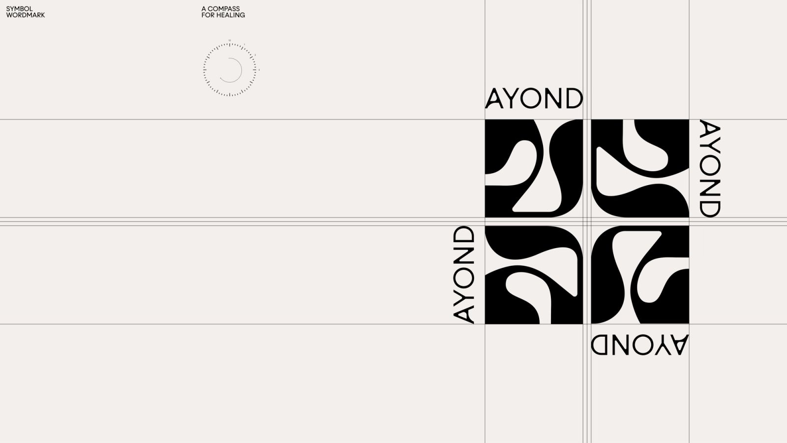
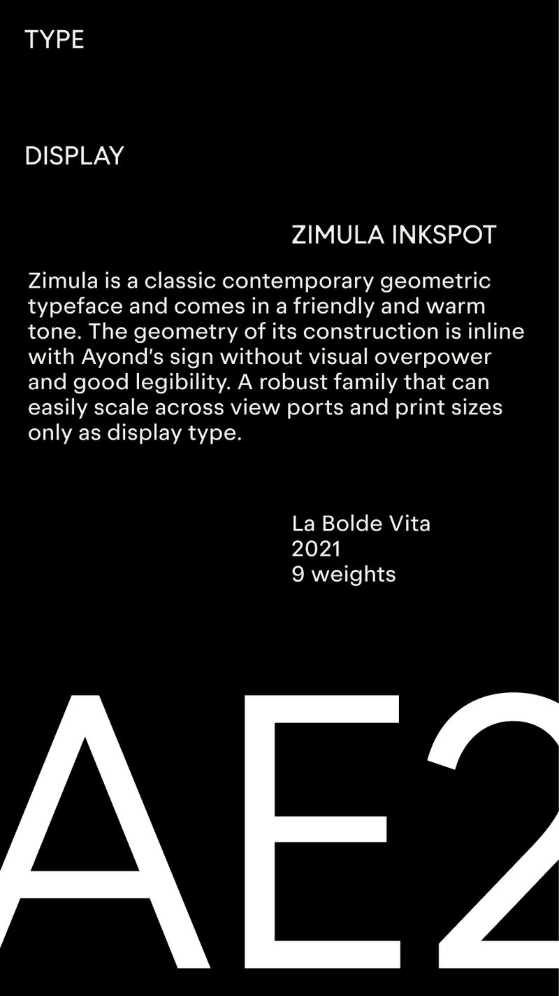
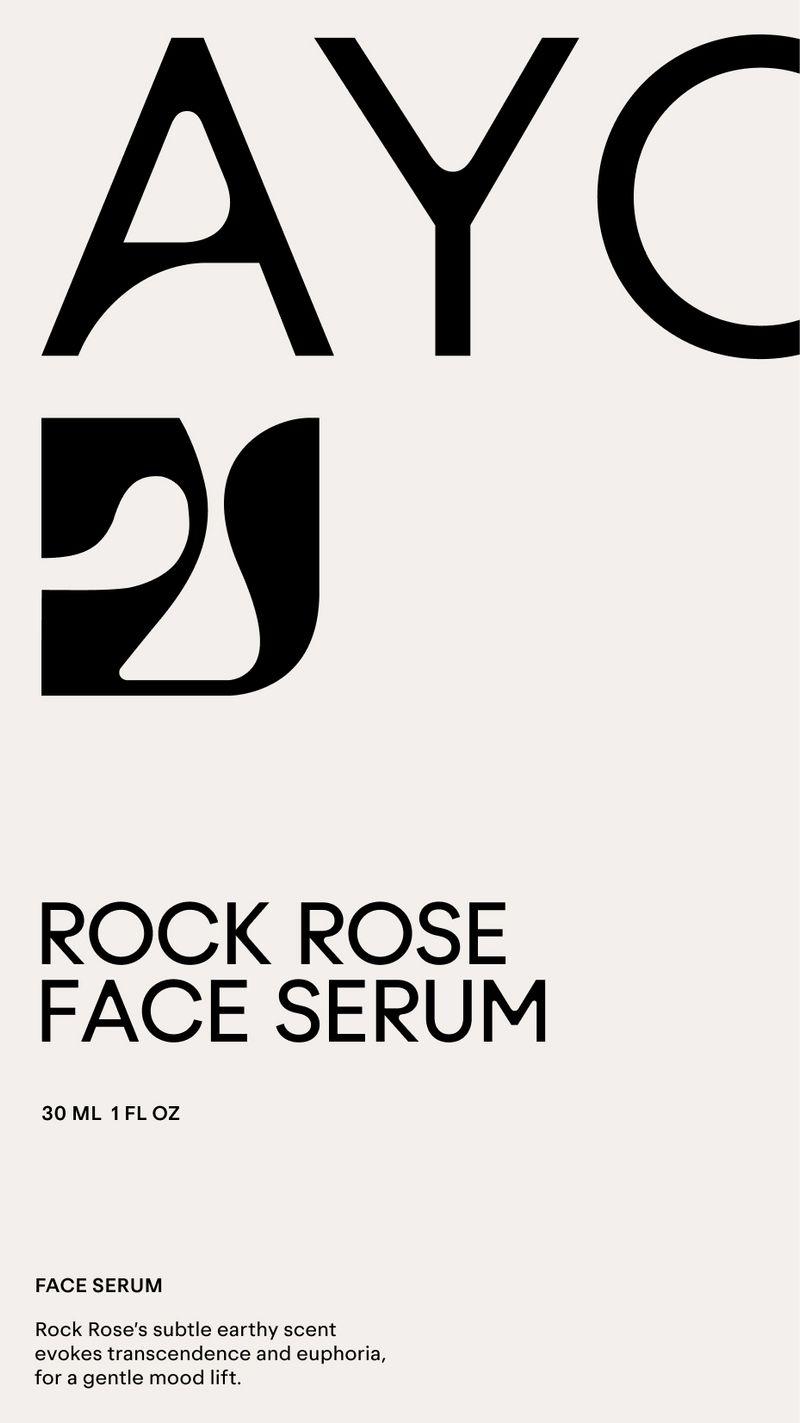
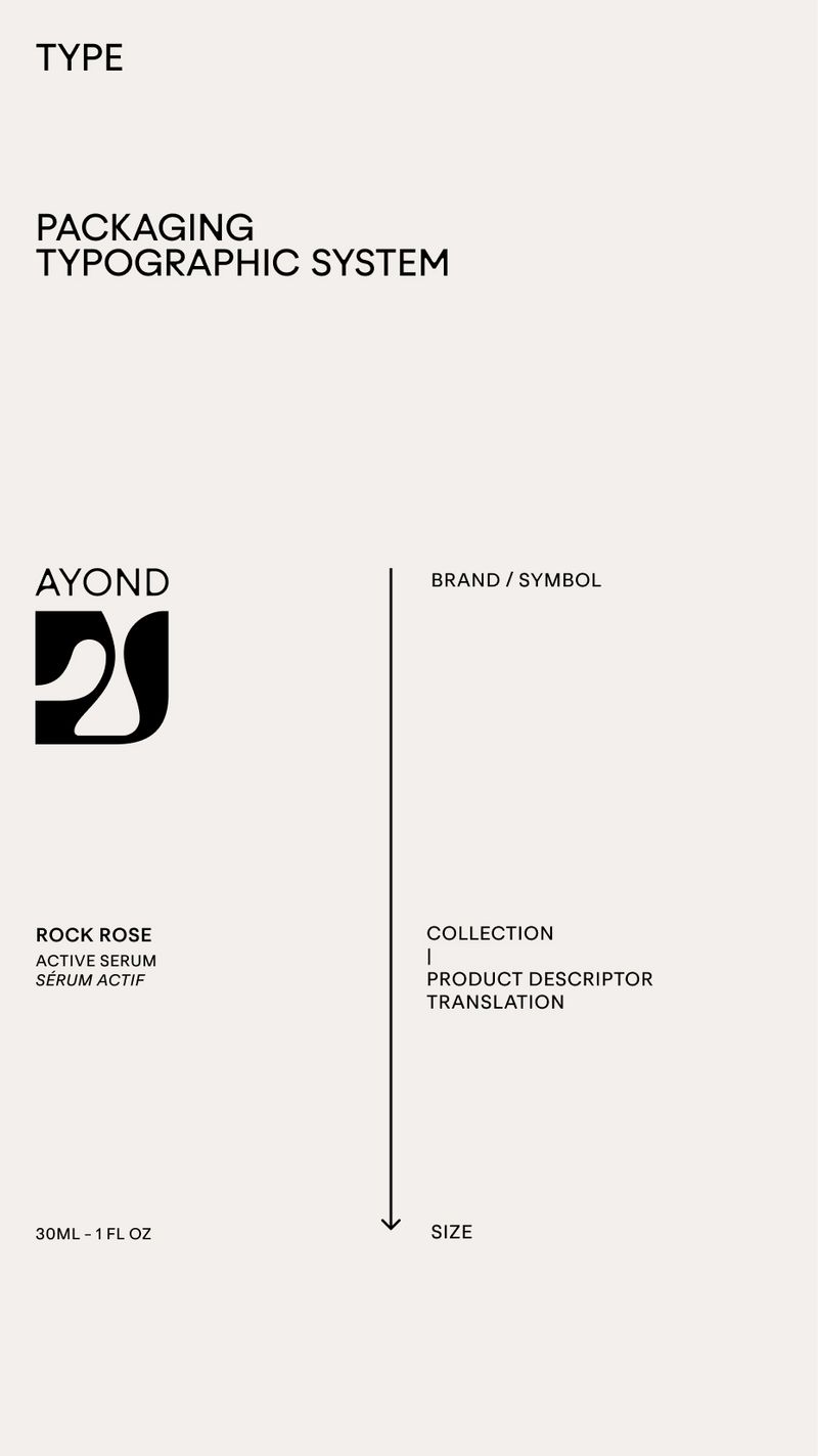
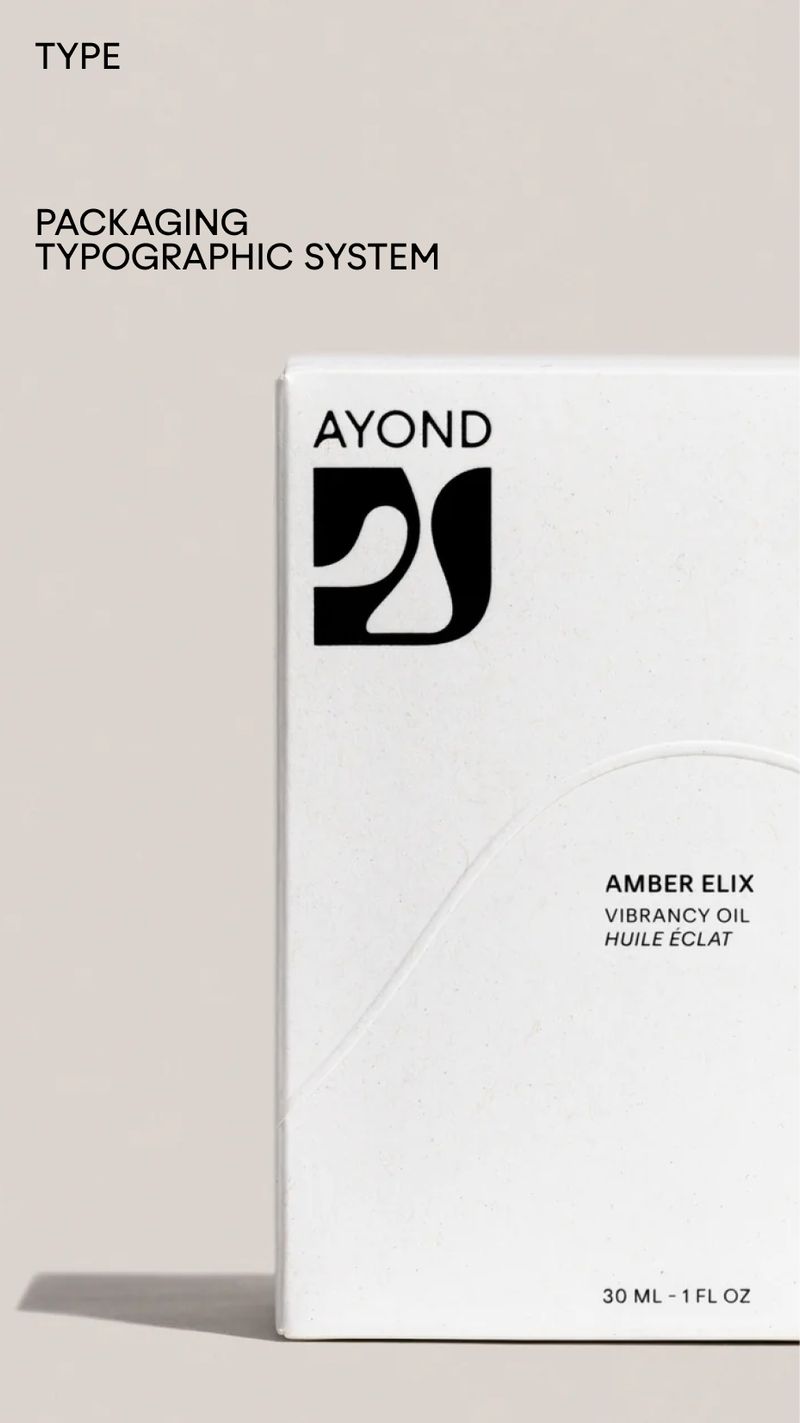
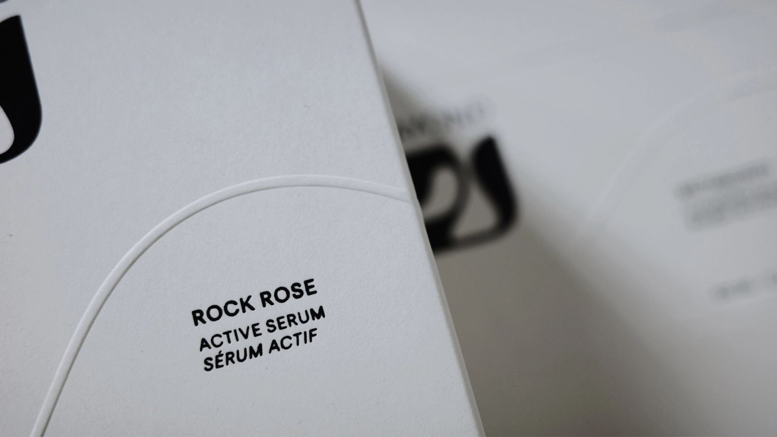
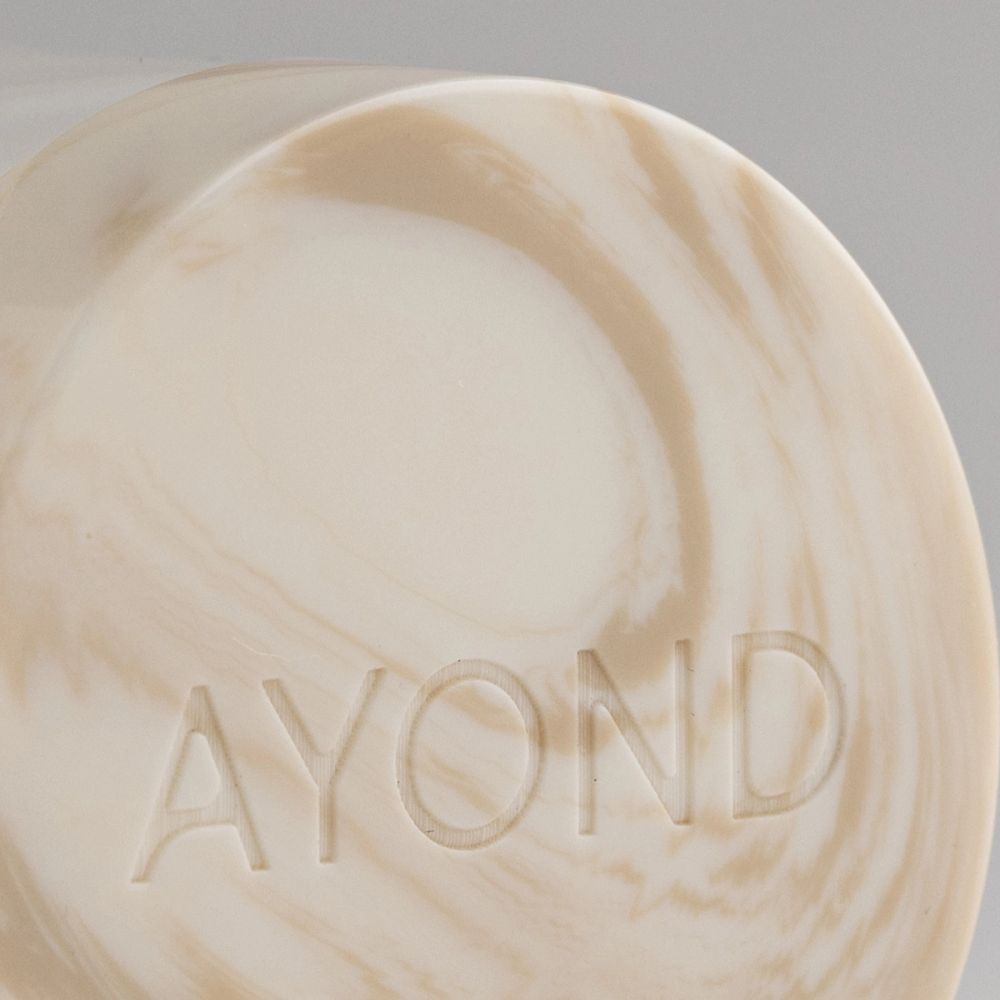
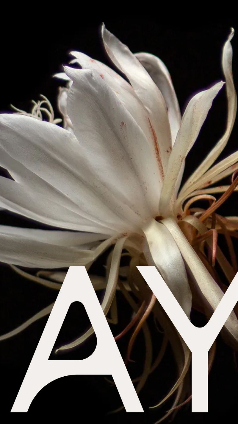
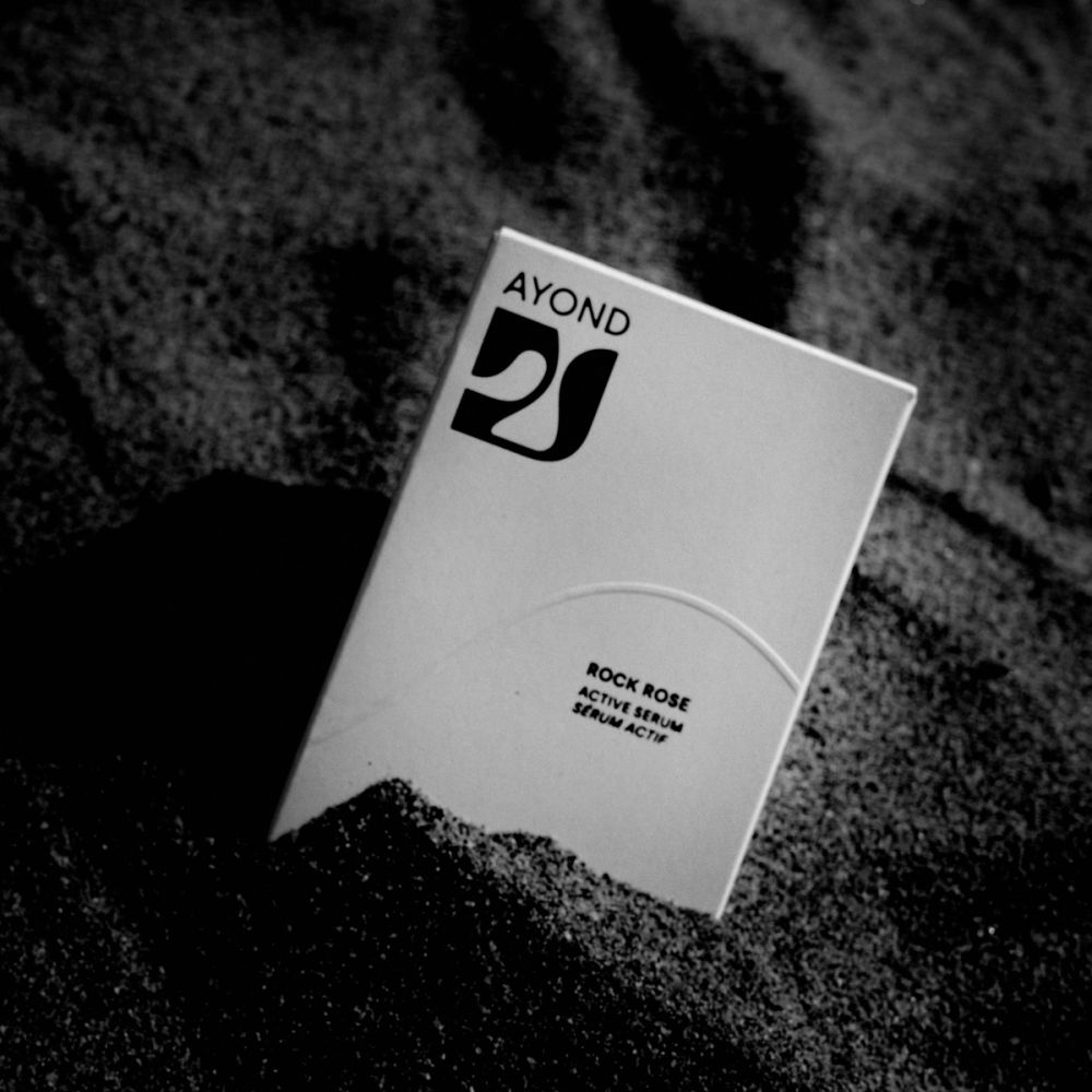
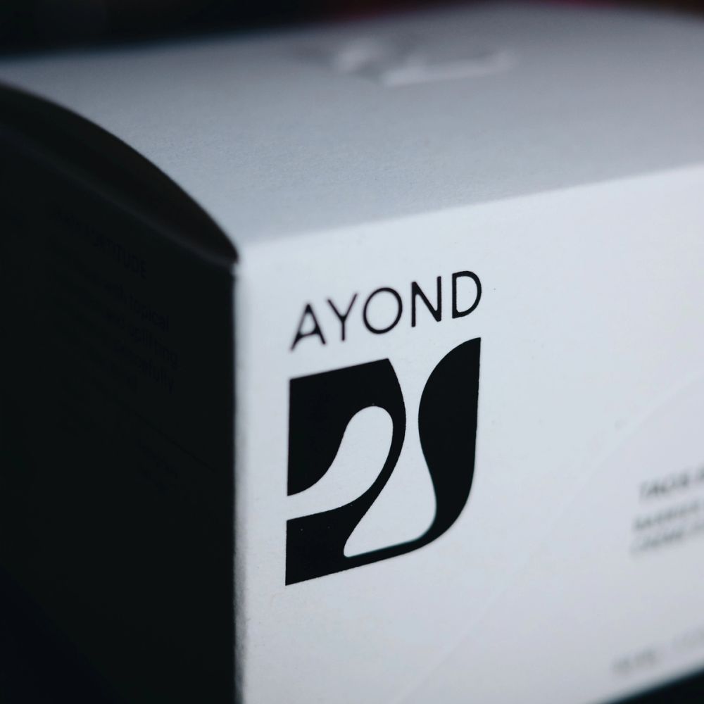
AYOND came to us with an existing logo: an organic shape with some performance challenges but already had a powerful shape. We added depth, creating, scaling, and expanding a system around its organic shape that resembles an 'A'. We realize that this 'A' had a potential behavior that could rotate 180 degrees like a compass. This way could symbolize a guiding totem to a healing and care process, as a compass guides you to find your way. After refining the proportions and weight of the icon, we matched a display type for the wordmark that encompassed its unique personality while being a timeless execution. For the wordmark, we used a modified Zimula Inkspot.
The original symbol mark was memorable and featured powerful shapes, but it encountered challenges with its proportions. To address these issues, we refined the curvature and increased the thickness of smaller elements to ensure legibility. We developed a system around its organic shape, resembling an 'A.' We recognized that this 'A' had the potential to rotate 180 degrees, similar to a compass. This rotation could symbolize a guiding totem for a healing and care journey, much like a compass guides you to find your way. For the original wordmark we opted for a structured typeface and meticulously customized it to amplify the curves while preserving the original essence in a refined and timeless manner.
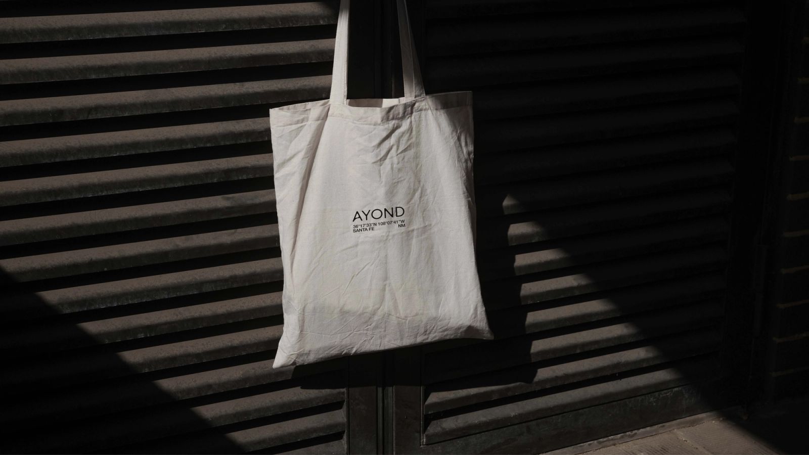
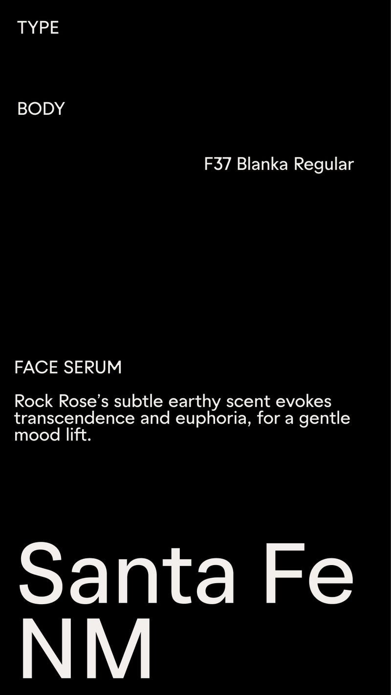
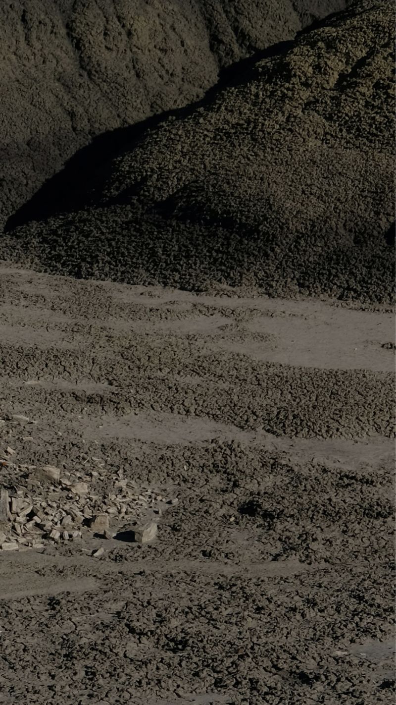
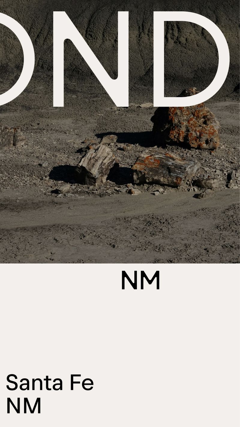
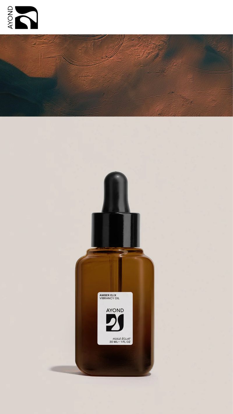
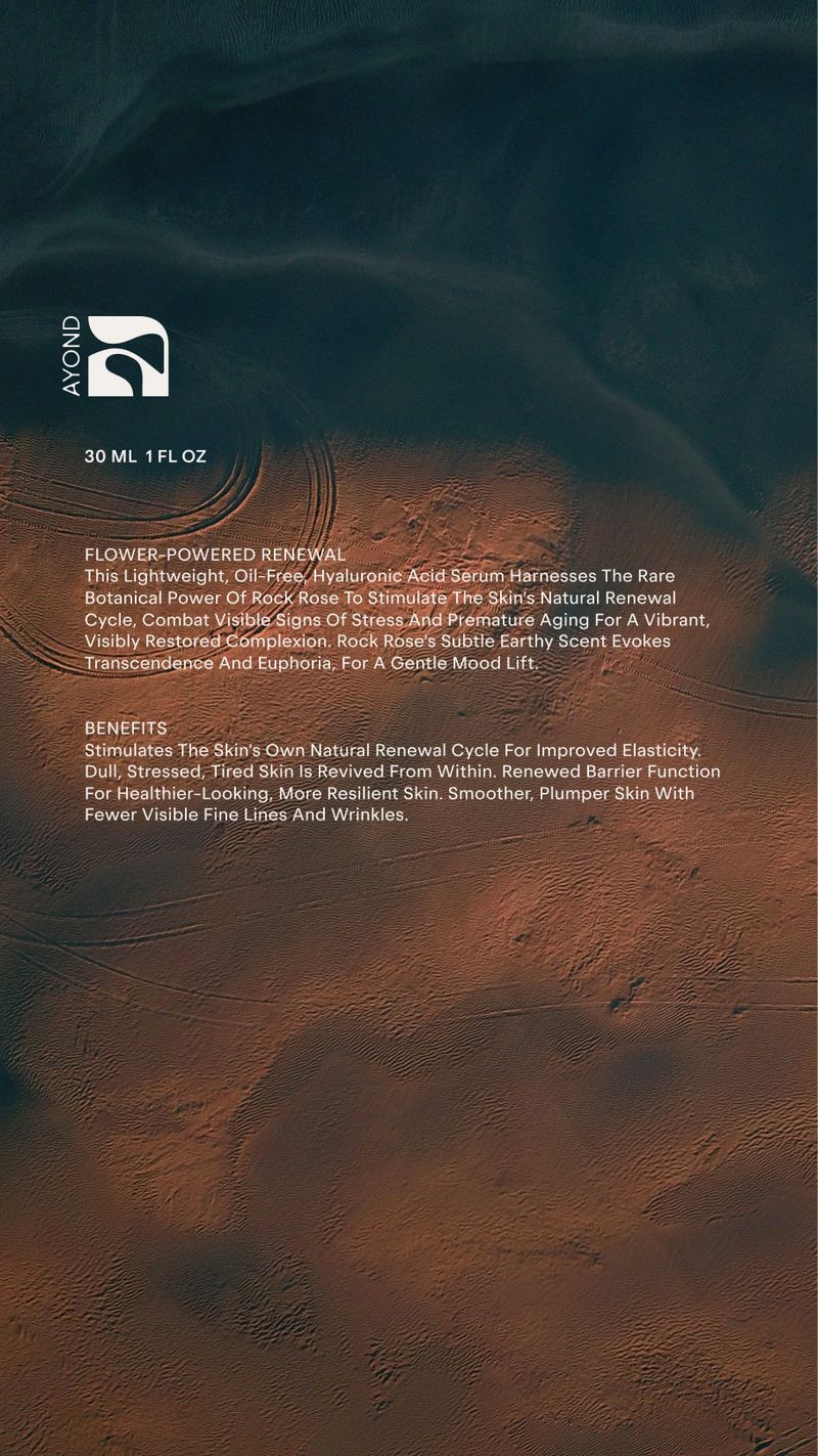
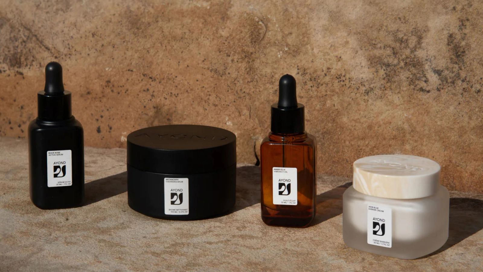

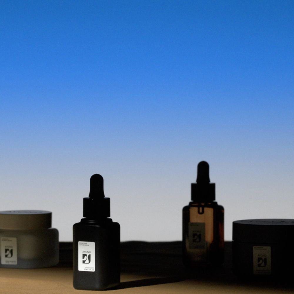
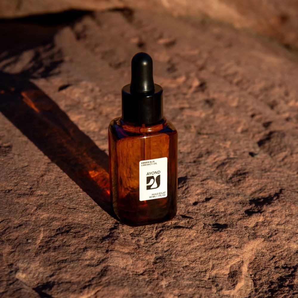
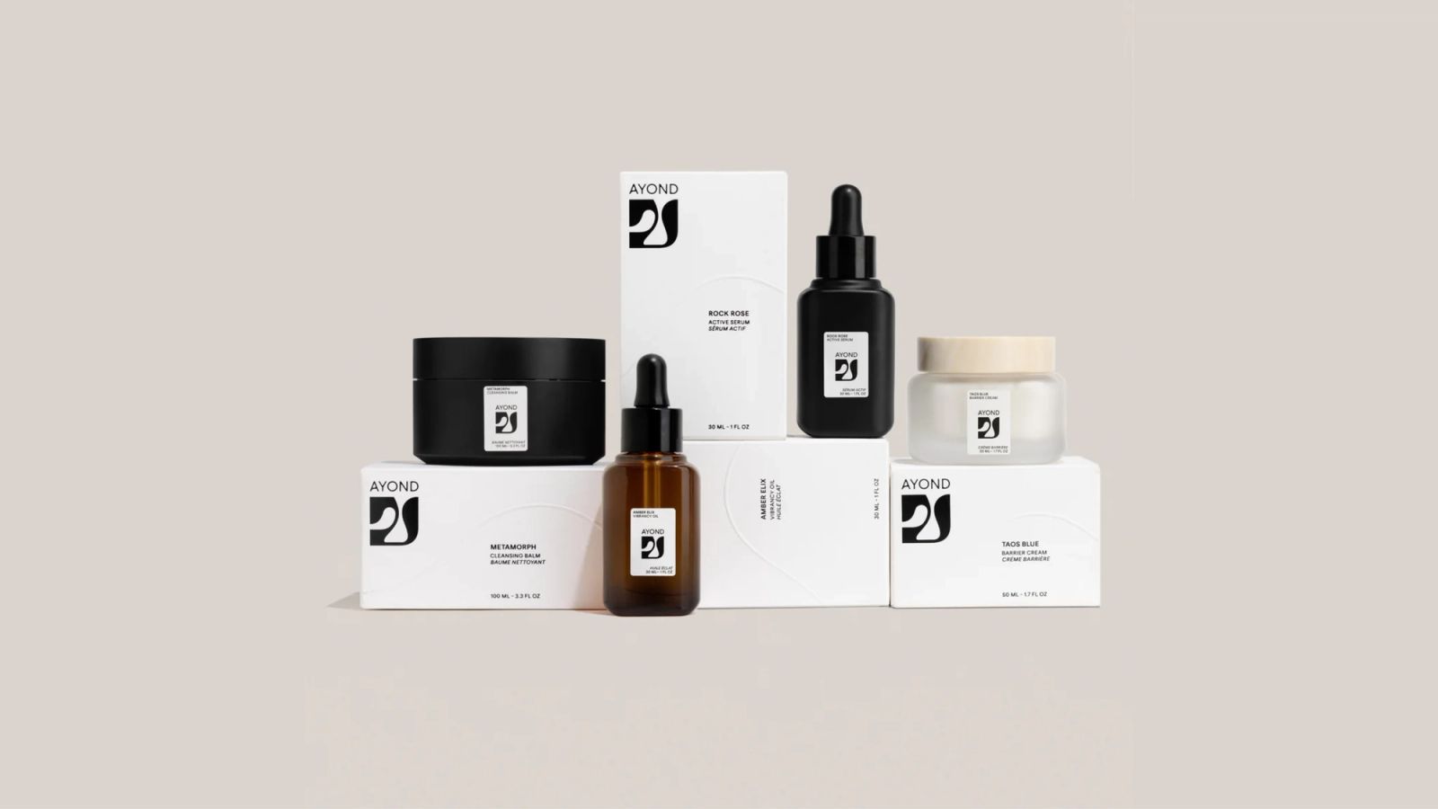
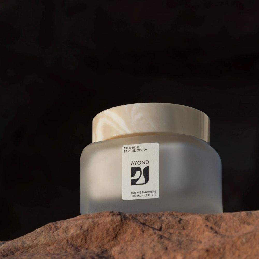
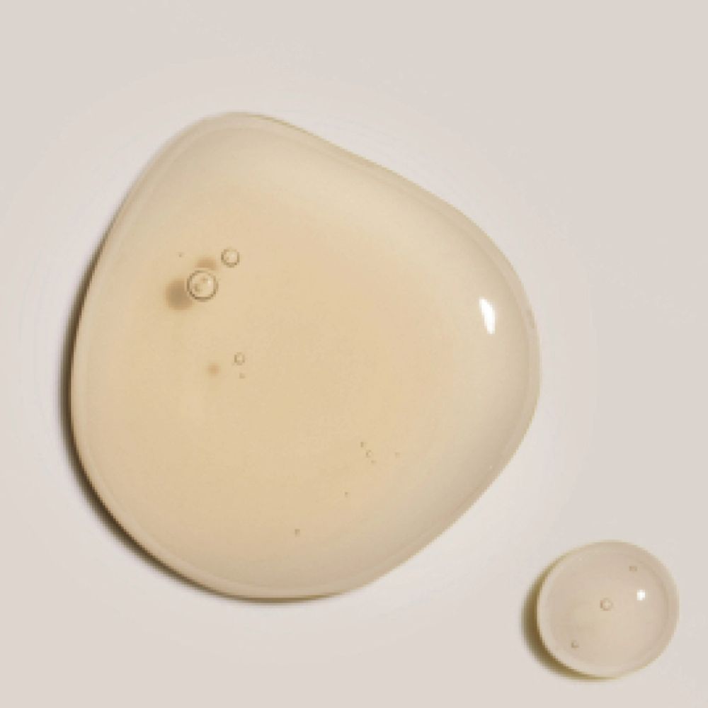
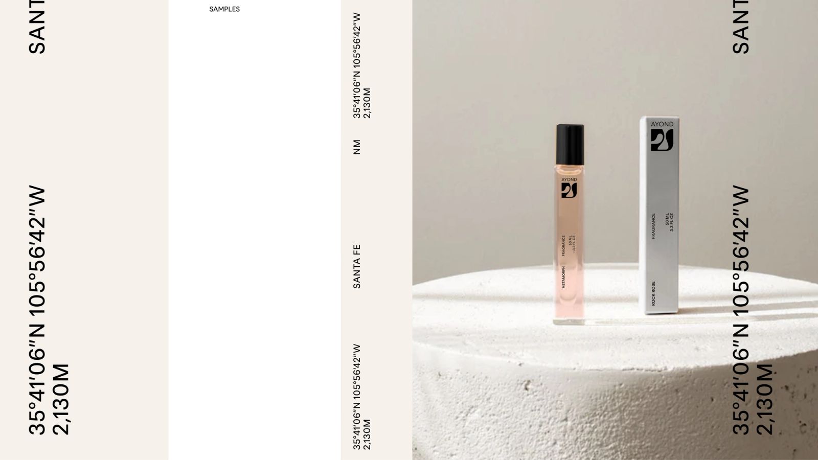
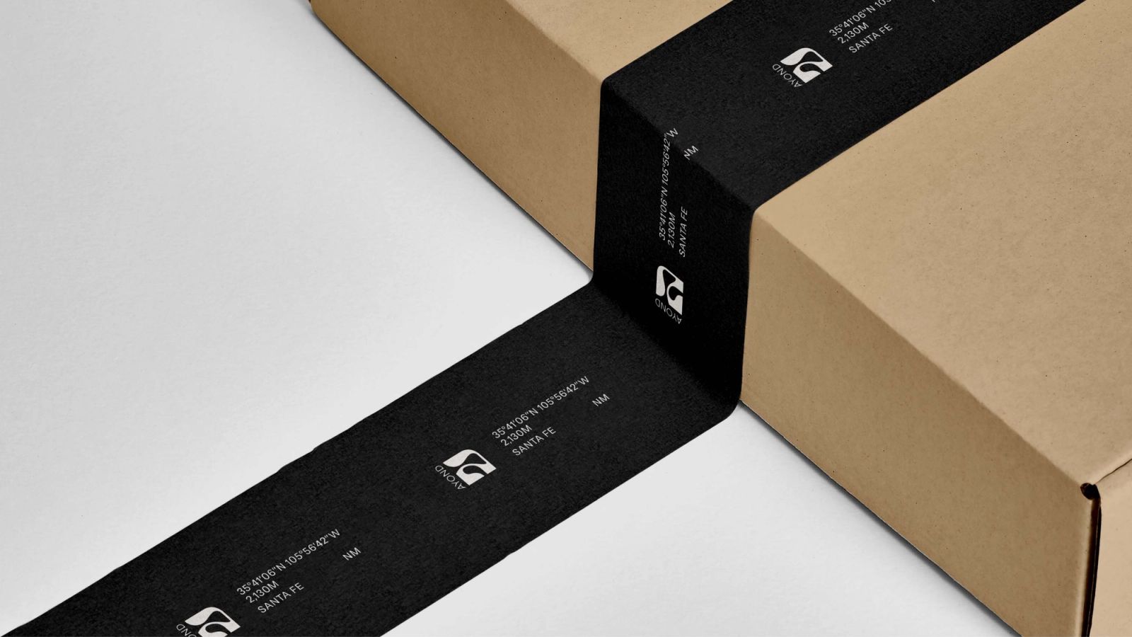
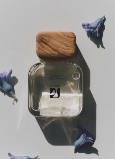
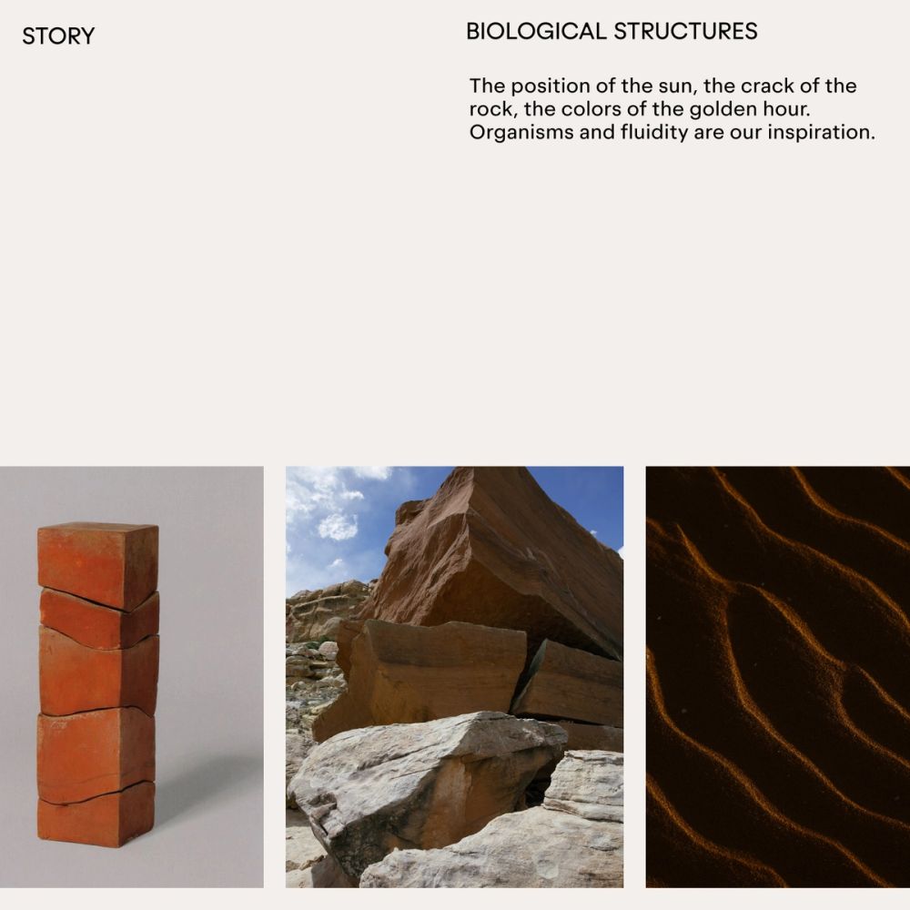
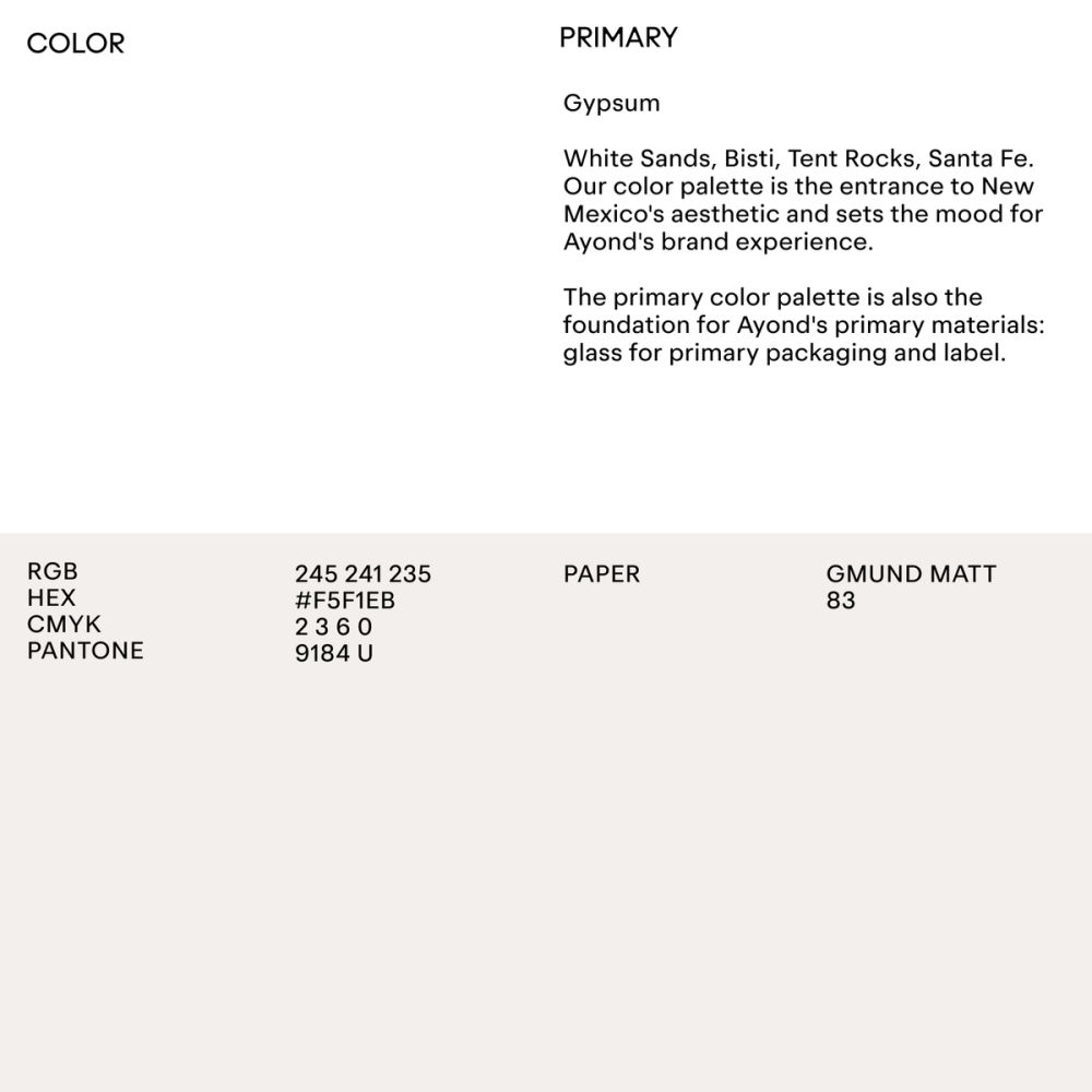
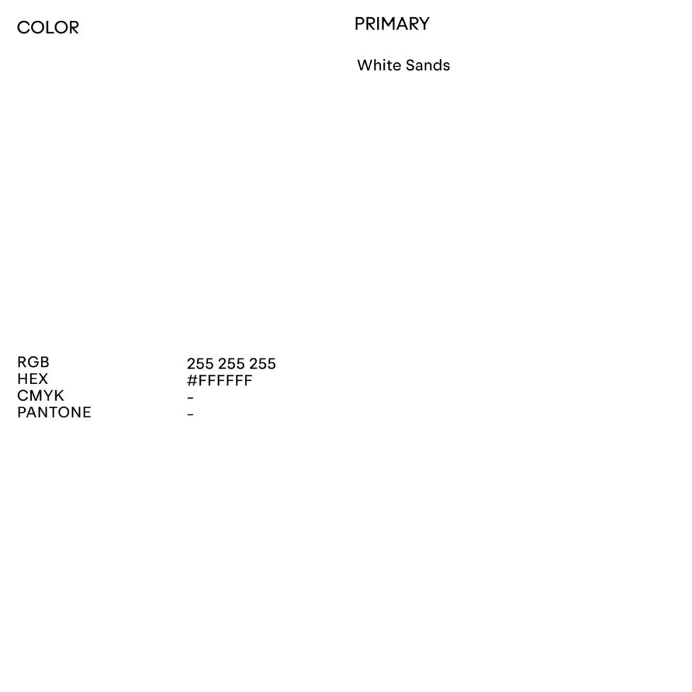
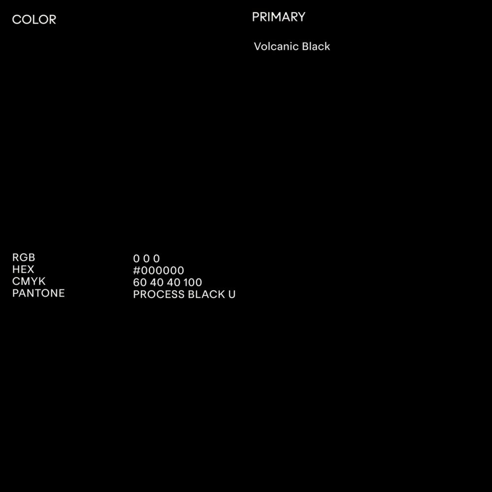
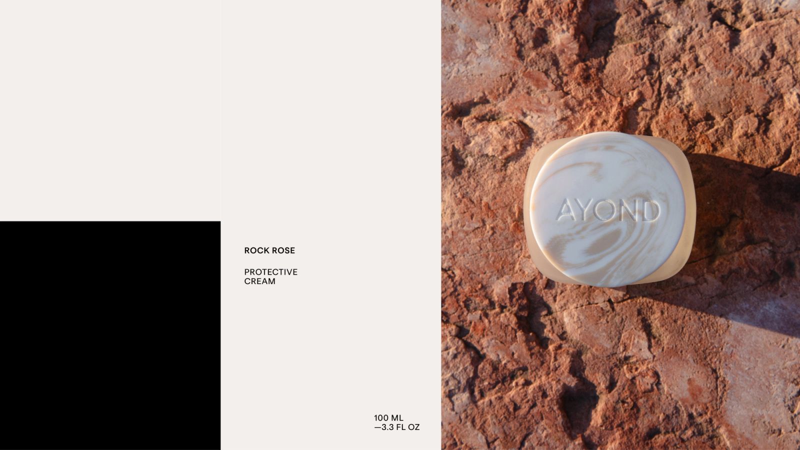
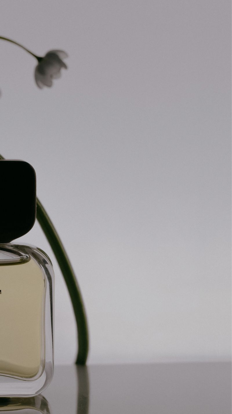
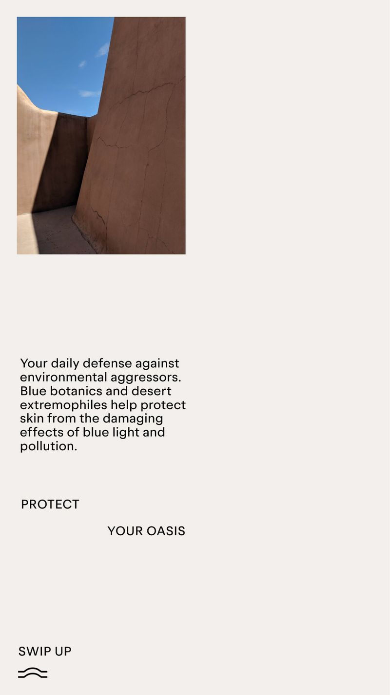
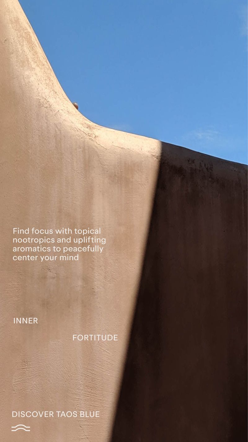
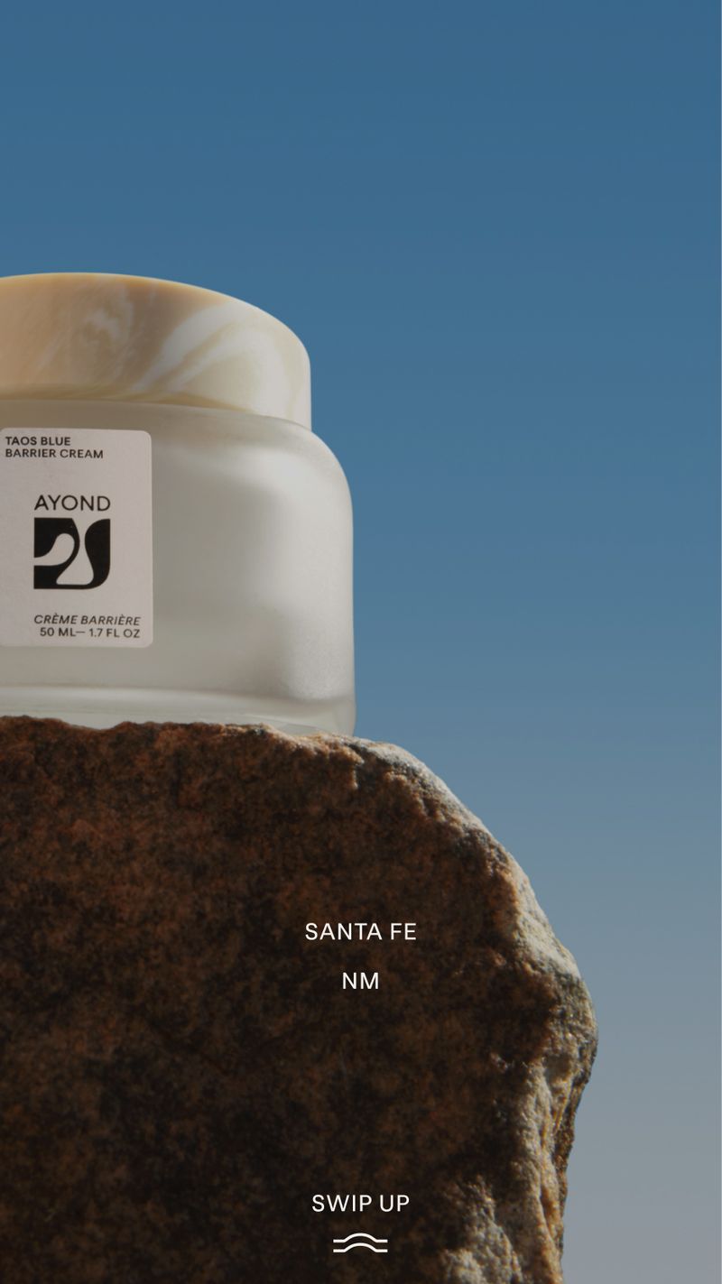
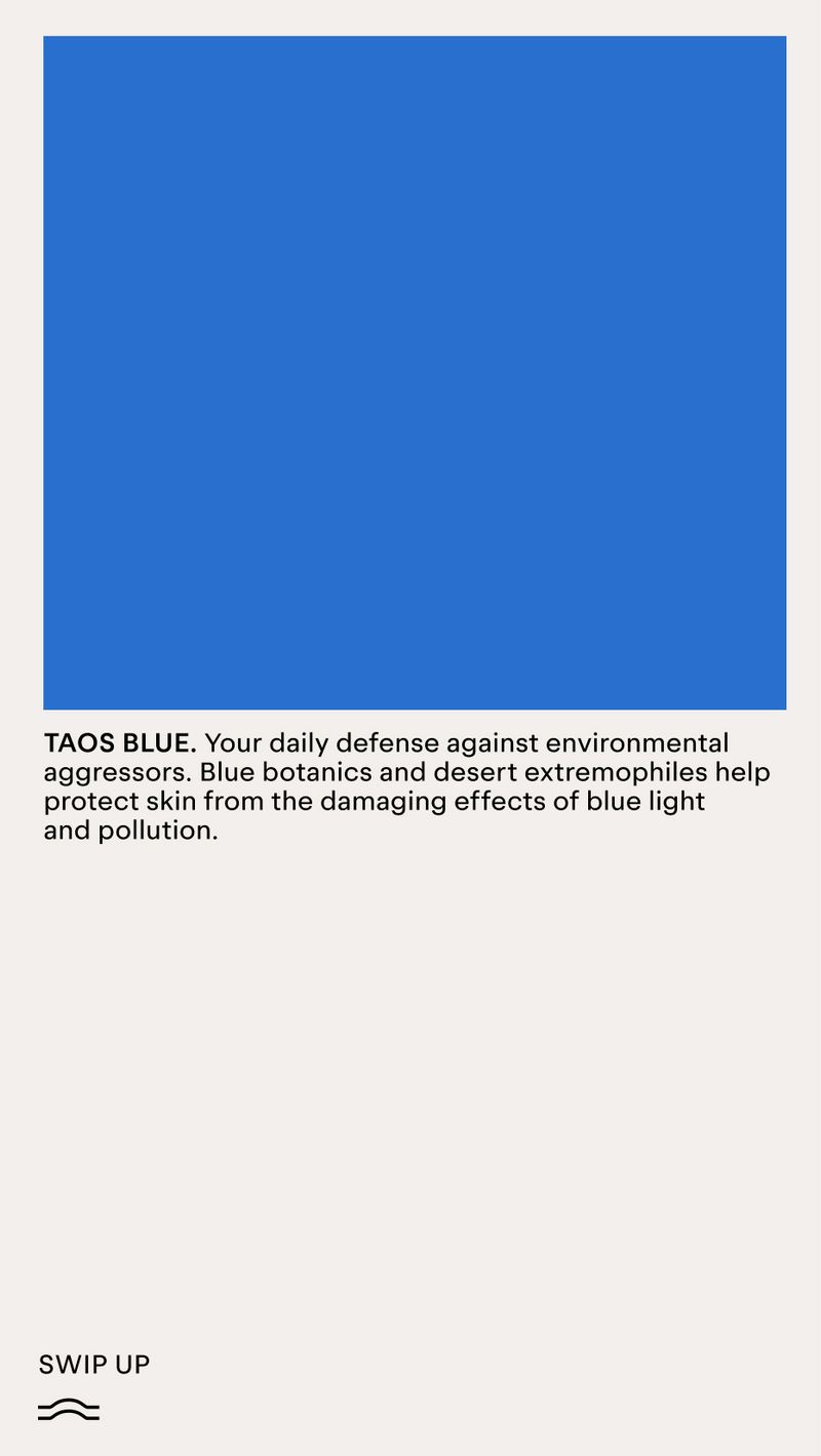
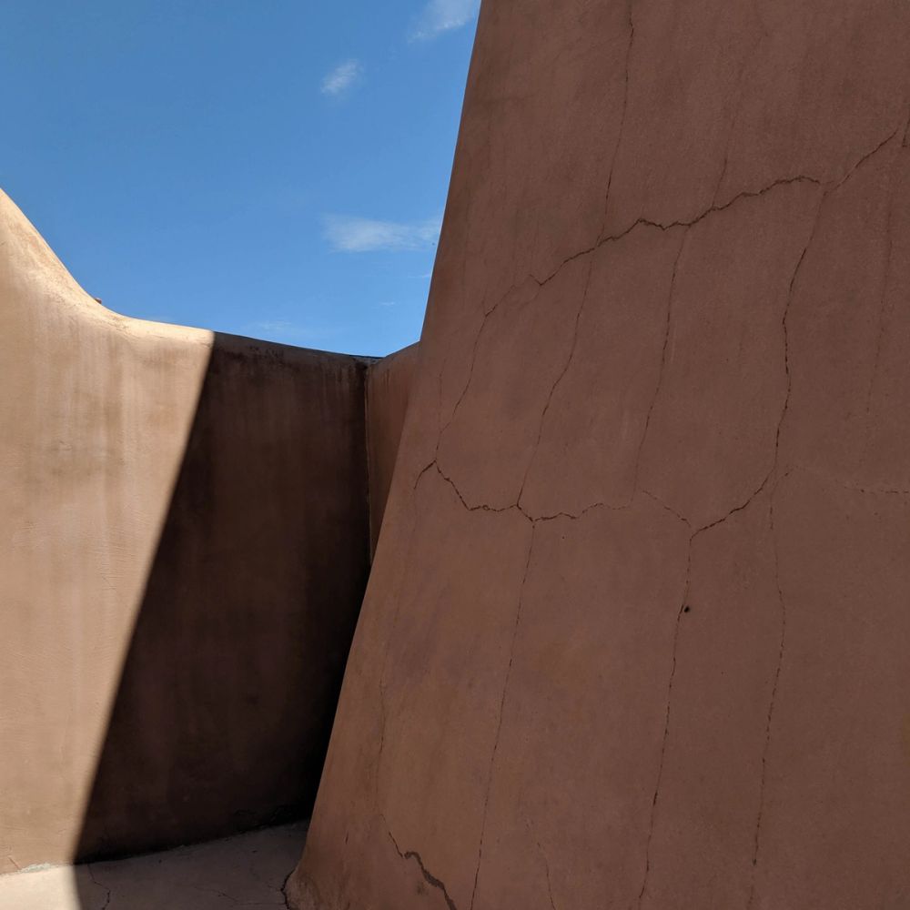
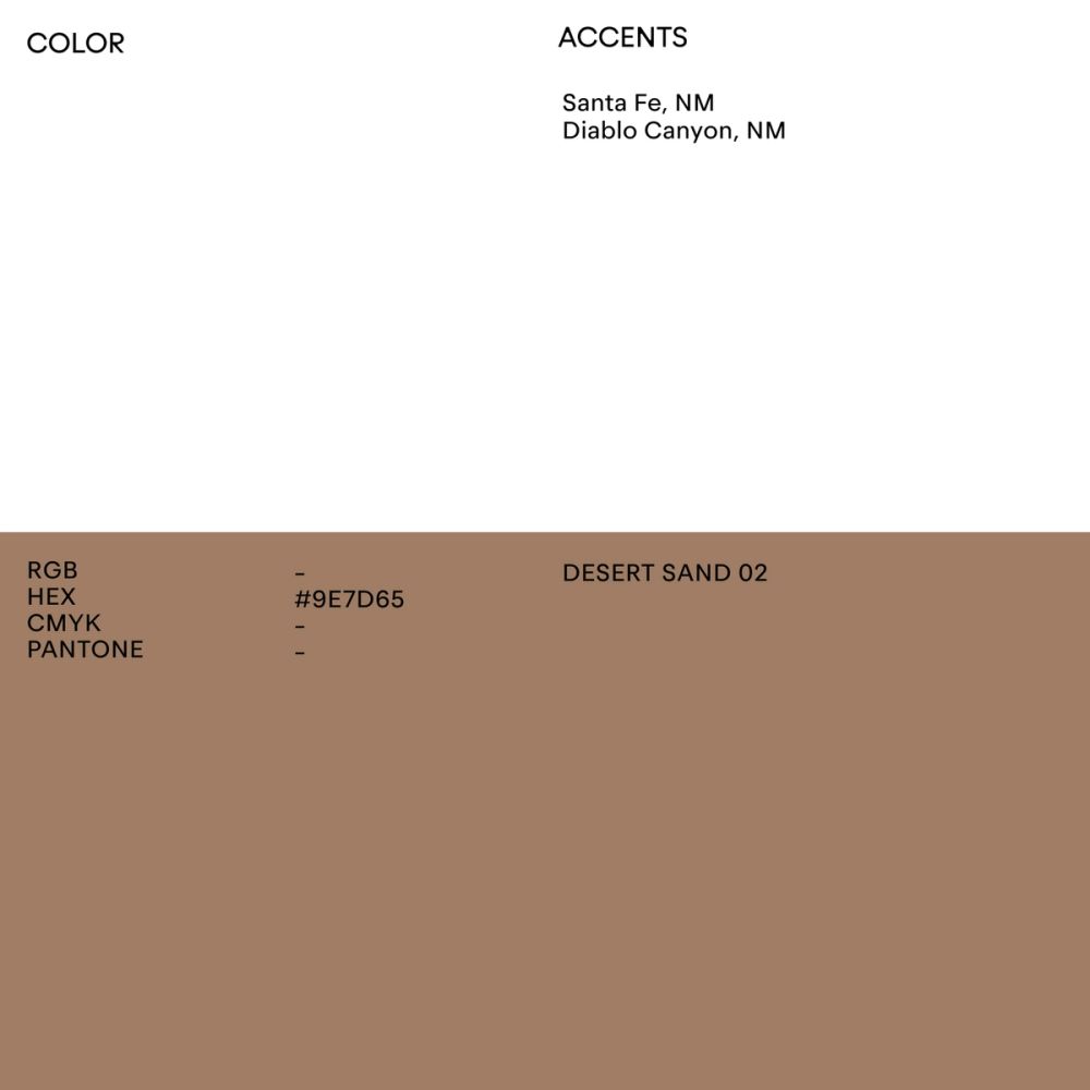
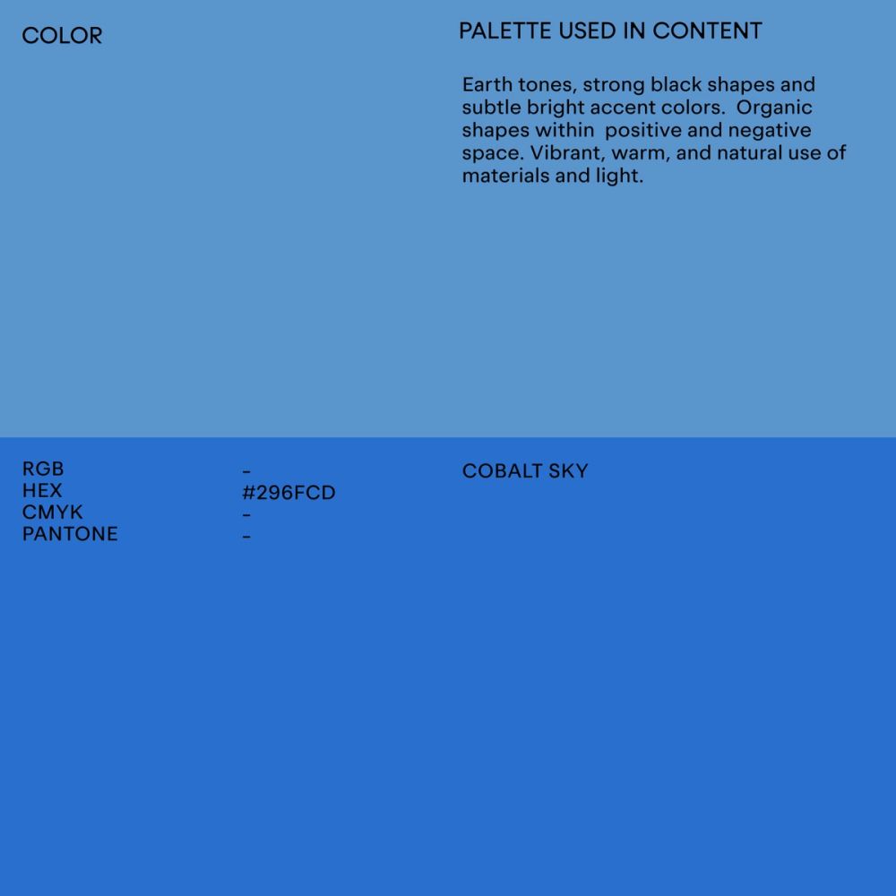
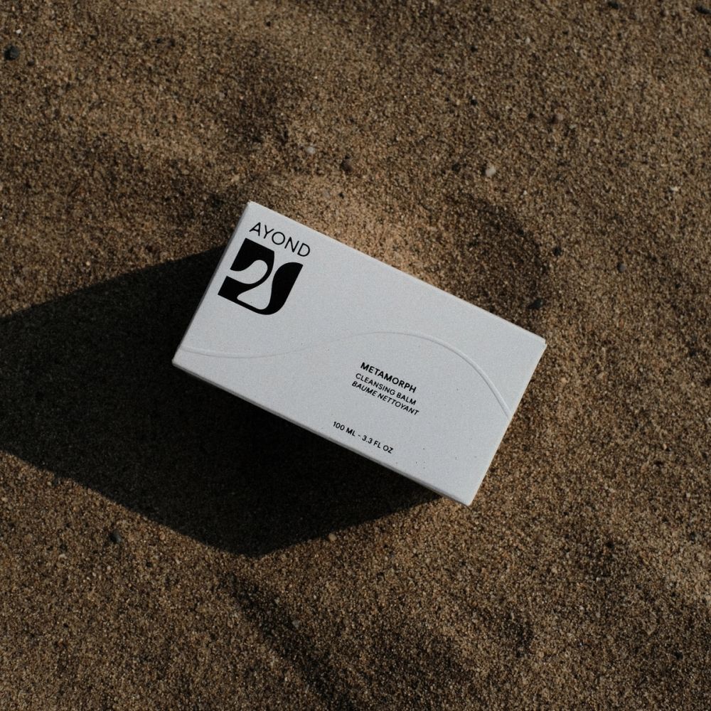
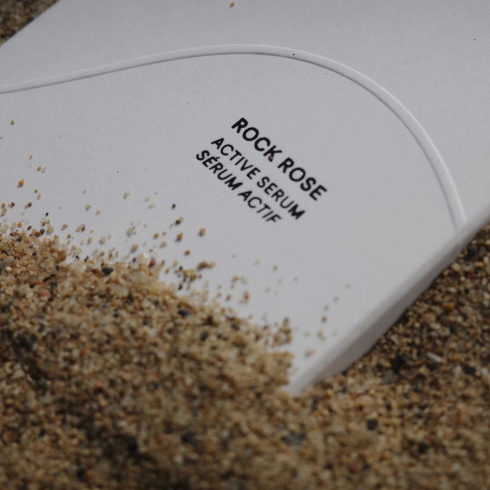
AYOND's color theory is rooted in its Architecture and Landscapes, the interior and exterior uniqueness of New Mexico. The color palette is the entrance to New Mexico's aesthetic. It sets the mood for AYOND's brand experience— inspired by the architectural characteristics of Santa Fe and the various deserts throughout the state. The primary color palette is also the foundation for AYOND's primary materials: glass for primary packaging and labels.
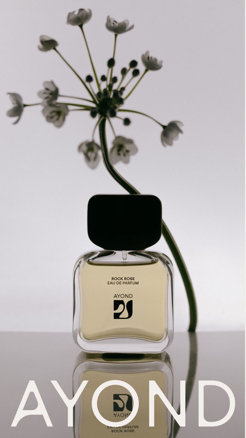
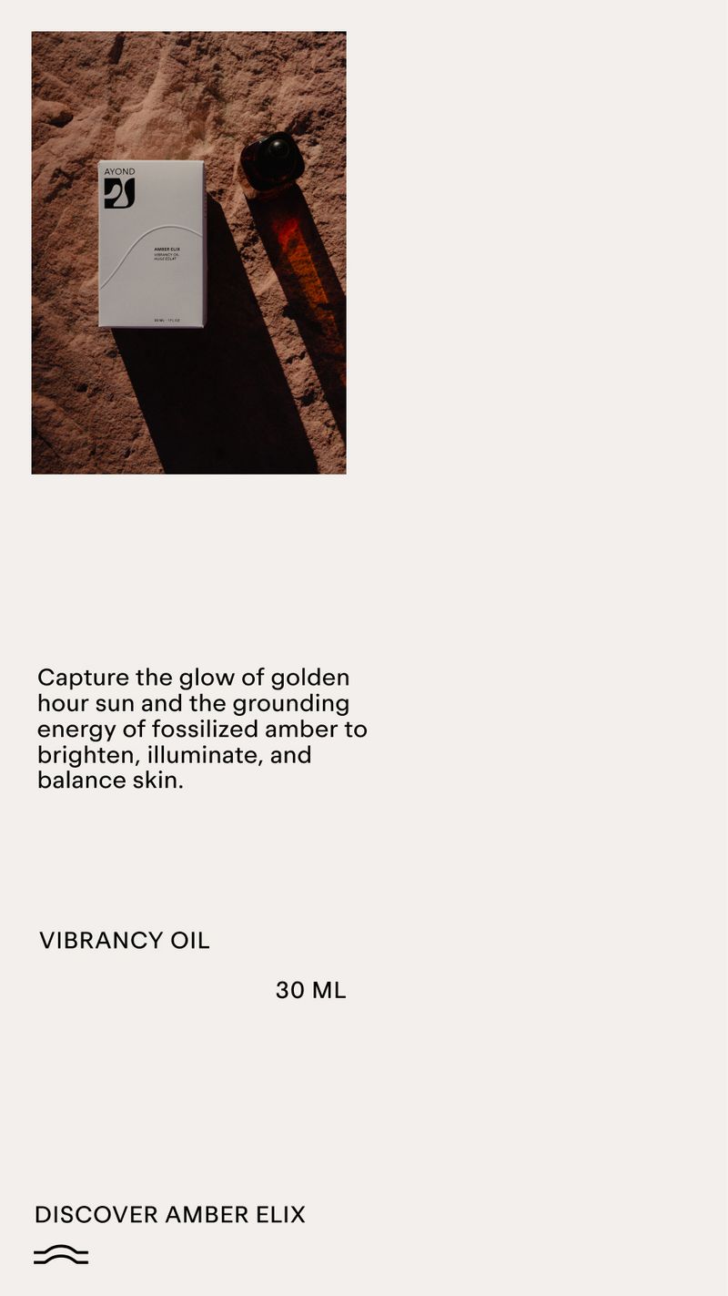
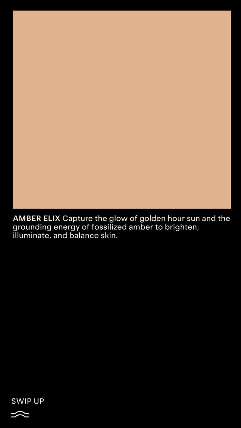
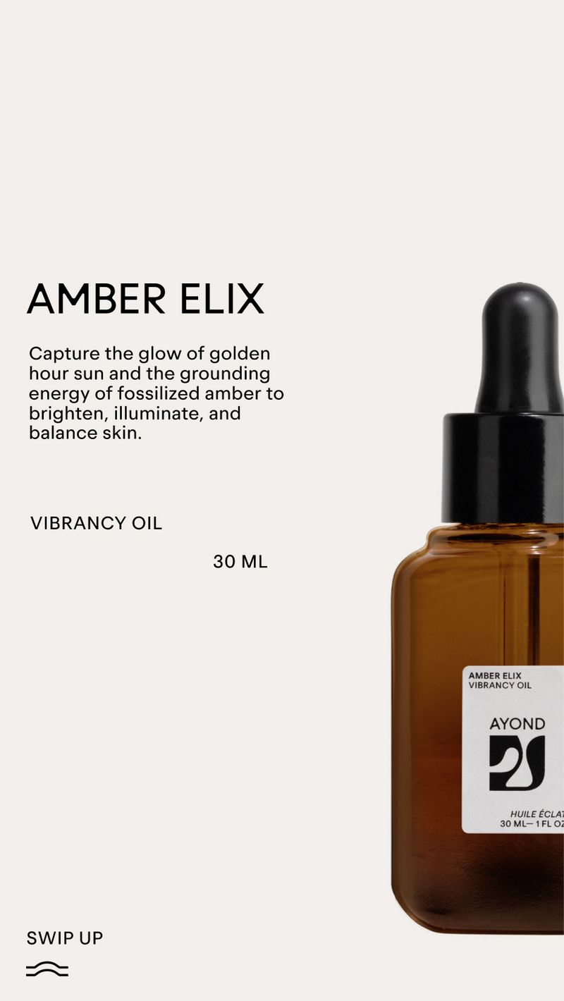
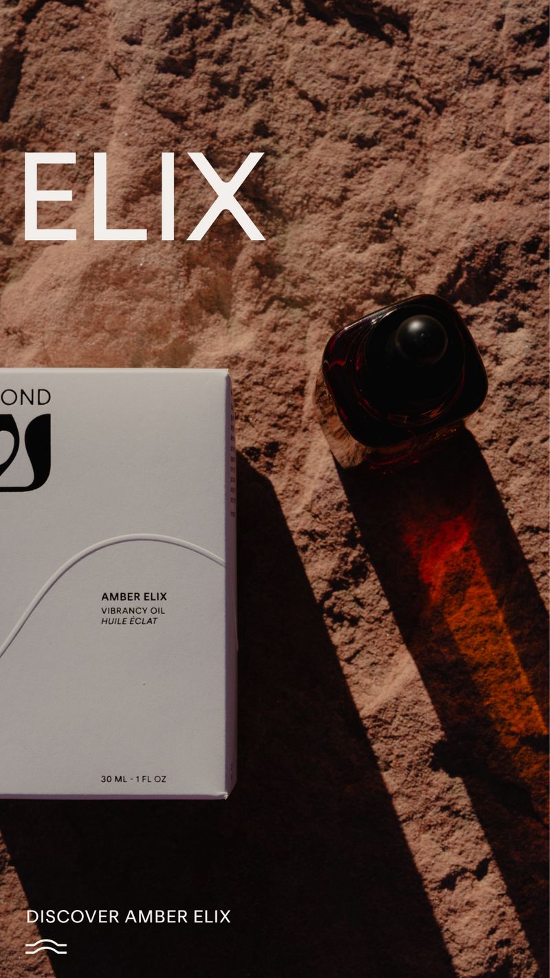
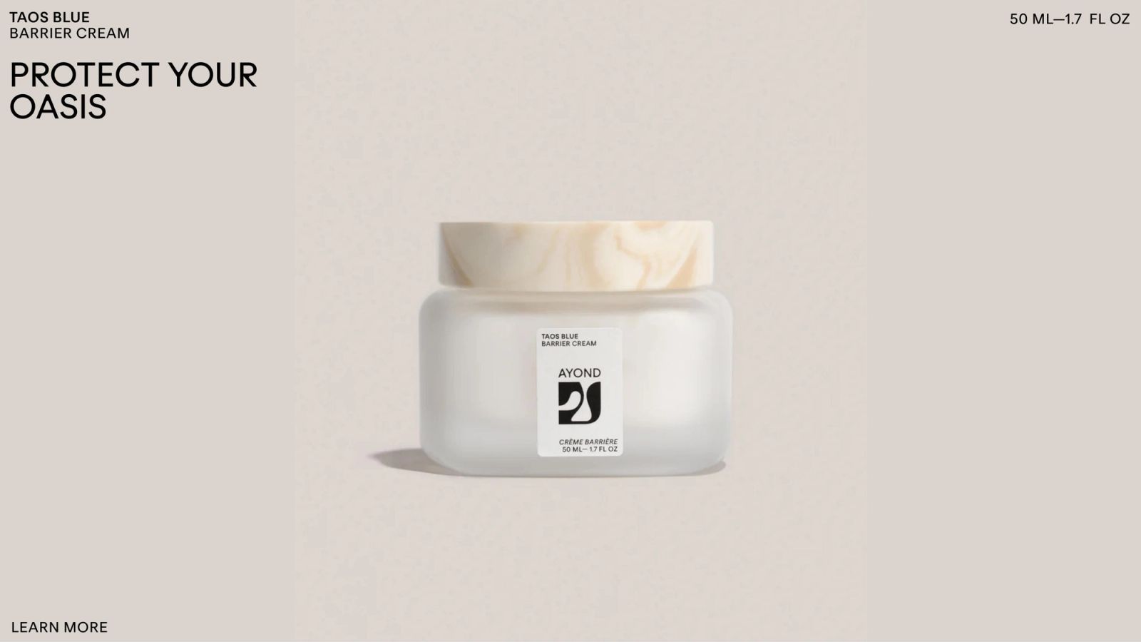
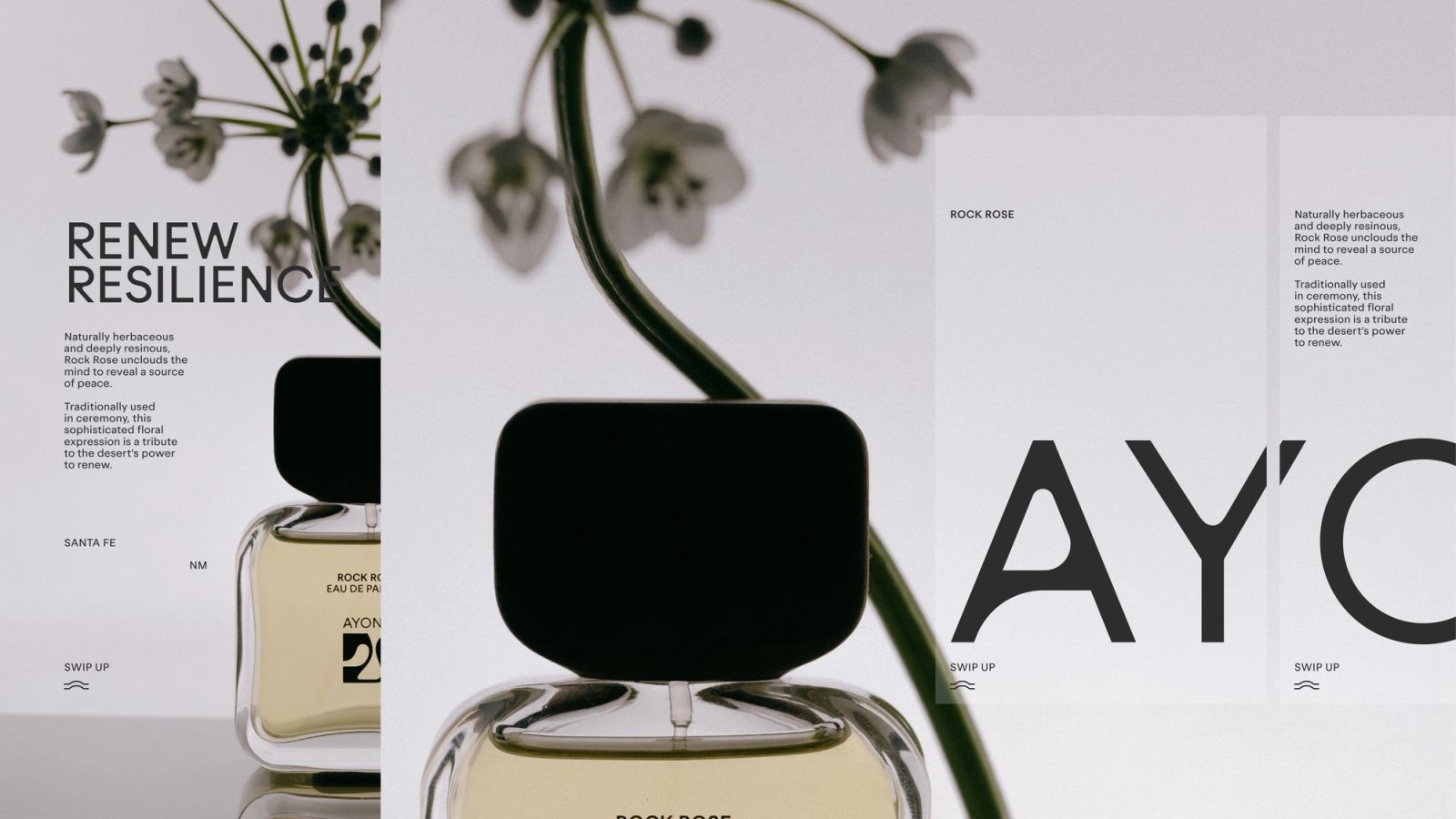
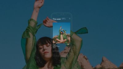
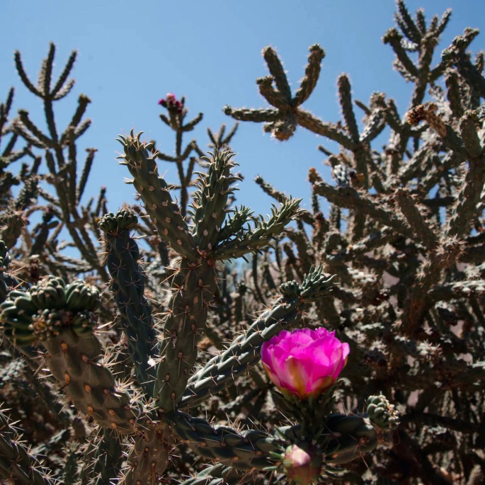
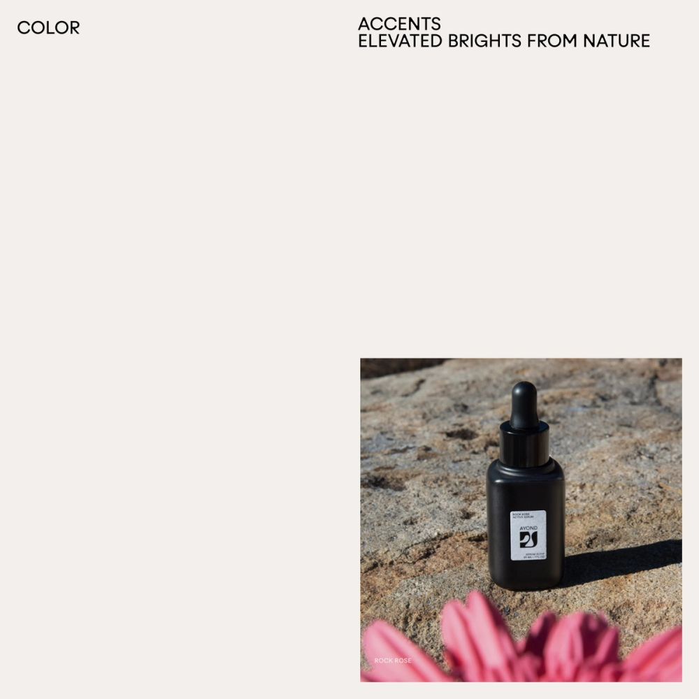
As a secondary color, we use accents and elevated brights from nature in content or secondary backgrounds in social media assets. Content owns the main narrative line of the desert story, supported by a graphic system and brand language. Using content to bring a unique color palette also helps create a visual cadence, allowing decluttering layouts and building a stronger and more meaningful relationship with AYOND's community. Each accent is linked to a collection, creating a consistent narrative across all the verticals and SKUs.
BP0003
Full Case Study
AYOND
Rebrand & Packaging Design
2023
AYOND was founded in 2018 by Shani van Breukelen, an African-American and Dutch fashion alumni from Central Saint Martins, and Porter Yates, a native of Santa Fe and mechanical engineer focused on sustainability. The pair shifted from their respective fields after Shani suffered a burn trauma, and the couple started working with plant-based remedies to help heal her skin. Inspired by their experience in the desert, the duo set out to create efficacious skincare that celebrates design without compromising the Earth. AYOND is a desert-inspired skincare and lifestyle brand. A clinically crafted beauty and lifestyle brand that combines powerful skincare actives grown only in the desert with topical nootropics and mood-boosting aromatics to rejuvenate from the inside out. It is a synonym for beyond, encompasses the belief that to thrive in a future beyond today, we must create consciously, inclusively, and sustainably. AYOND believes that the desert is a powerful source of rejuvenation that awakens our body, mind, and soul to transformative experiences. This state of well-being consciously shifts our awareness from me to us, uplifting our lives to feel more connected, empowered, and whole. AYOND's visual system is inspired by desert resilience, creating a physical and ethereal space for healing and self-discovery. Our task was to re-redesign the original logo and to create a brand system that could scale into packaging, interface, marketing, and beyond. Their original logo was an organic shape with some performance challenges, but it already had a powerful shape. We added depth, creating, scaling, and expanding a system around its organic shape that resembles an 'A'. We realize that this 'A' had a potential behavior that could rotate 180 degrees like a compass. This way could symbolize a guiding totem to a healing and care journey, as a compass guides you to find your way. We wanted to create a metaphor that could translate the physical and mental experiences we encounter in vast, neverending desertic environments. There is nothing around to guide us: only the position of the sun and our inner thoughts and nature. Our task was to redesign the original brand identity in a close collaboration with its visionary founders Shani van Breukelen and Porter Yates. We created a brand system that could scale into packaging, interface, marketing, and beyond. We embarked on a journey to redefine the brand's visual strategy while also underscoring its commitment to sustainability and mindful living.
The original symbol mark was memorable and featured powerful shapes, but it encountered challenges with its proportions. To address these issues, we refined the curvature and increased the thickness of smaller elements to ensure legibility. We developed a system around its organic shape, resembling an 'A.' We recognized that this 'A' had the potential to rotate 180 degrees, similar to a compass. This rotation could symbolize a guiding totem for a healing and care journey, much like a compass guides you to find your way. For the original wordmark we opted for a structured typeface and meticulously customized it to amplify the curves while preserving the original essence in a refined and timeless manner. We also delivered extensive brand guidelines, a creative toolkit, ready-to-print files for primary and secondary packaging, samples, and bundle packaging to equip the team in their future endeavors for content creation.
EST+6 New York, 2023
Foundry La Bolde Vita for Zimula Inkspot Zimula Inkspot Regular F37 for F37 Blanka F37 Blanka Regular F37 Blanka Medium
Output Brand Strategy Design Strategy Brand Identity Brand Systems Creative Direction Packaging Design Editorial Design Marketing Design Photography
Team Shani van Breukelen (Ayond's Founder, Creative Director) Porter Yates (Ayond's Founder) Clara Ongil (Design) Cris Mascort (Creative Director, Design)
Printer Rohner Press
Photography & Campaign David William Baum Porter Yates Manolo Campion Bangal Dawson + Plainsight Cris Mascort
eCommerce Concept and cadence