A Visual Supply Company.
NYC EST
WorkAbout BCN +6
VSCO
Brand Platform Relaunch
2023
- Brand platforms
- Brand strategy
- Design Strategy
- Brand Identity
- Art Direction
- Marketing Design
- Brand Audit
- Brand Guidelines & Creative Toolkits
- Curation
- Brand Implementation
- Brand Systems
BP0006
Play Video
Visual Supply Company is a start-up founded by Joel Flory and Greg Lutze in California in 2011. VSCO launched in 2012. In 2017, VSCO launched a subscription model. As of 2018, Visual Supply Company has $90 million in funding from investors and over 2 million paying members. Its business model has continuously evolved from an Adobe Lightroom preset to a mobile app photo editing platform to a general community focus. However, during 2018-2020, the business wanted to refocus on its original core: photographers, not just pros, but anyone who wanted to commit to their craft with time, skillset, education, or money—what VSCO calls "Serious Creators."
We partnered to develop a brand strategy through workshops, stakeholder interviews, and a brand audit. We shaped a design brief and started working with foundational elements to keep, discard, or evolve existing assets and principles. VSCO is a beloved brand, so it was a delicate and thoughtful exercise. The intention was never to do a complete redesign but a brand evolution. We evolved the logo and rethought the usage of its typographic family, designed by Göran Söderström from Letters from Sweden. Everything else, we updated. We built a system from creator to creator, so we had to use and start speaking the same language.
Quality, Trust, and Curation.
We started this partnership by auditing the existing brand, competitors, and adjacent players to develop a comprehensive design brief followed by brand and design strategy from VSCO's new mission statement, "We Nurture Creativity So You Can Make It." From solidifying the brand strategy, we defined the evolved brand language, created an extensive creative tool with in-app and marketing templates, identities for programs and other internal initiatives, and created a vast guidelines document for internal and third-party implementation. VSCO is more than an app with editing tools or any other social media destination. It is a platform for creative growth. It revolves around three powerful values: QUALITY, TRUST, and CURATION. We had to find a language and a story that would honor its original DNA and bridge the creative flow: from creation to expression. VSCO puts the creator at the center of its existence. It believes that creativity is of the essence. It reflects all people and cultures and challenges us to be our best selves. The platform gives opportunities for discovery and growth, innovation, and collaboration. It helps creators realize their passion.
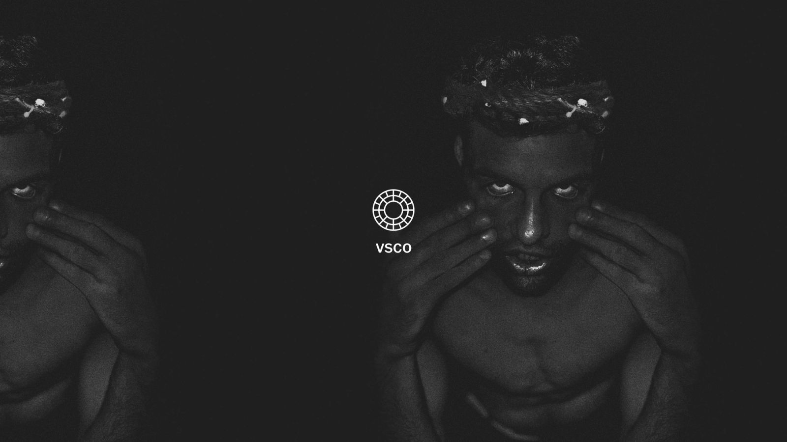
Our design story started with the creators' relationship with their cameras and tools: when they are behind or in front of them (sharing the work with the world). This relationship is the foundation for the entire design system. "Photography trains us to look in and out at the same time, paying closer attention not only to the world around us but also to the quality of our own response to it." —Sophie Howarth "The camera is an instrument that teaches people to see without a camera." —Dorothea Lange
Creator always first.
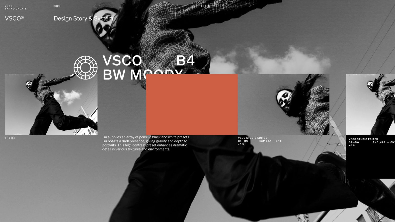
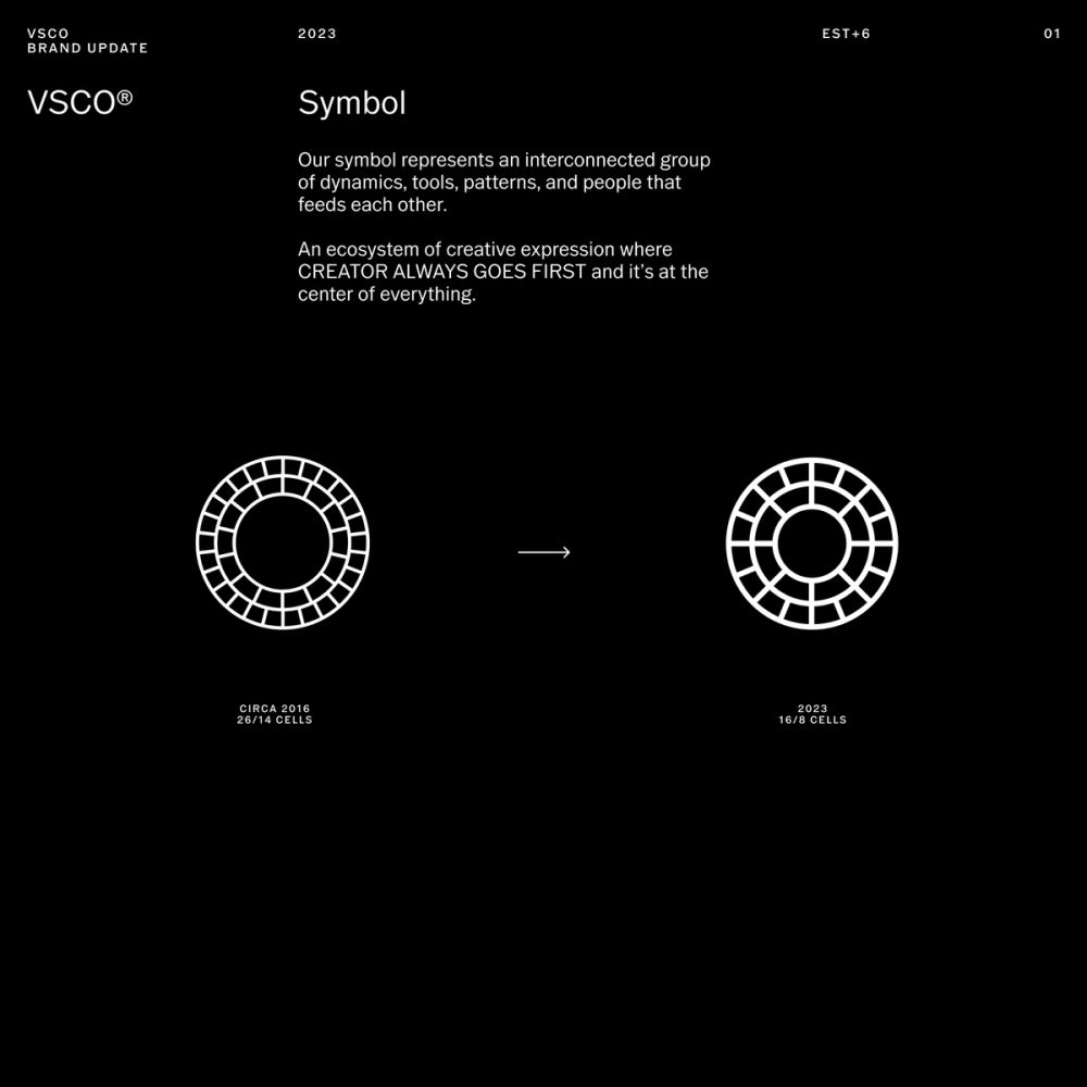
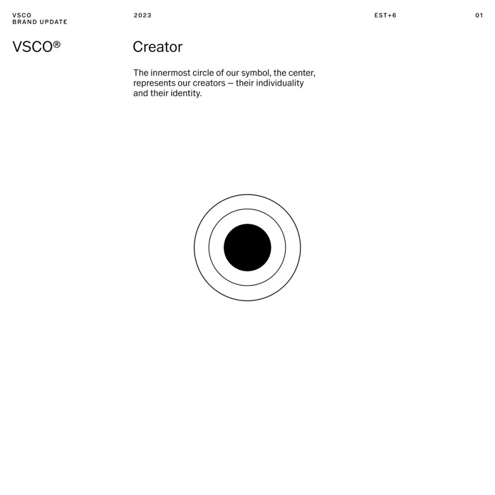
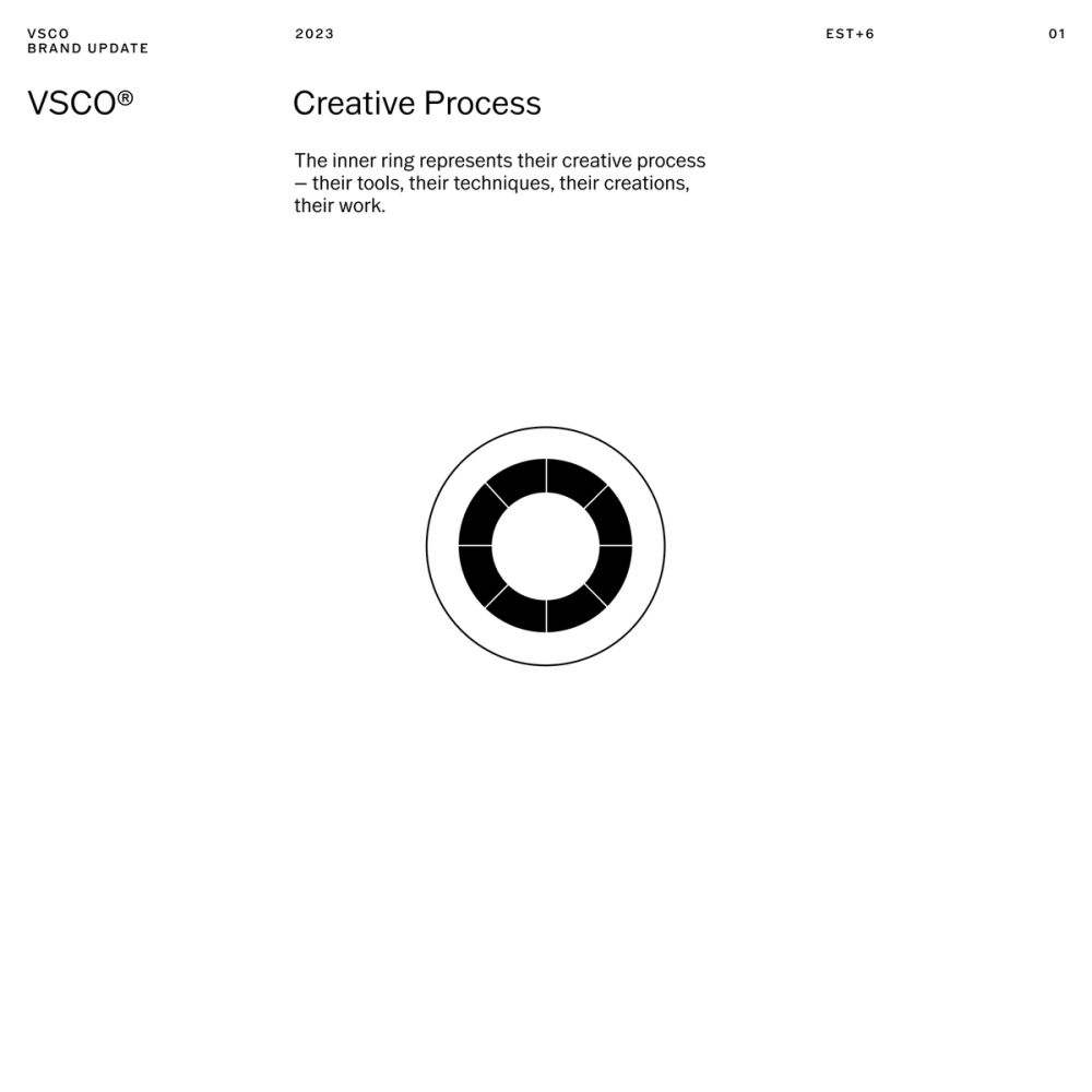
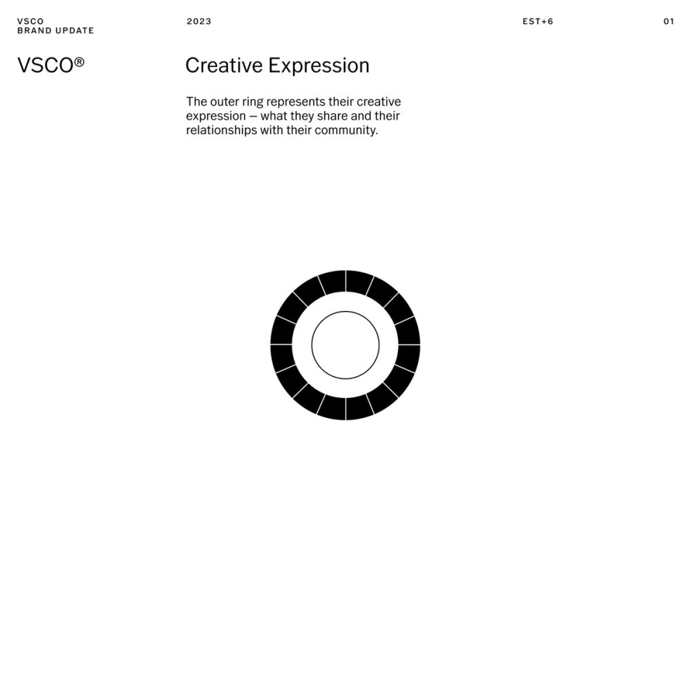
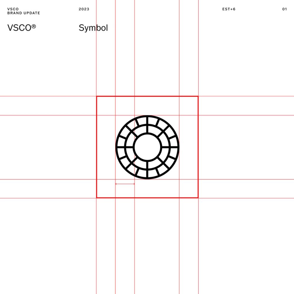
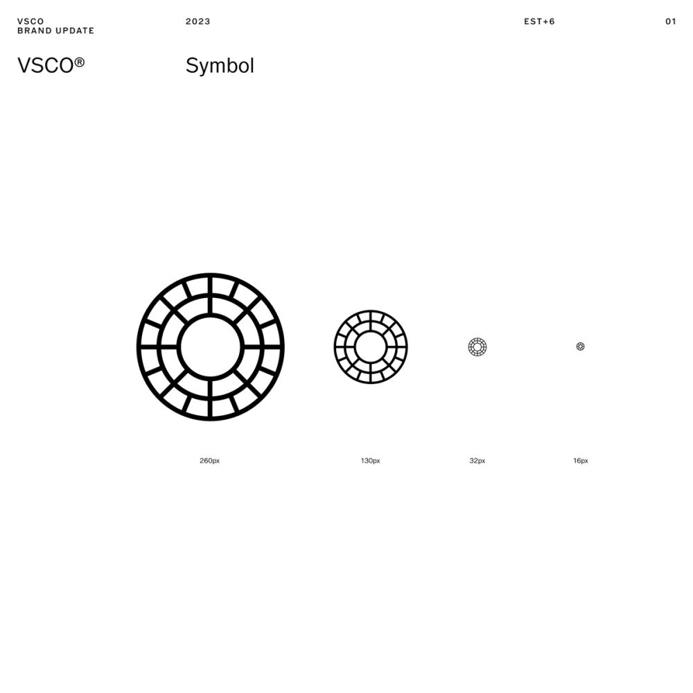
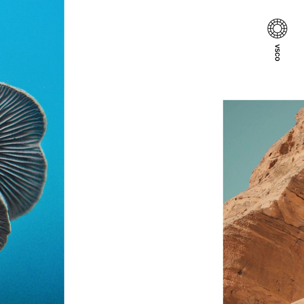
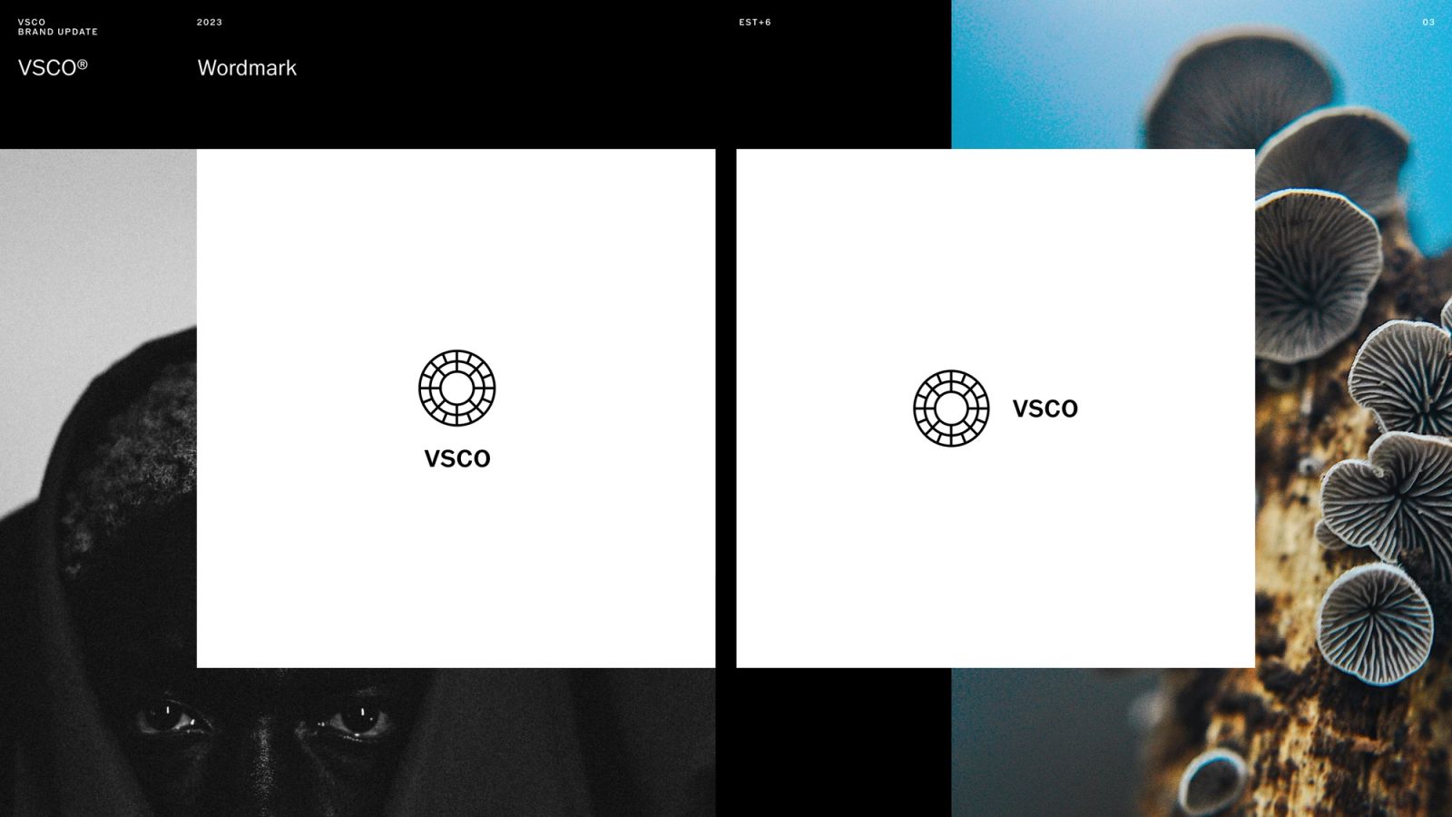
We revisited the symbol: its original shape was based on 26-slot outer ring, and a 14-slot inner ring. While the seal had a strong design story behind genetic mapping, codex, and mitosis, it was experiencing performance challenges on screen devices, motion, and smaller contexts. Changing the symbol would have never been a wise option, as we wanted to pay respect to its foundational archeology and DNA. However, we needed to find a solution to optimize it. We reduced the amount cells following its geometry as a design principle from the original guidelines. We added a simplified meaning that could reflect the platform's evolution to its present state: creator at the core of the experience. The inner ring represents their creative process – tools, techniques, creations, and work. The outer ring represents their creative expression – what creators share and their relationships with their community. The symbol represents an interconnected group of dynamics, tools, patterns, and people that feed each other. An ecosystem of creative expression where CREATOR ALWAYS GOES FIRST, and it's at the center of everything.
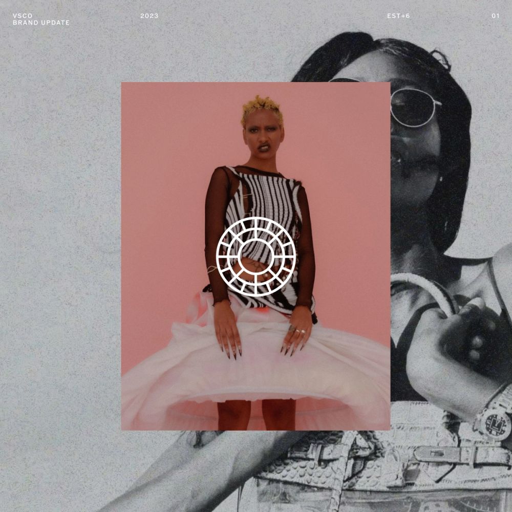
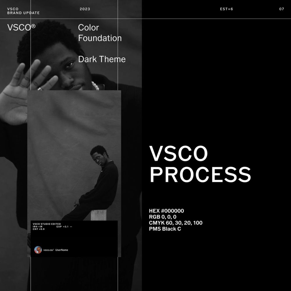
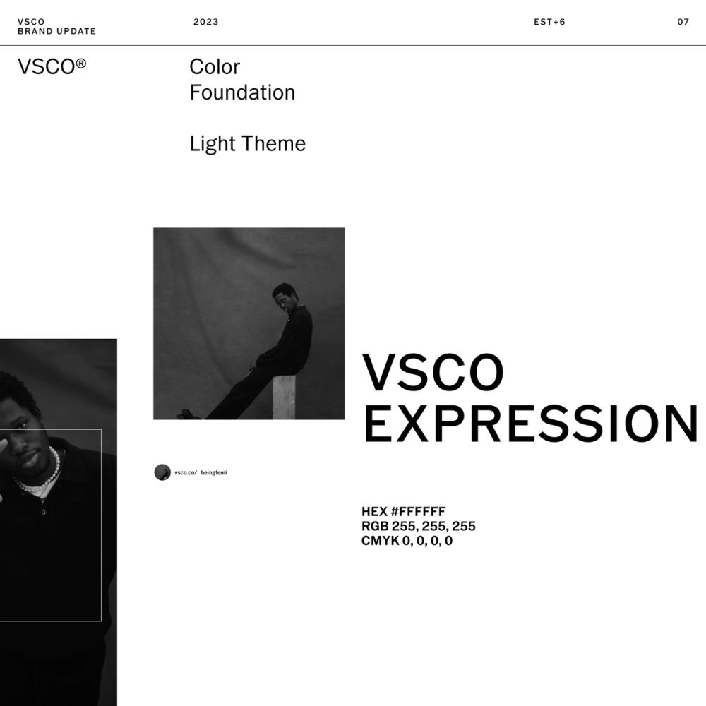
After, we unfolded the rest of the system based in the relationship mentioned with creators and their tools. A black and white symbiosis with a colorful full range in between. The black universe is born from the physical experience of looking through the camera visor. Where everything else disappears, and all that matters is the creative process. On the other hand, we have the output of that process: when creators share their work with the world and their point of view. It is pristine, light, and artwork-oriented gallery-like.
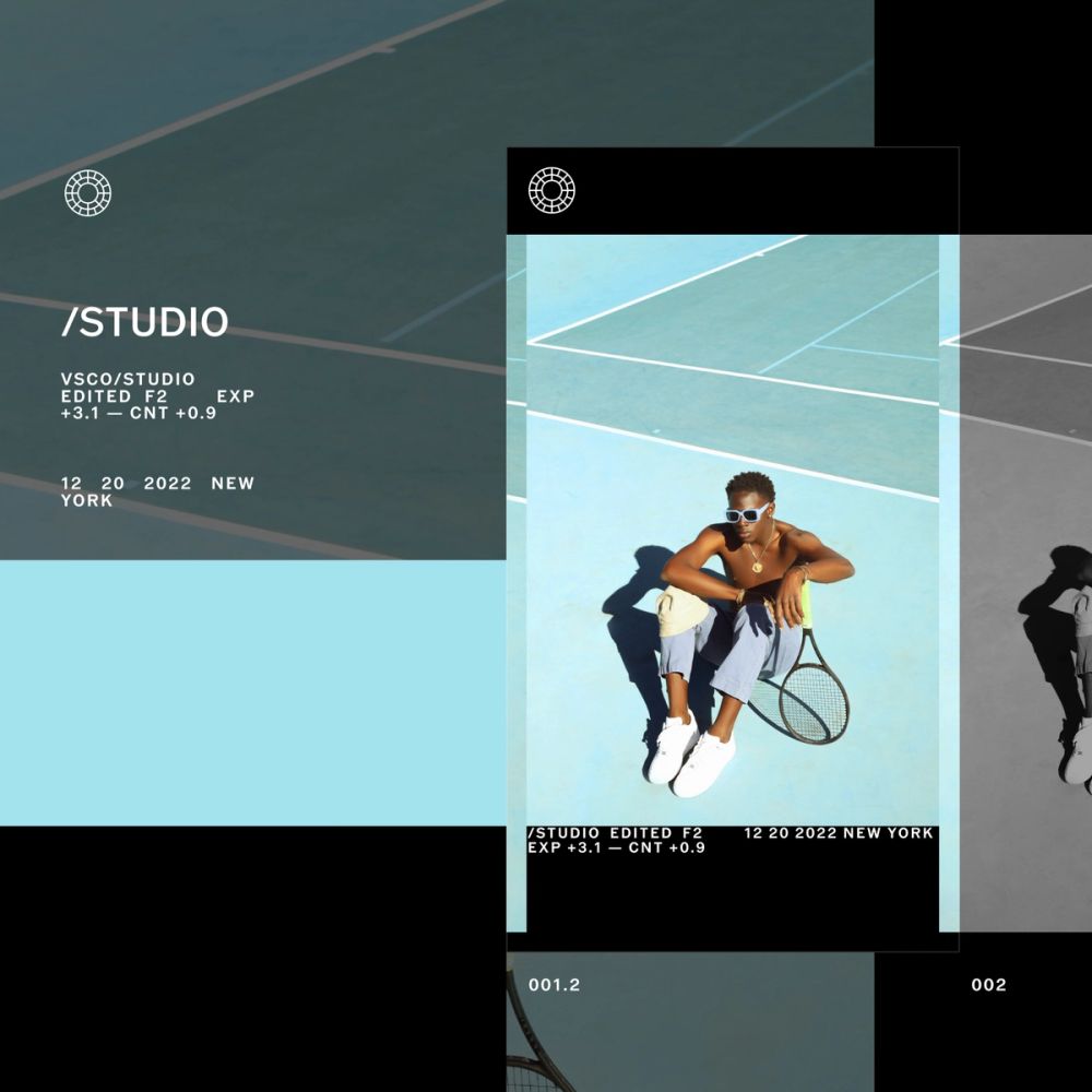
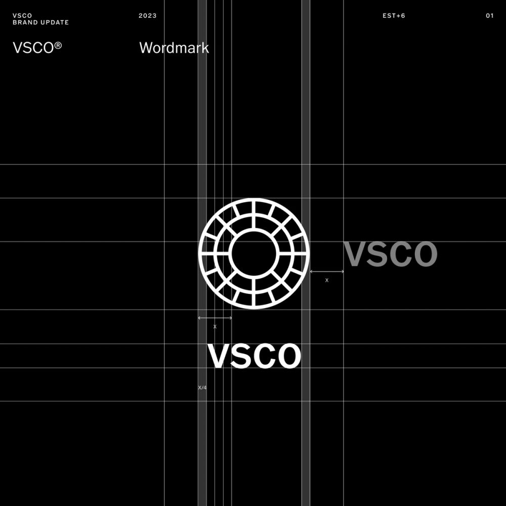
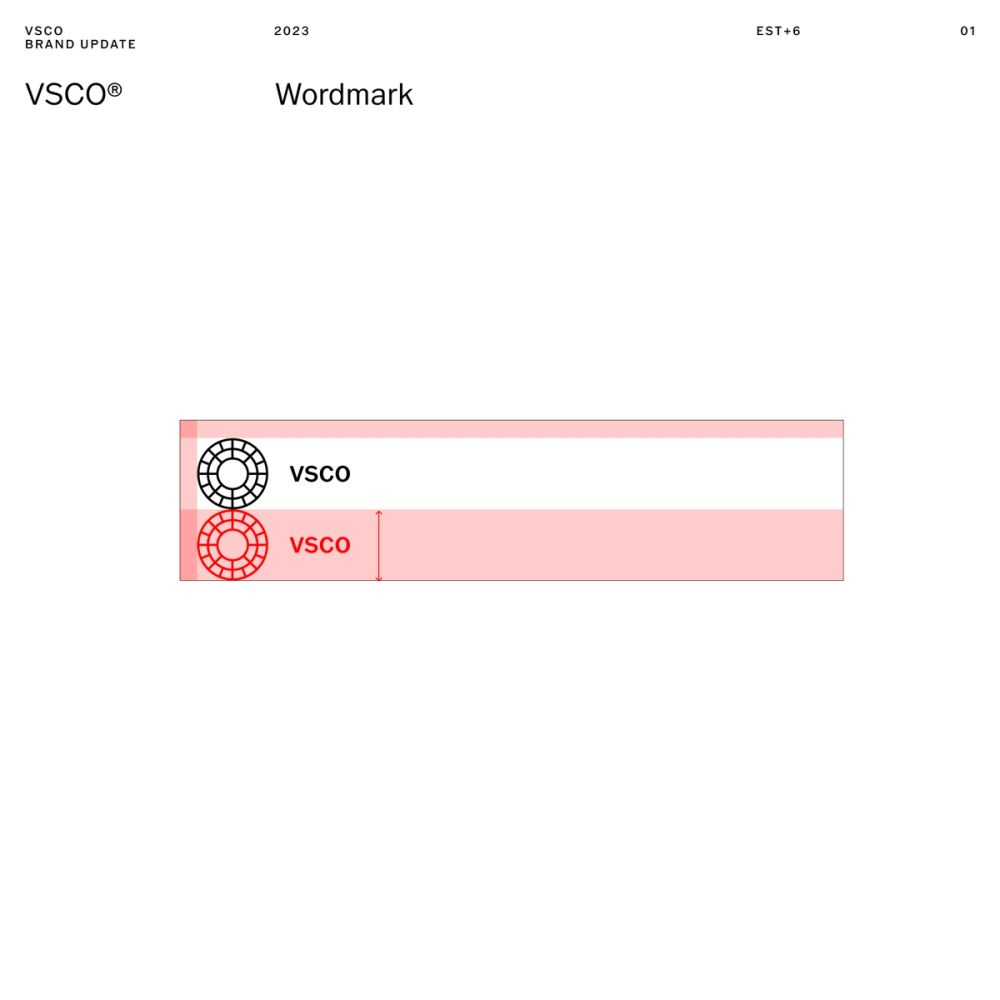


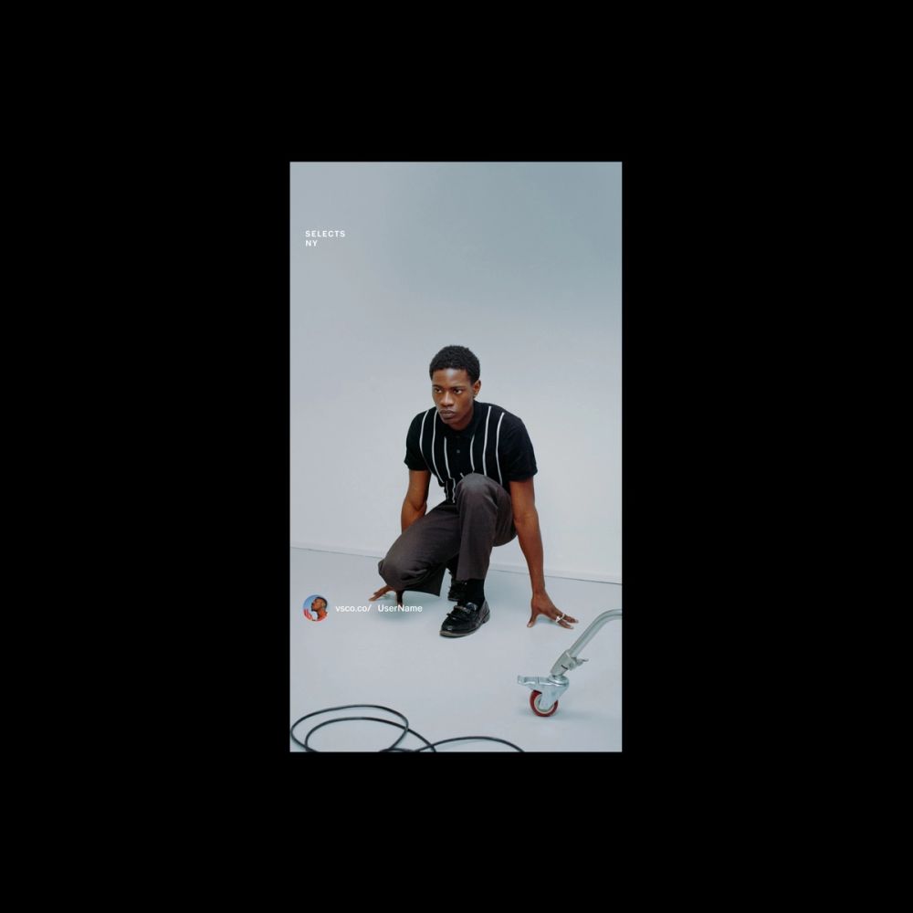
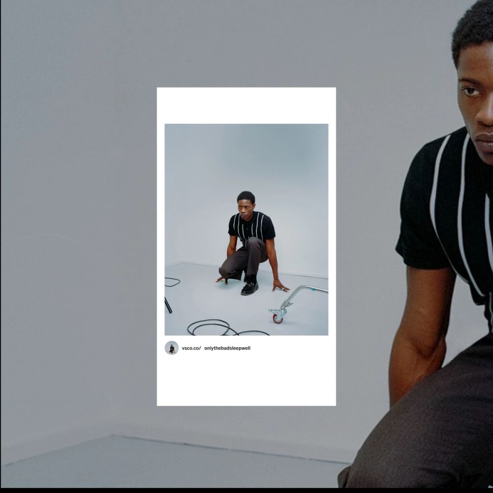
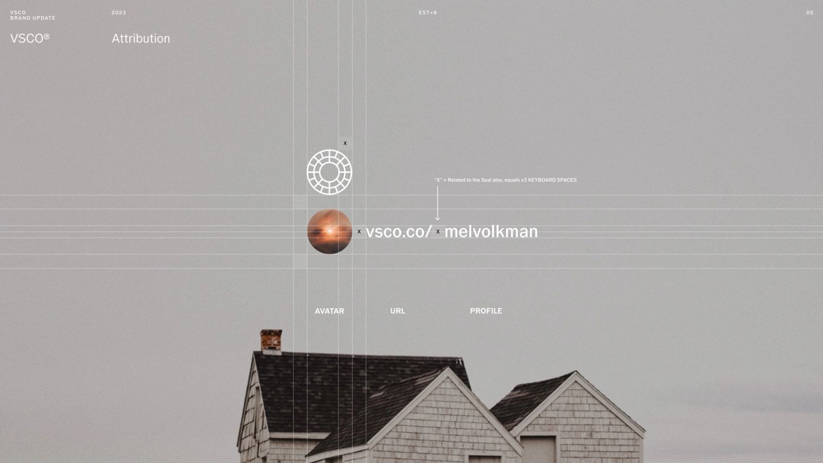
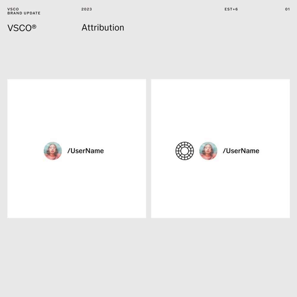
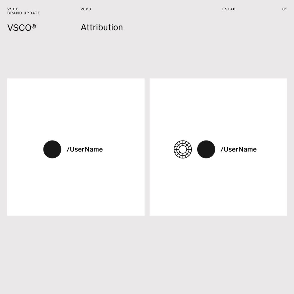
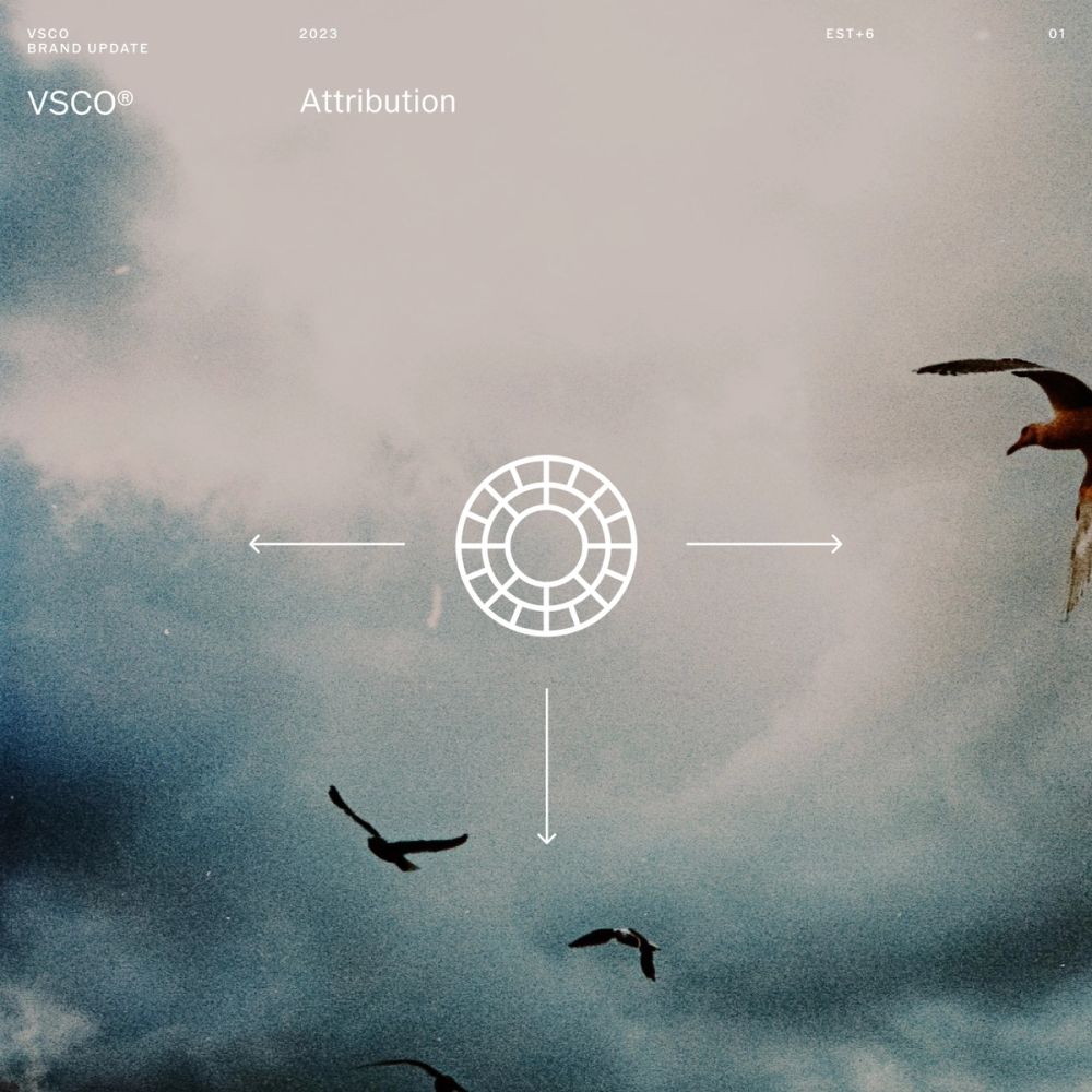
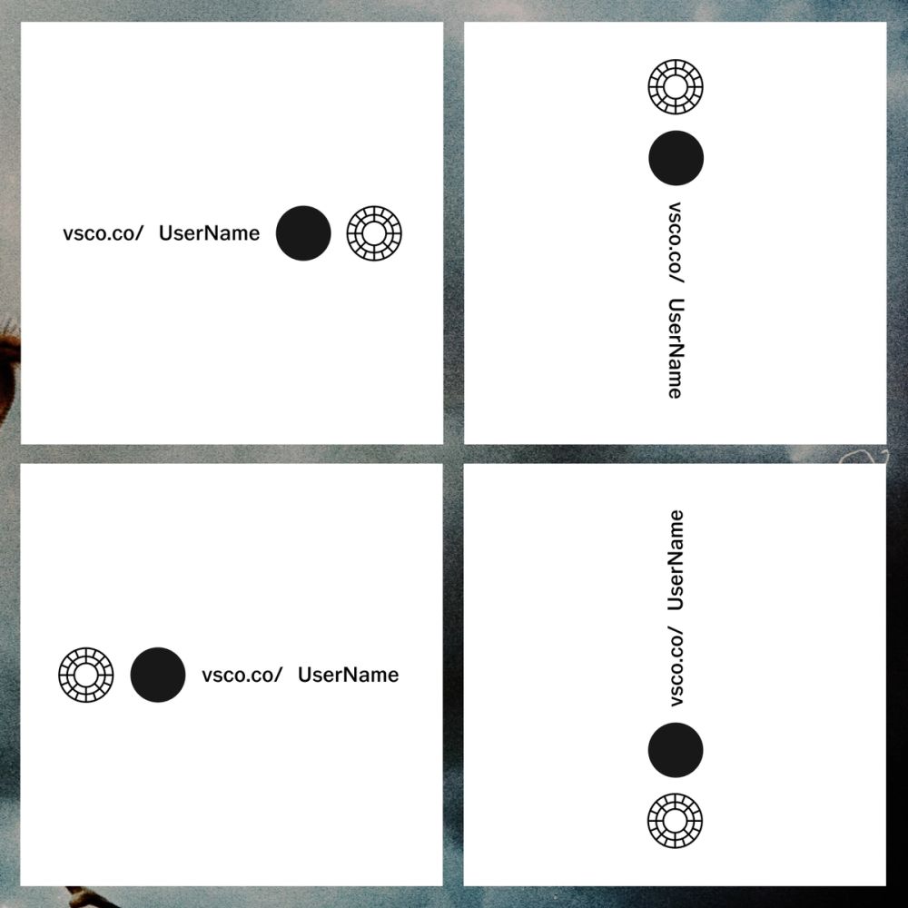
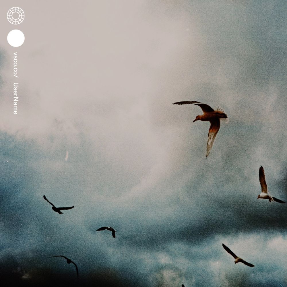
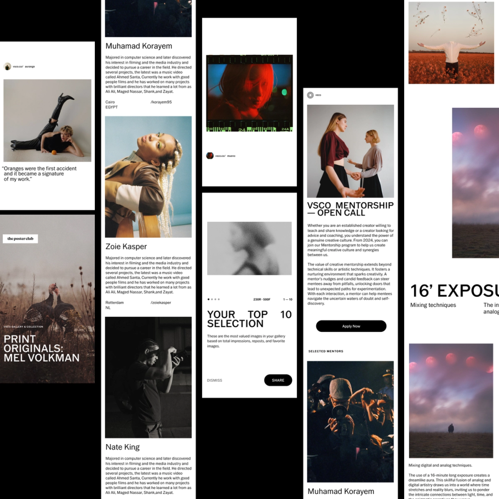
Another critical strategic decision was to create an attribution device to bring the new strategy to life. This device would credit VSCO's creators and generate leads for the platform. It is composed of the user's avatar, URL, and username. Its implementation follows the circularity of the wordmark and a contextual simplification (in/out of the platform). Our attribution device serves as a wordmark that puts the creator at the core of the experience.
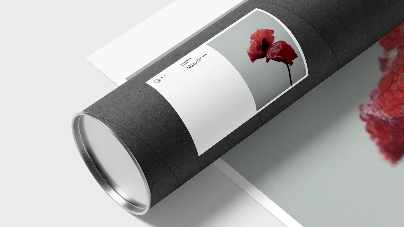
For VSCO, it was important to leverage member's work and promote them as part of its DNA. An attribution tag is a badge generally used: — As a signed-off / call to action at the end of our layouts — Next to the seal as a brand device — Next to the artwork itself when using multiple images.
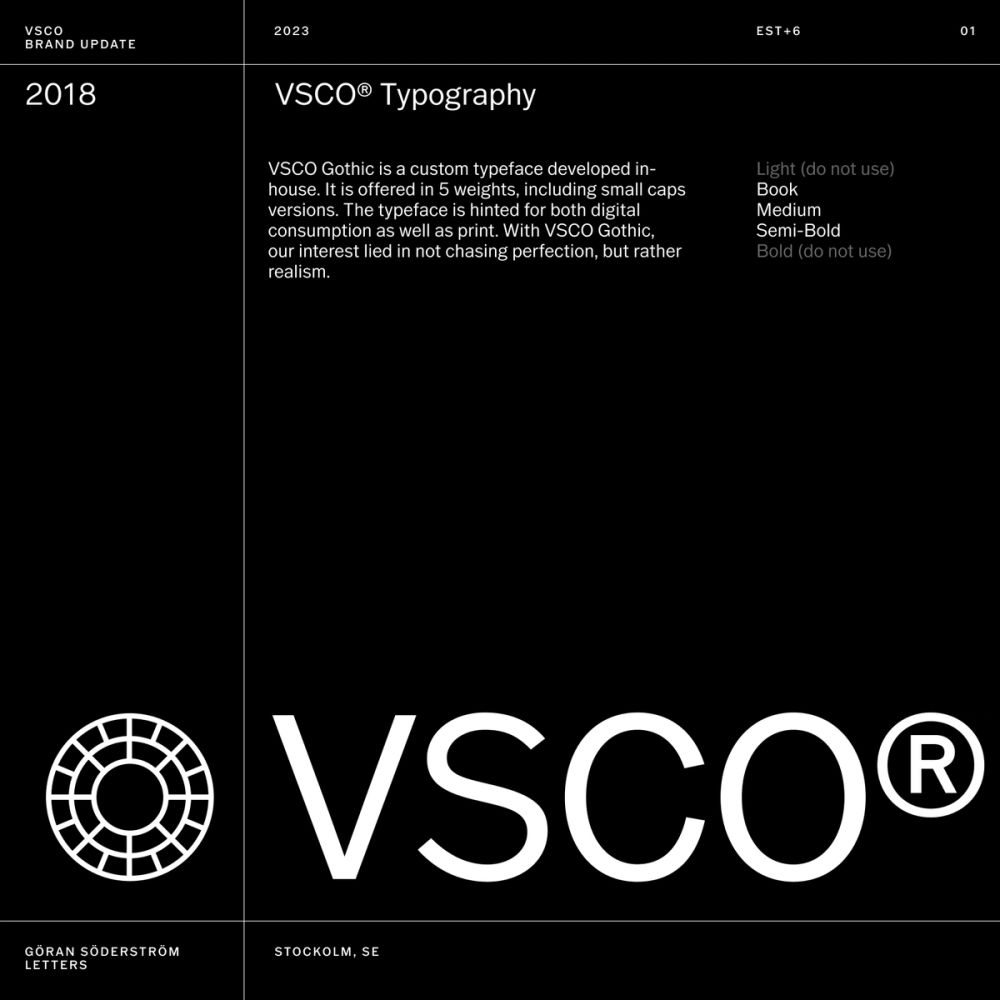
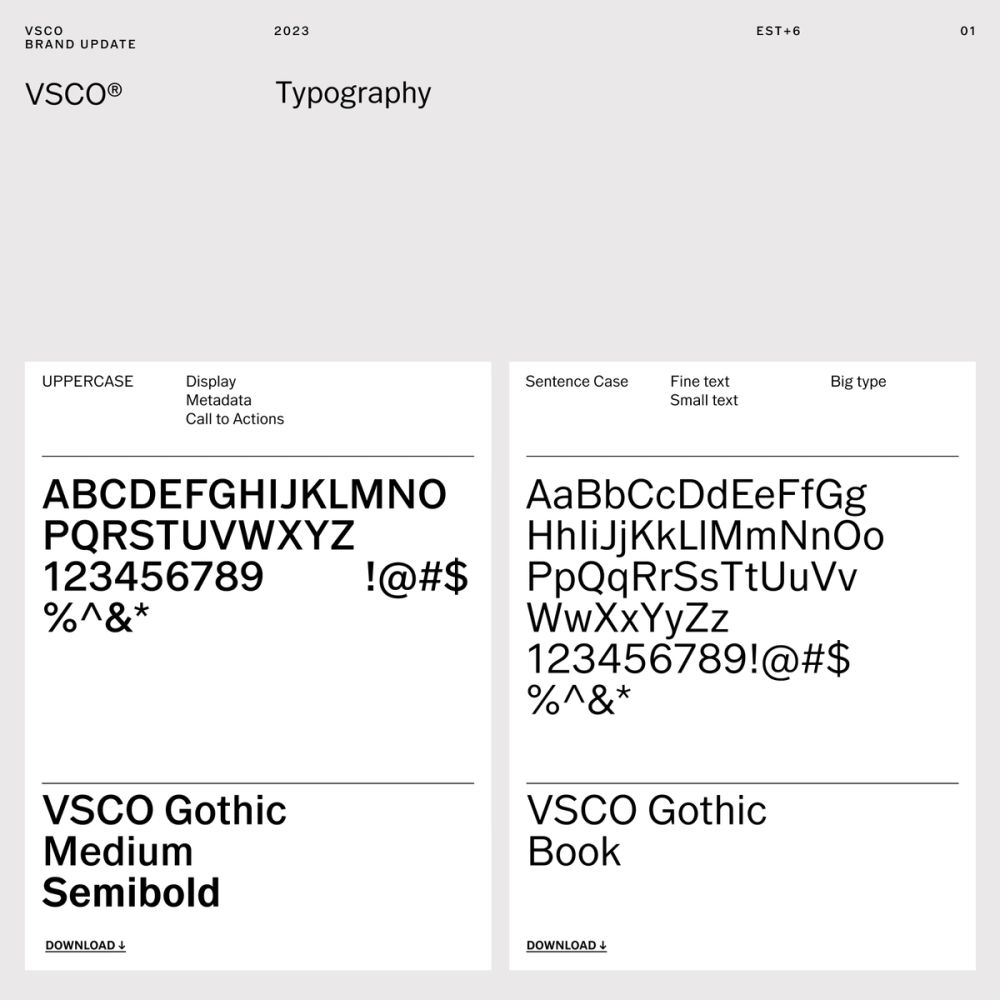
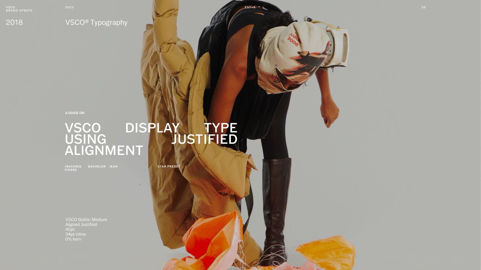
VSCO Gothic
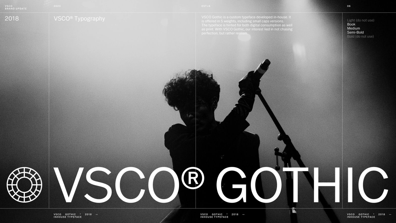
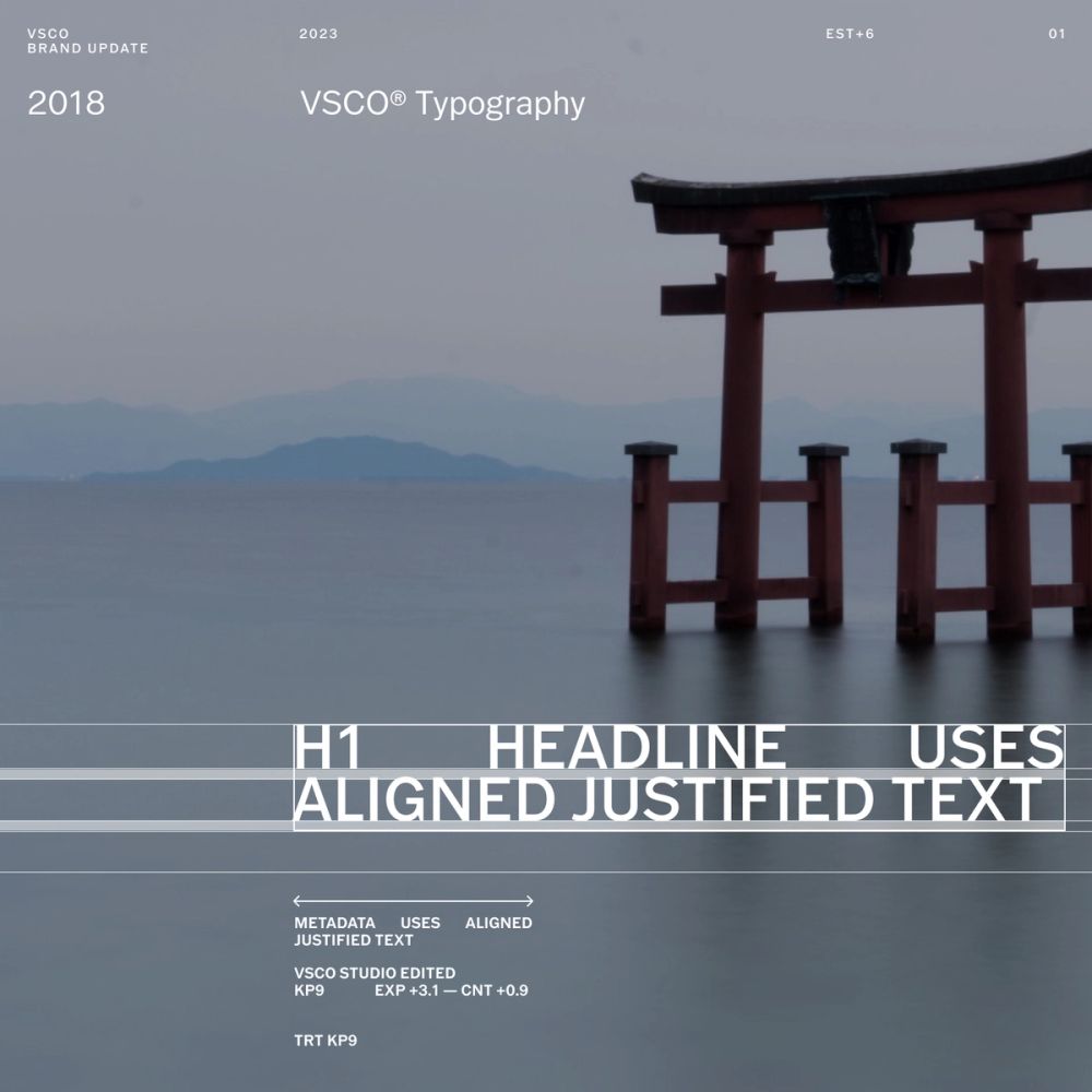
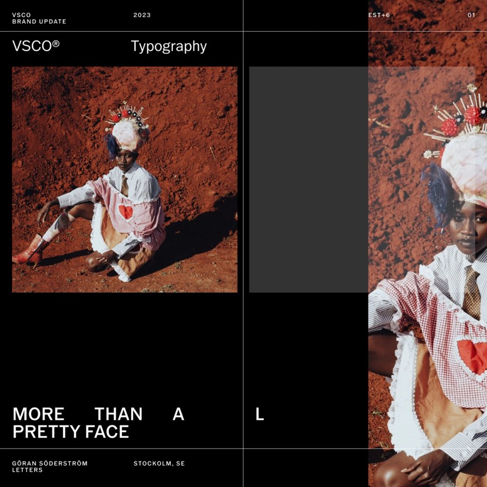
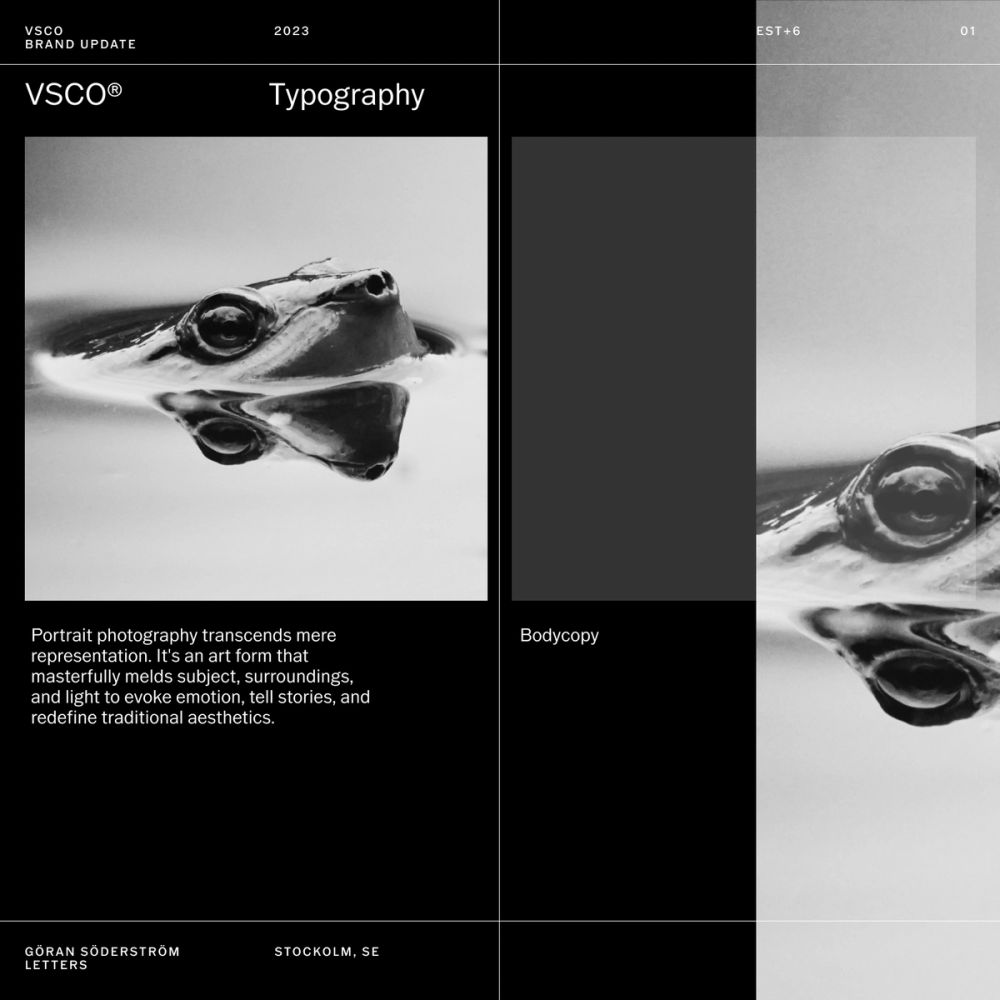
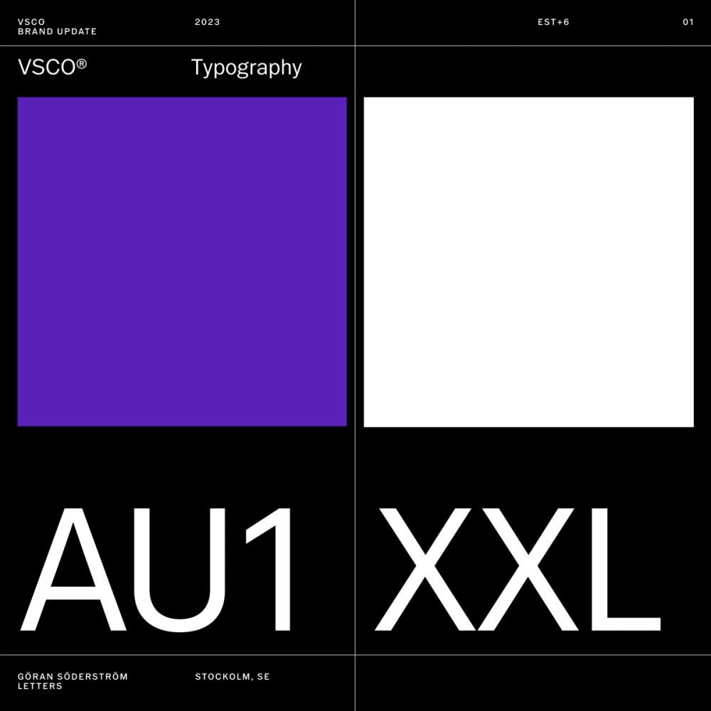
VSCO Gothic is a custom typographic family designed by Göran Söderström from Letters (Sweden). It is offered in 5 weights, including small caps versions. The typeface is intended for both digital consumption and print. The interest lies in not chasing perfection but rather realism. VSCO does not overdo type. It finds the right proportions through the different typographic styles. It avoids over-decoration for an elegant and serene effect, even when we treat type as a graphic element. It also follows accessibility guidelines for informational text.
We also reduced the number of type sizes in our layouts as much as possible to declutter the space and create a coherent graphic language—only using type as a companion of visual content and the creator's artwork that flows seamlessly around it.
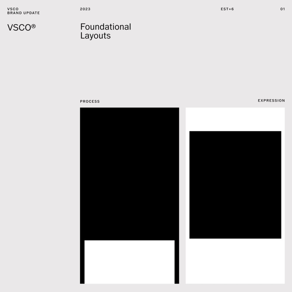
Creative Process and Creative Expression
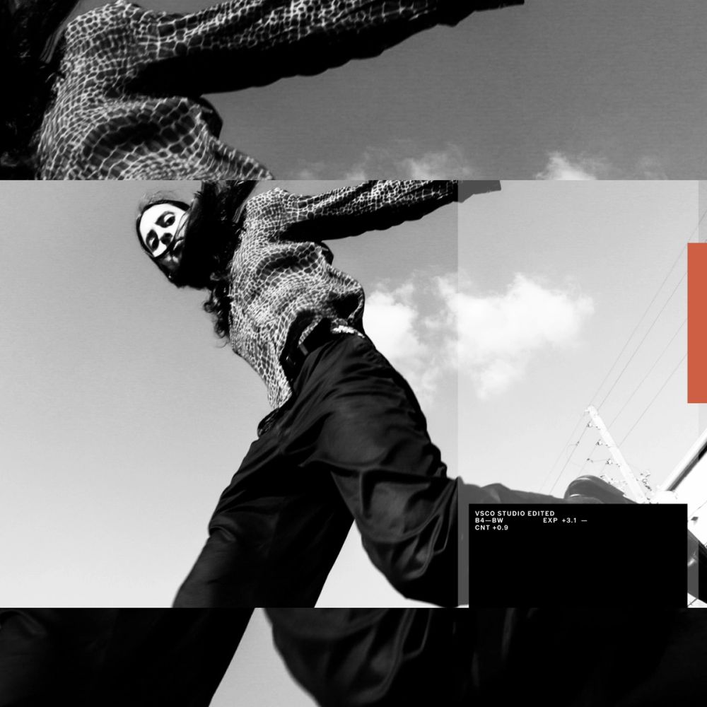
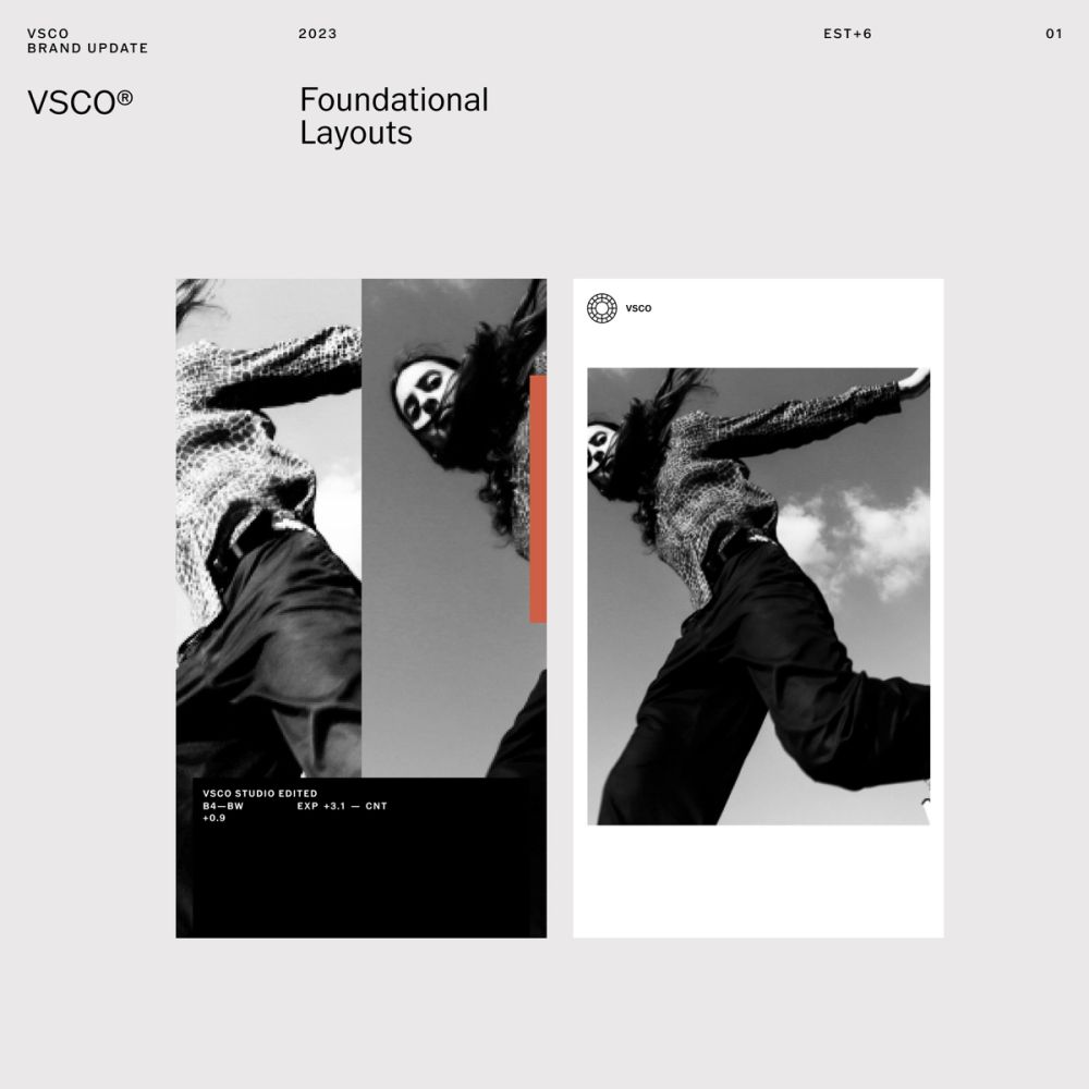
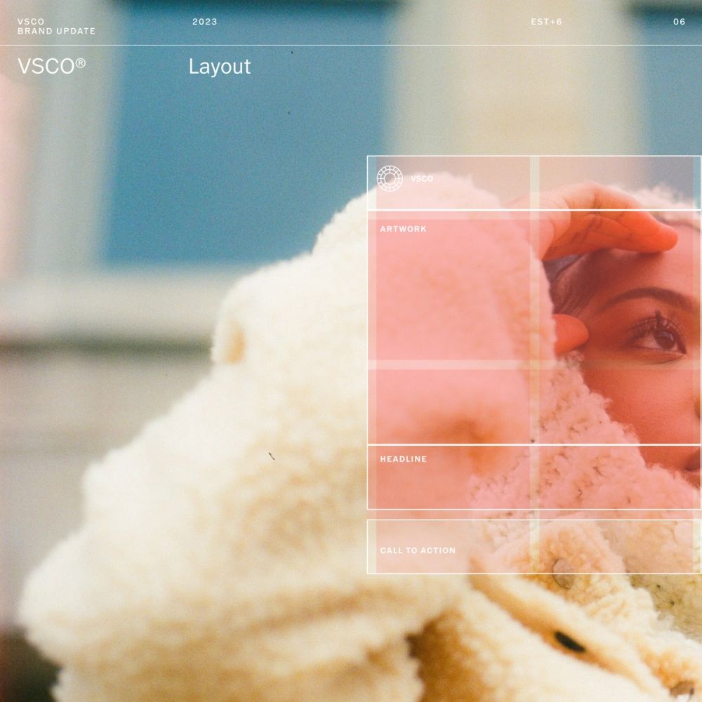
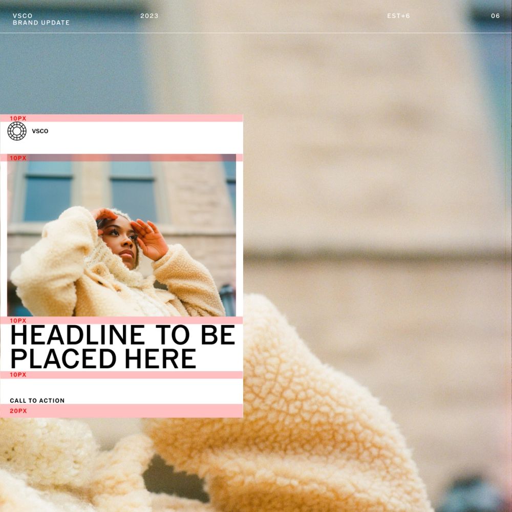
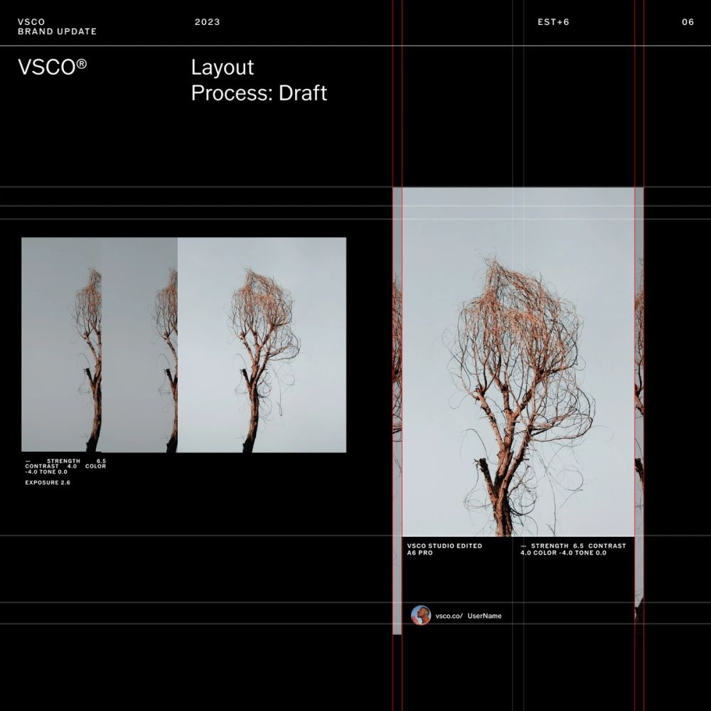
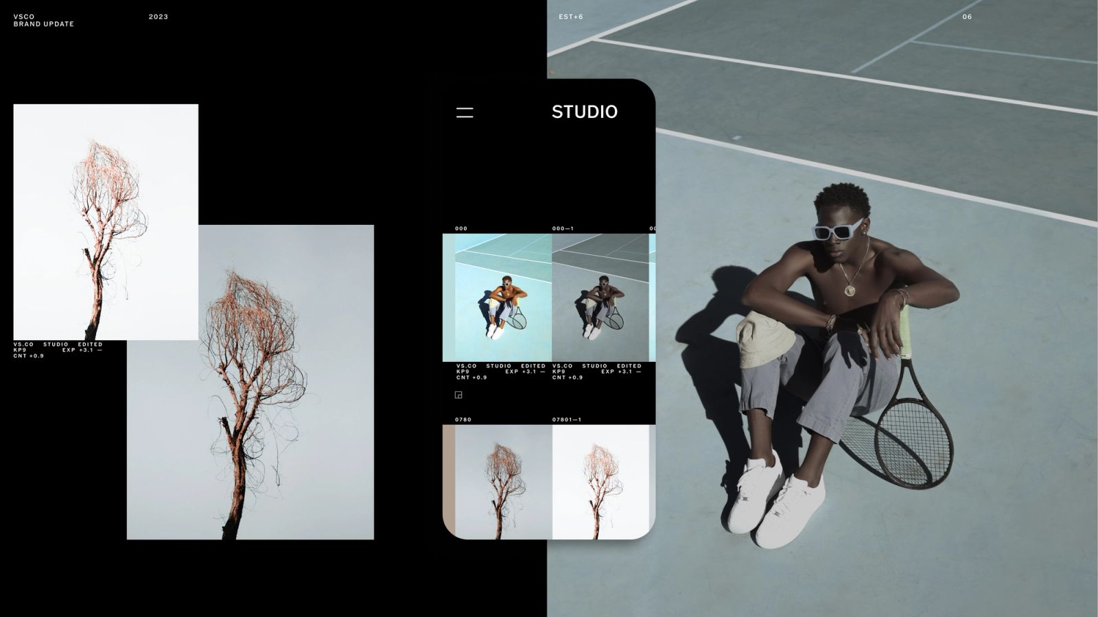
For the system's foundation, we defined two main types of layouts: The first one refers to the creative process and uses film negatives as a visual reference to define type placement close to the edges. The second one refers to a gallery and editorial approach using white space to frame artwork and allow a good lecture of the content. The layout system uses of grids to organize the informationand protect the artwork display. It embraces negative space for a healthy content cadence and decluttering the compositions. It also uses simplification to focus on the most relevant information for a more significant impact.
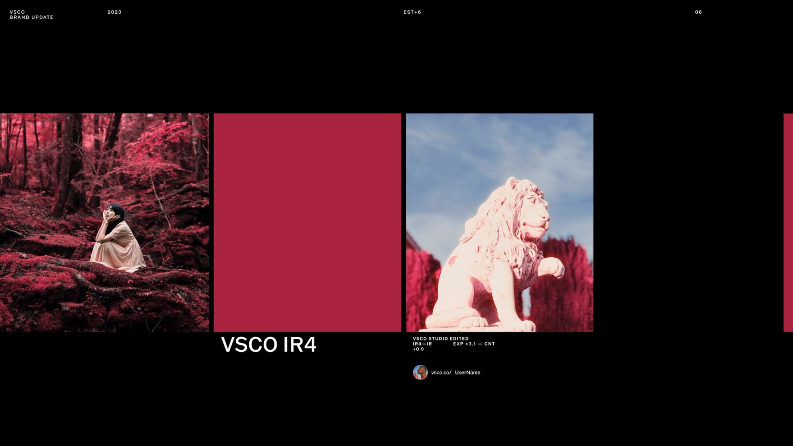
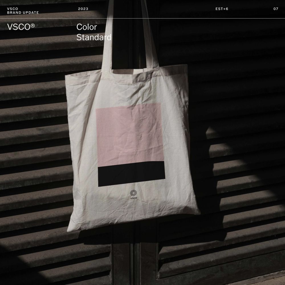
While VSCO's color theory is based on black-and-white (dark for creative process and light for creative expression), VSCO's use of color encompasses the entire spectrum in between. Color represents creative self-expression and identity: a statement that VSCO supports individuals' self-expression, communicates diversity, and connects our customers to the tools themselves.
Empower, inspire, and push the community.
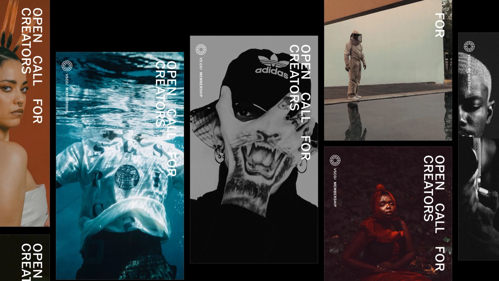
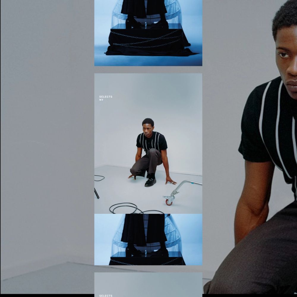
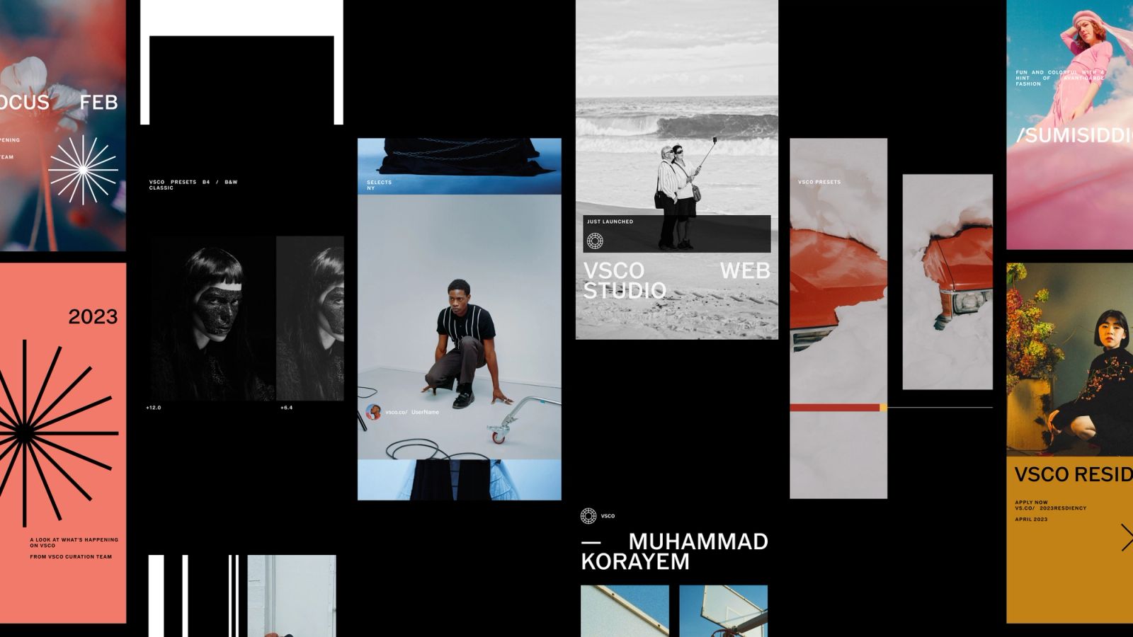
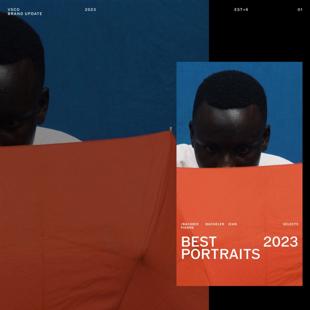
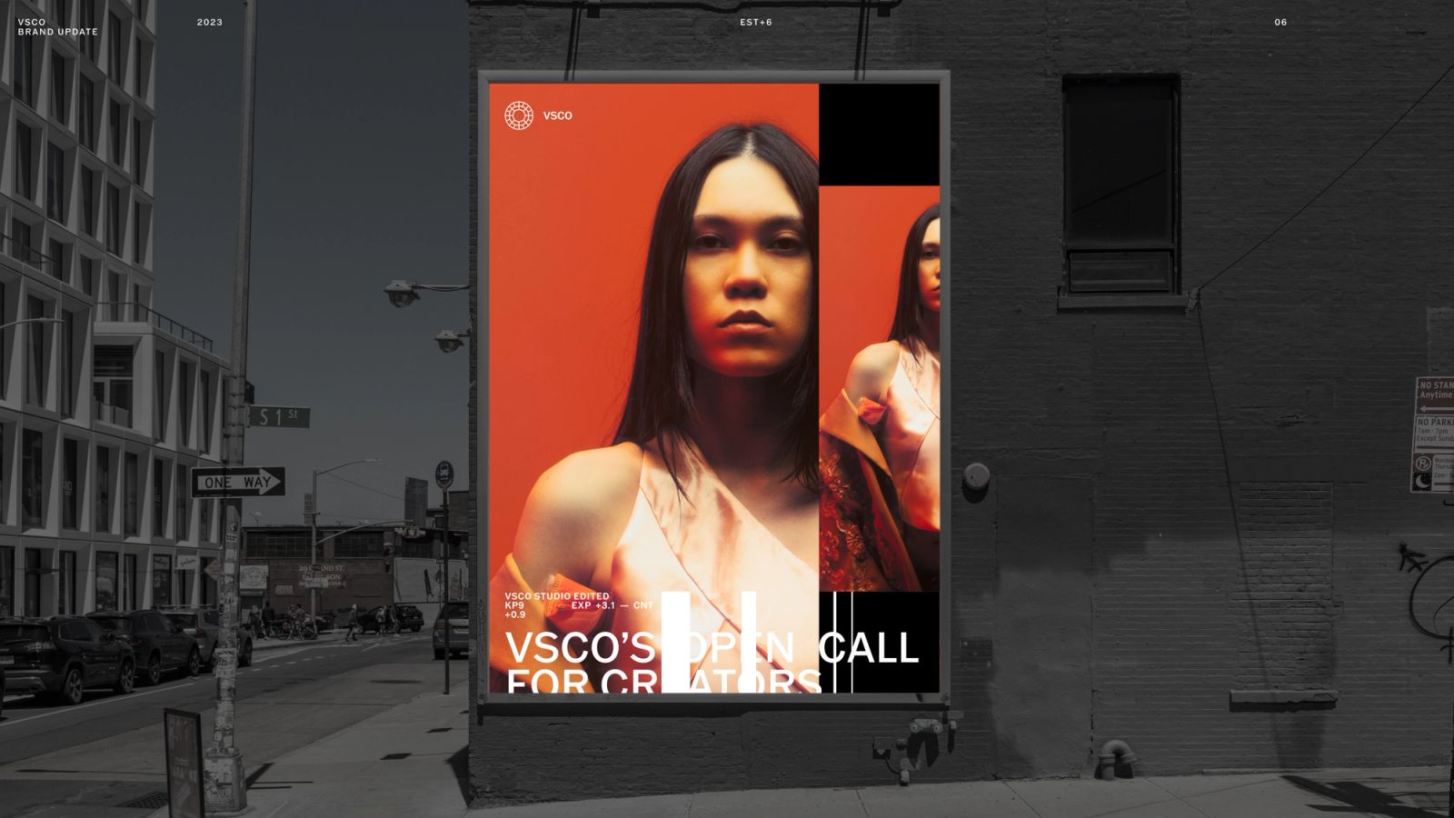
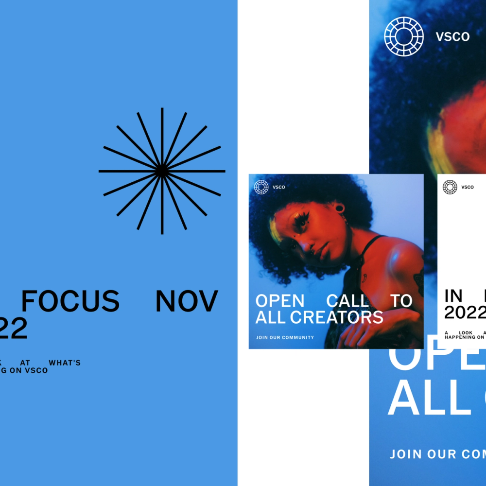
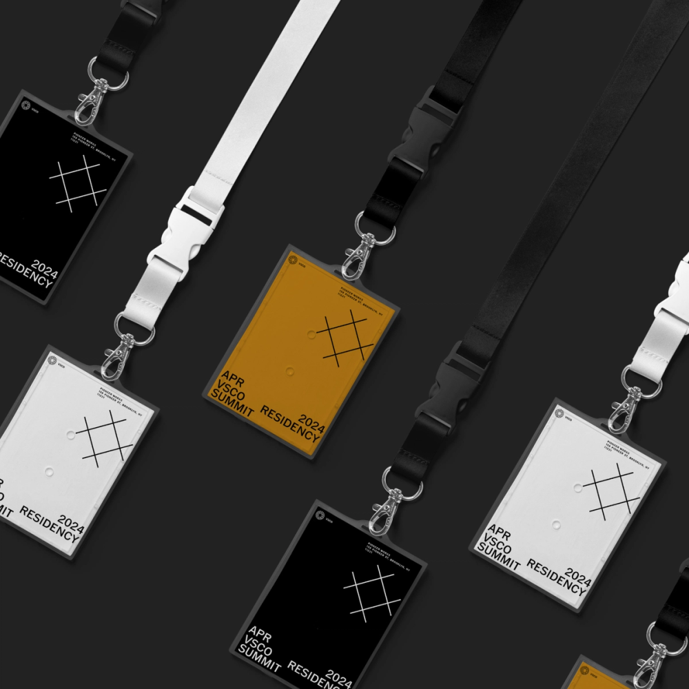
Programs are about how the VSCO system comes to life through key marketing environments, from product marketing to curation programs. The Curation and Marketing team develops programs to empower, inspire, and push the community and creators. We developed a series of sub-identities for these programs. They require a visual distinction, yet they have to feel part of the overarching VSCO system.
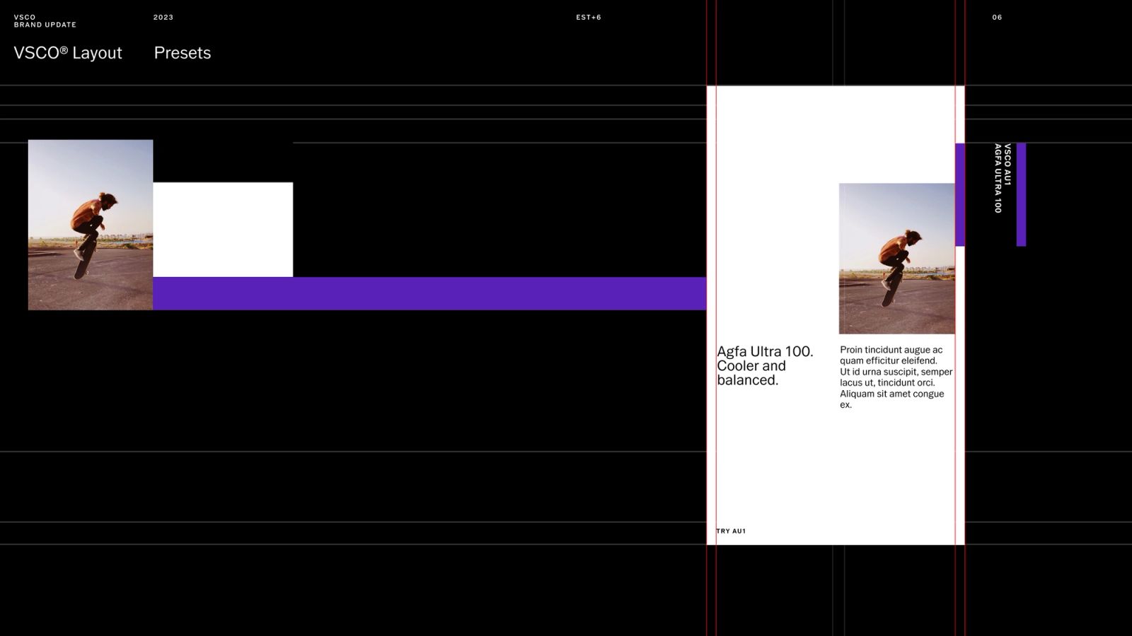
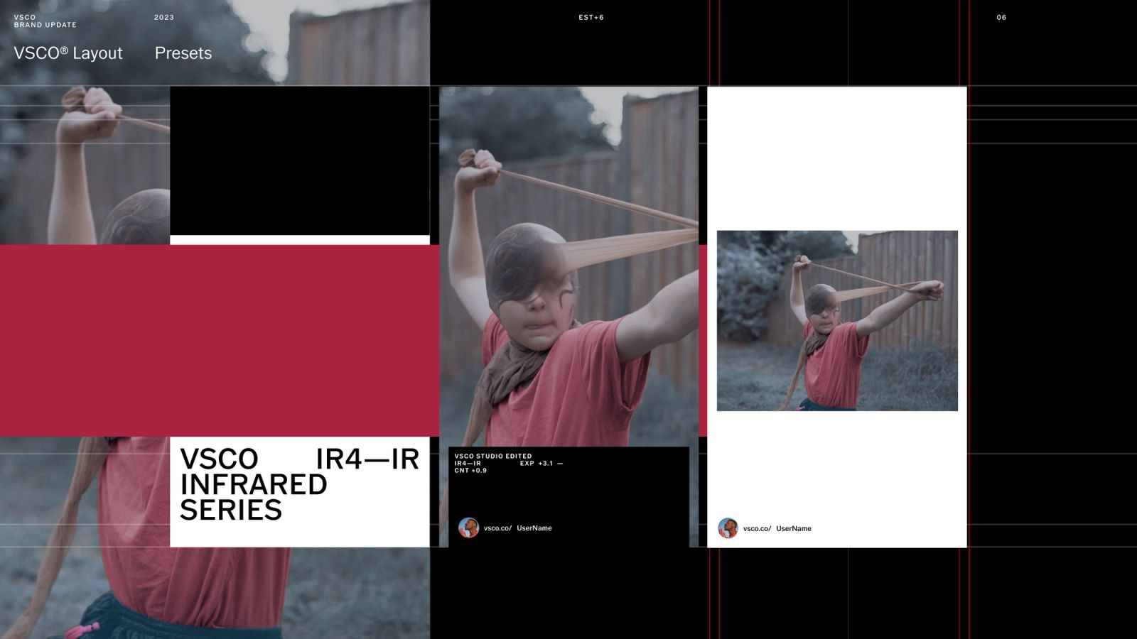
For scalability purposes and to avoid generating a complex brand portfolio, we developed a system to generate those micro-identities for new or upcoming programs. As inspiration, we looked into lens sharpness test cards and other analog photography materials to develop a series of graphic elements that communicate the different program's offerings.
Mindful, Intentional, and 100% Community-focused
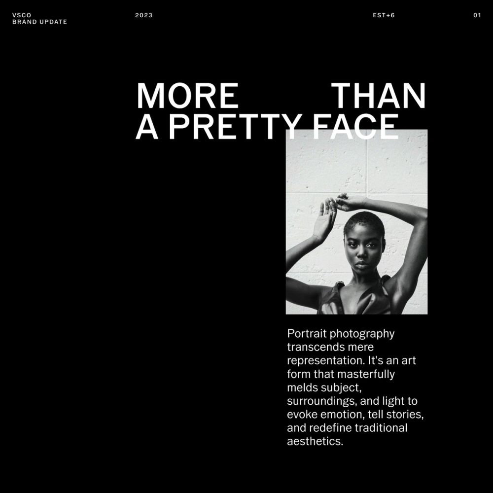
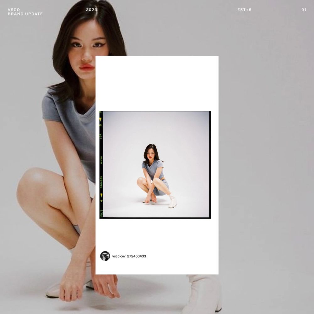
VSCO's point of view around photography is to be mindful, intentional, and 100% community-focused. It is about our community and diversity. VSCO licenses and leverages its members; VSCO credits them and creates value through our communications, which are 100% community-sourced.
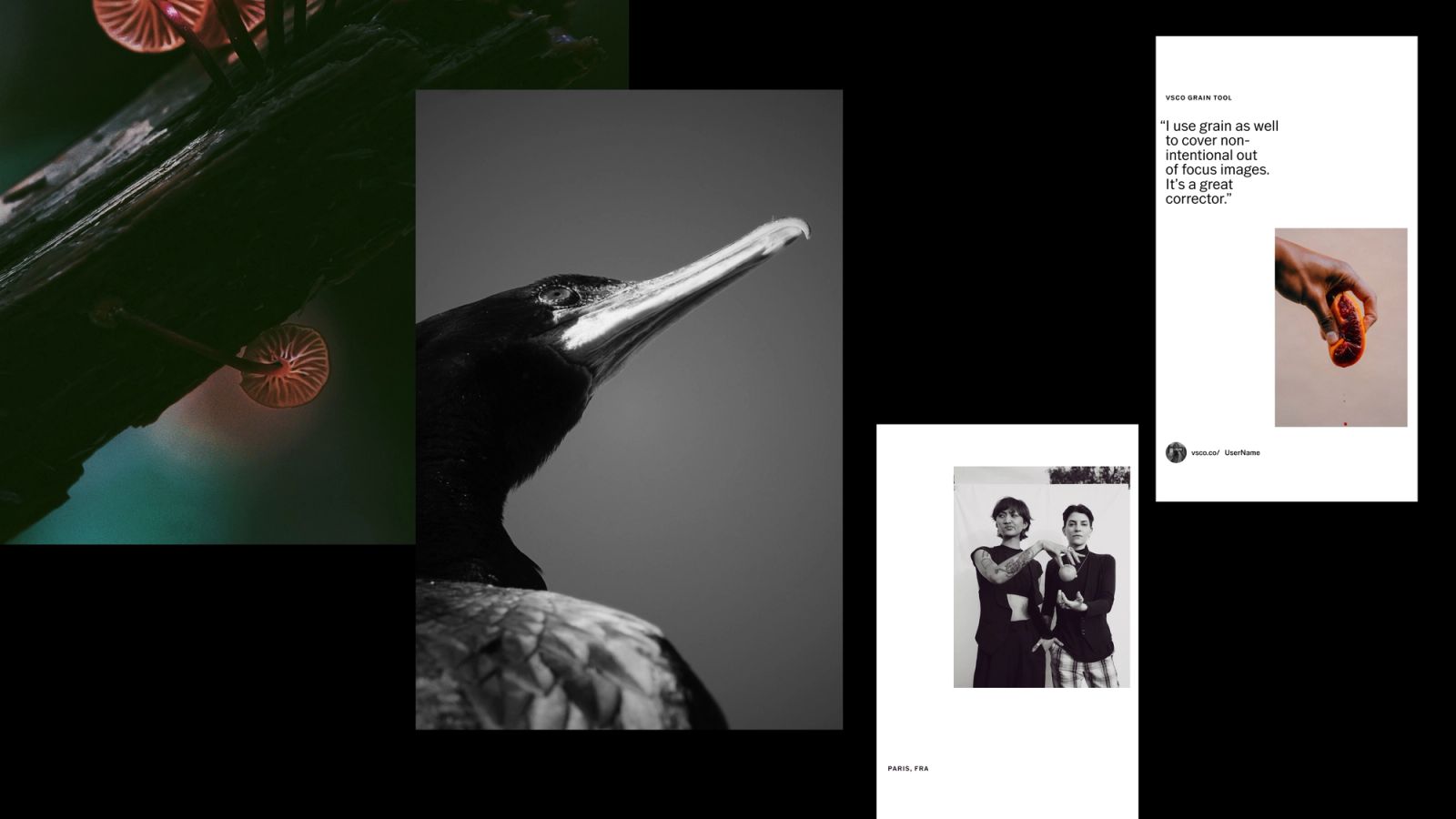
As with all the brand identity elements, photography revolves around QUALITY, TRUST, and CURATION. Being one of the most sensitive chapters of the entire system: QUALITY Quality means being a relevant place for photography from a technical and subject matter standpoint. VSCO advocates for craft, for images that create a reaction in us and want us to see them. They are beautifully composed and have a clear point of view on how to decode the world. TRUST VSCO believes in honest, down-to-earth visual culture. It's not about showing off but creating a safe, inviting community of creators. VSCO avoids offensive content or activism-related content. However, they stay relevant by leveraging conversations in our culture, no matter their nature. CURATION VSCO curates photography by reducing the existing visual noise and pushing forward images that are thoughtful and generate excitement and creative energy. Those images inspire creators to keep pushing the boundaries and creativity. VSCO is an immersive platform that allows a slower pace for content consumption and learning.
As part of extensive guidelines, we also defined other business key factors like the representation of interface, motion design, and guidance around attribution. All of it is alongside a creative toolkit document primarily for marketing, with more than 1000 templates for social media, CRM, and in-app communications. We worked closely with the team to implement and integrate the new system internally and with third-party collaborators until today.
BP0006
Full Case Study
VSCO
Brand Platform Relaunch
2023
Visual Supply Company is a start-up founded by Joel Flory and Greg Lutze in California in 2011. VSCO launched in 2012. In 2017, VSCO launched a subscription model. As of 2018, Visual Supply Company has $90 million in funding from investors and over 2 million paying members. Its business model has continuously evolved from an Adobe Lightroom preset to a mobile app photo editing platform to a general community focus. However, during 2018-2020, the business wanted to refocus on its original core: photographers, not just pros, but anyone who wanted to commit to their craft with time, skillset, education, or money—what VSCO calls "Serious Creators." We partnered to develop a brand strategy through workshops, stakeholder interviews, and a brand audit. We shaped a design brief and started working with foundational elements to keep, discard, or evolve existing assets and principles. VSCO is a beloved brand, so it was a delicate and thoughtful exercise. The intention was never to do a complete redesign but a brand evolution. We evolved the logo and rethought the usage of its typographic family, designed by Göran Söderström from Letters from Sweden. Everything else, we updated. We built a system from creator to creator, so we had to use and start speaking the same language.
Brand & Design Strategy
We started this partnership by auditing the existing brand, competitors, and adjacent players to develop a comprehensive design brief followed by brand and design strategy from VSCO's new mission statement, "We Nurture Creativity So You Can Make It." From solidifying the brand strategy, we defined the evolved brand language, created an extensive creative tool with in-app and marketing templates, identities for programs and other internal initiatives, and created a vast guidelines document for internal and third-party implementation. VSCO is more than an app with editing tools or any other social media destination. It is a platform for creative growth. It revolves around three powerful values: QUALITY, TRUST, and CURATION. We had to find a language and a story that would honor its original DNA and bridge the creative flow: from creation to expression. VSCO puts the creator at the center of its existence. It believes that creativity is of the essence. It reflects all people and cultures and challenges us to be our best selves. The platform gives opportunities for discovery and growth, innovation, and collaboration. It helps creators realize their passion. Our design story started with the creators' relationship with their cameras and tools: when they are behind or in front of them (sharing the work with the world). This relationship is the foundation for the entire design system. "Photography trains us to look in and out at the same time, paying closer attention not only to the world around us but also to the quality of our own response to it." —Sophie Howarth "The camera is an instrument that teaches people to see without a camera." —Dorothea Lange
Symbol & System
We revisited the symbol: its original shape was based on 26-slot outer ring, and a 14-slot inner ring. While the seal had a strong design story behind genetic mapping, codex, and mitosis, it was experiencing performance challenges on screen devices, motion, and smaller contexts. Changing the symbol would have never been a wise option, as we wanted to pay respect to its foundational archeology and DNA. However, we needed to find a solution to optimize it. We reduced the amount cells following its geometry as a design principle from the original guidelines. We added a simplified meaning that could reflect the platform's evolution to its present state: creator at the core of the experience. The inner ring represents their creative process – tools, techniques, creations, and work. The outer ring represents their creative expression – what creators share and their relationships with their community. The symbol represents an interconnected group of dynamics, tools, patterns, and people that feed each other. An ecosystem of creative expression where CREATOR ALWAYS GOES FIRST, and it's at the center of everything. After, we unfolded the rest of the system based in the relationship mentioned with creators and their tools. A black and white symbiosis with a colorful full range in between. The black universe is born from the physical experience of looking through the camera visor. Where everything else disappears, and all that matters is the creative process. On the other hand, we have the output of that process: when creators share their work with the world and their point of view. It is pristine, light, and artwork-oriented gallery-like.
Attribution
Another critical strategic decision was to create an attribution device to bring the new strategy to life. This device would credit VSCO's creators and generate leads for the platform. It is composed of the user's avatar, URL, and username. Its implementation follows the circularity of the wordmark and a contextual simplification (in/out of the platform). Our attribution device serves as a wordmark that puts the creator at the core of the experience. For VSCO, it was important to leverage member's work and promote them as part of its DNA. An attribution tag is a badge generally used: — As a signed-off / call to action at the end of our layouts — Next to the seal as a brand device — Next to the artwork itself when using multiple images.
Role of typography
VSCO Gothic is a custom typographic family designed by Göran Söderström from Letters (Sweden). It is offered in 5 weights, including small caps versions. The typeface is intended for both digital consumption and print. The interest lies in not chasing perfection but rather realism. VSCO does not overdo type. It finds the right proportions through the different typographic styles. It avoids over-decoration for an elegant and serene effect, even when we treat type as a graphic element. It also follows accessibility guidelines for informational text. We also reduced the number of type sizes in our layouts as much as possible to declutter the space and create a coherent graphic language—only using type as a companion of visual content and the creator's artwork that flows seamlessly around it.
Role of color
While VSCO's color theory is based on black-and-white (dark for creative process and light for creative expression), VSCO's use of color encompasses the entire spectrum in between. Color represents creative self-expression and identity: a statement that VSCO supports individuals' self-expression, communicates diversity, and connects our customers to the tools themselves.
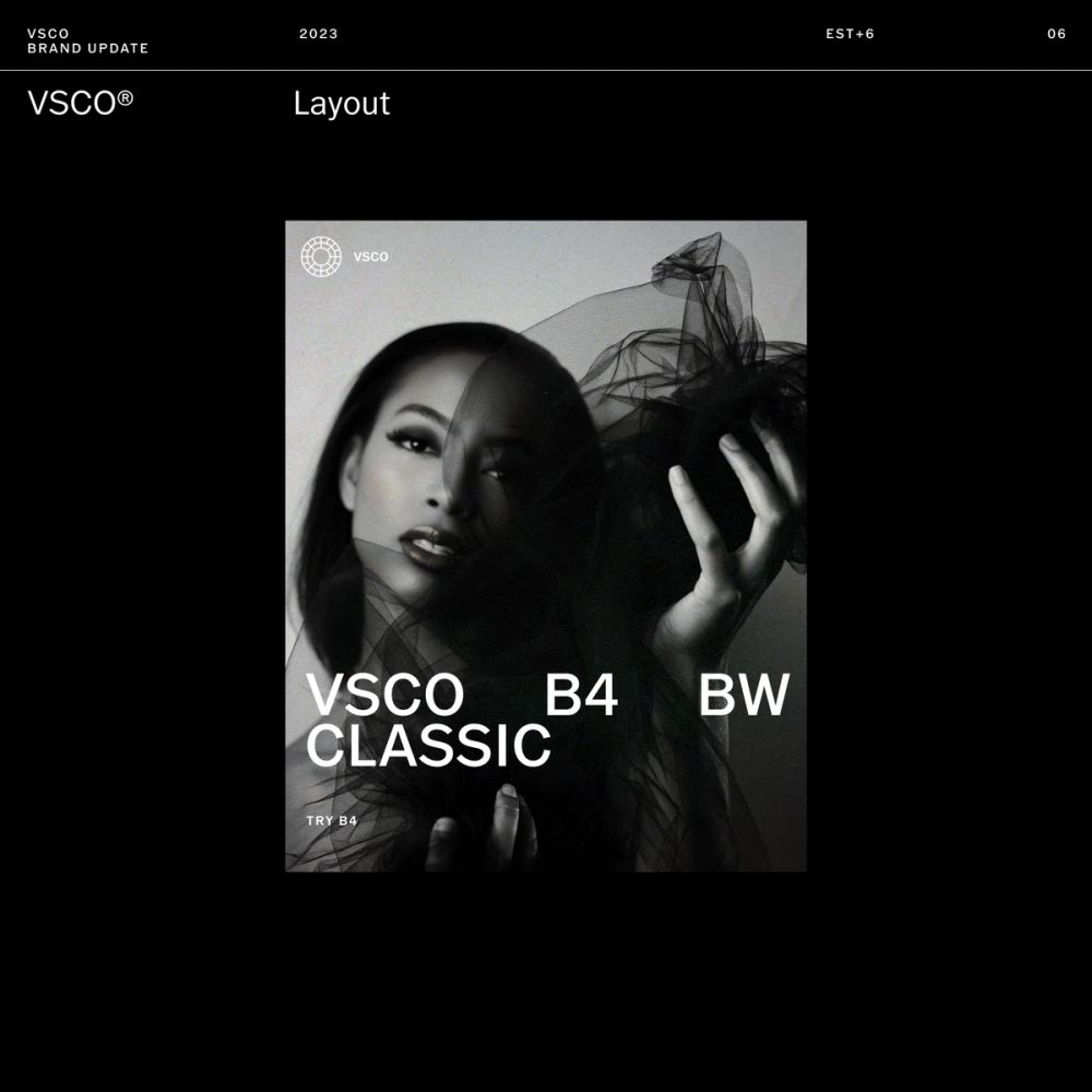
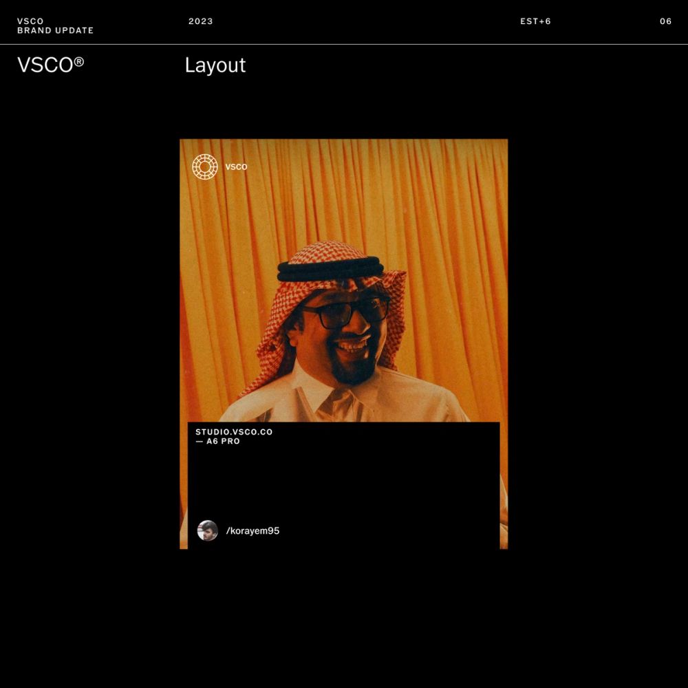
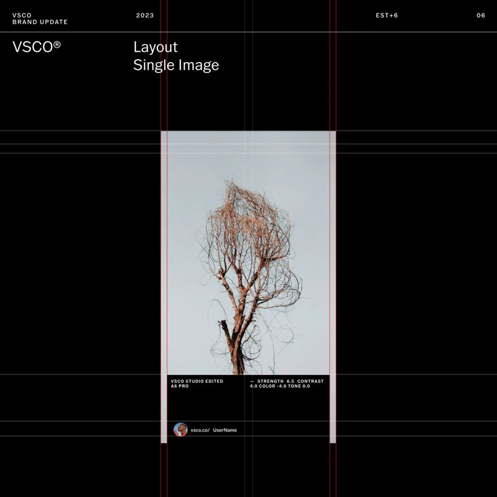
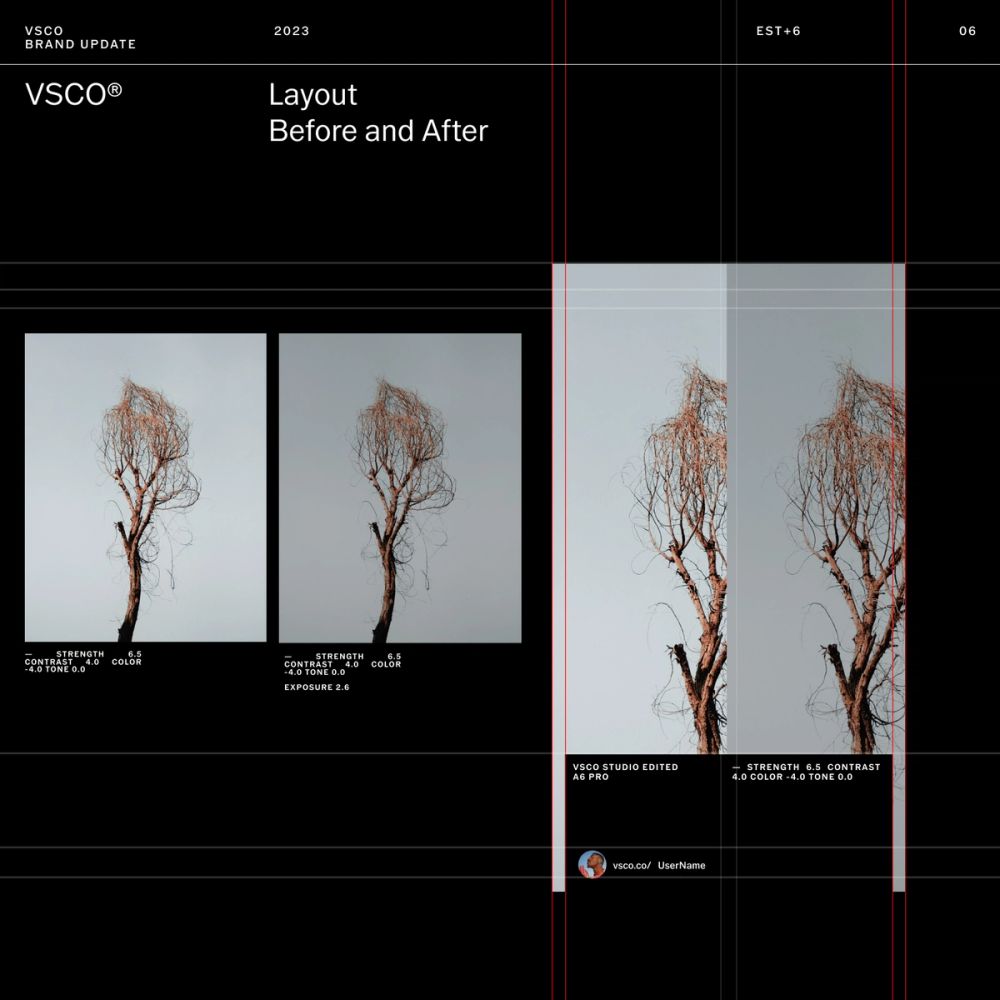
Layout
For the system's foundation, we defined two main types of layouts: The first one refers to the creative process and uses film negatives as a visual reference to define type placement close to the edges. The second one refers to a gallery and editorial approach using white space to frame artwork and allow a good lecture of the content. The layout system uses of grids to organize the informationand protect the artwork display. It embraces negative space for a healthy content cadence and decluttering the compositions. It also uses simplification to focus on the most relevant information for a more significant impact.
Programs
Programs are about how the VSCO system comes to life through key marketing environments, from product marketing to curation programs. The Curation and Marketing team develops programs to empower, inspire, and push the community and creators. We developed a series of sub-identities for these programs. They require a visual distinction, yet they have to feel part of the overarching VSCO system. For scalability purposes and to avoid generating a complex brand portfolio, we developed a system to generate those micro-identities for new or upcoming programs. As inspiration, we looked into lens sharpness test cards and other analog photography materials to develop a series of graphic elements that communicate the different program's offerings.
Curation & Content
VSCO's point of view around photography is to be mindful, intentional, and 100% community-focused. It is about our community and diversity. VSCO licenses and leverages its members; VSCO credits them and creates value through our communications, which are 100% community-sourced. As with all the brand identity elements, photography revolves around QUALITY, TRUST, and CURATION. Being one of the most sensitive chapters of the entire system: QUALITY Quality means being a relevant place for photography from a technical and subject matter standpoint. VSCO advocates for craft, for images that create a reaction in us and want us to see them. They are beautifully composed and have a clear point of view on how to decode the world. TRUST VSCO believes in honest, down-to-earth visual culture. It's not about showing off but creating a safe, inviting community of creators. VSCO avoids offensive content or activism-related content. However, they stay relevant by leveraging conversations in our culture, no matter their nature. CURATION VSCO curates photography by reducing the existing visual noise and pushing forward images that are thoughtful and generate excitement and creative energy. Those images inspire creators to keep pushing the boundaries and creativity. VSCO is an immersive platform that allows a slower pace for content consumption and learning.
Brand Guidelines, Implementation + Creative Toolkit
As part of extensive guidelines, we also defined other business key factors like the representation of interface, motion design, and guidance around attribution. All of it is alongside a creative toolkit document primarily for marketing, with more than 1000 templates for social media, CRM, and in-app communications. We worked closely with the team to implement and integrate the new system internally and with third-party collaborators until today.
EST+6 San Francisco, Barcelona 2022/2023
Foundry Göran Söderström, Letters for VSCO Gothic VSCO Gothic Book VSCO Gothic Medium VSCO Gothic Semi-Bold
Output Brand Platforms Brand Strategy Design Strategy Brand Audit Brand Identity Brand Design Systems Brand Guidelines & Creative Toolkits Design Implementation Digital Product Design Editorial Design Motion Design Art direction Marketing Design Curation Team Cris Mascort (Creative & Design Director, Design) Josh Ulm (VP Design & Marketing), VSCO John Slye (Curation, VSCO) Maggie Jurow (Design, VSCO) Collaborators Playlist Studio (Motion Design) Music B2 from De Leon — 2018 Mana Records