The Analog Nostalgia
NYC EST
WorkAbout BCN +6
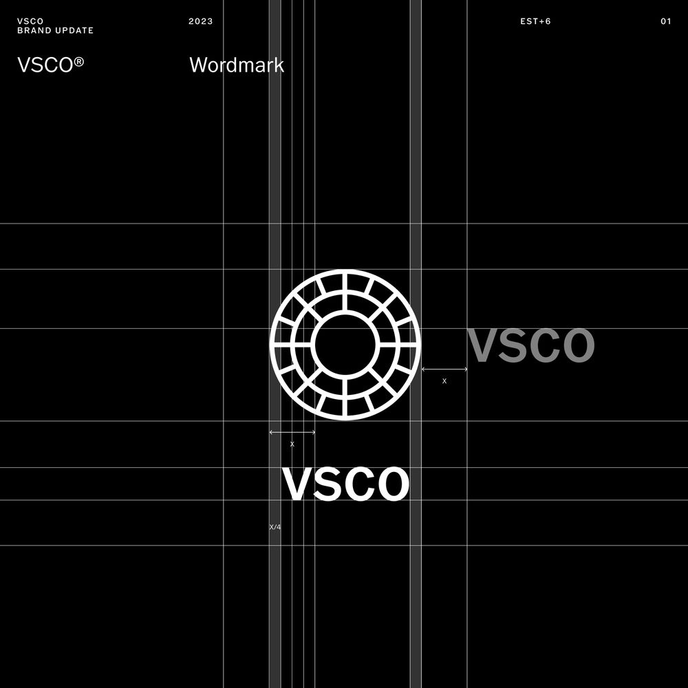
VSCO
Motion Design
2024
- Motion Design
- Brand Systems
- Design Strategy
- Marketing Design
MD0004
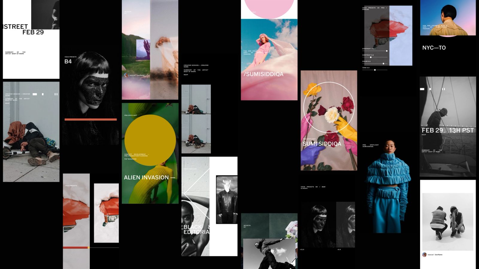
Along with Playlist Studio and the VSCO Brand Team, we developed a set of motion principles and studied how to apply movement and translate the system to VSCO's brand strategy. The result was a new chapter of the brand guidelines and motion templates for internal use and third parties as part of the creative toolkit. Analog photography and the photographer's behavior are the foundation for VSCO's motion principles: how we interact with a camera, process film, etc. VSCO's motion has the opportunity to create a unique point of view on Motion Design and Animation that communicates our brand strategy and allows content to be displayed harmonically.
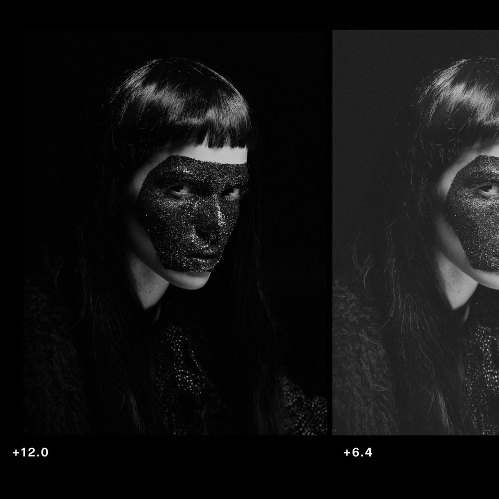
Following VSCO's brand principles: QUALITY Quality means using animations and transitions that elevate content as its main purpose. The creator's artwork must be protected. It also means using pauses when needed and letting viewers seamlessly enjoy content. TRUST By trust, we mean to avoid letting animation confuse viewers by using techniques that are irrelevant in a photography or mechanical context; using animations or transitions that allow you to read the content correctly, and avoiding too fast or over-decorative animations. CURATION And for curation; we mean to simplify the amount of animation used on screen. Using transitions when needed and embrace steadiness for proper legibility.
Symbol & End Cards
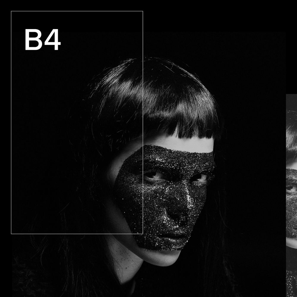
The rotation of the camera lenses inspires the motion for VSCO's symbol. This rotation is also a metaphor for 'unlocking' the inner rings and all the possibilities of creative growth. The Seal's rings rotate until they find their ultimate position and reveal the wordmark next to it.
Transitions
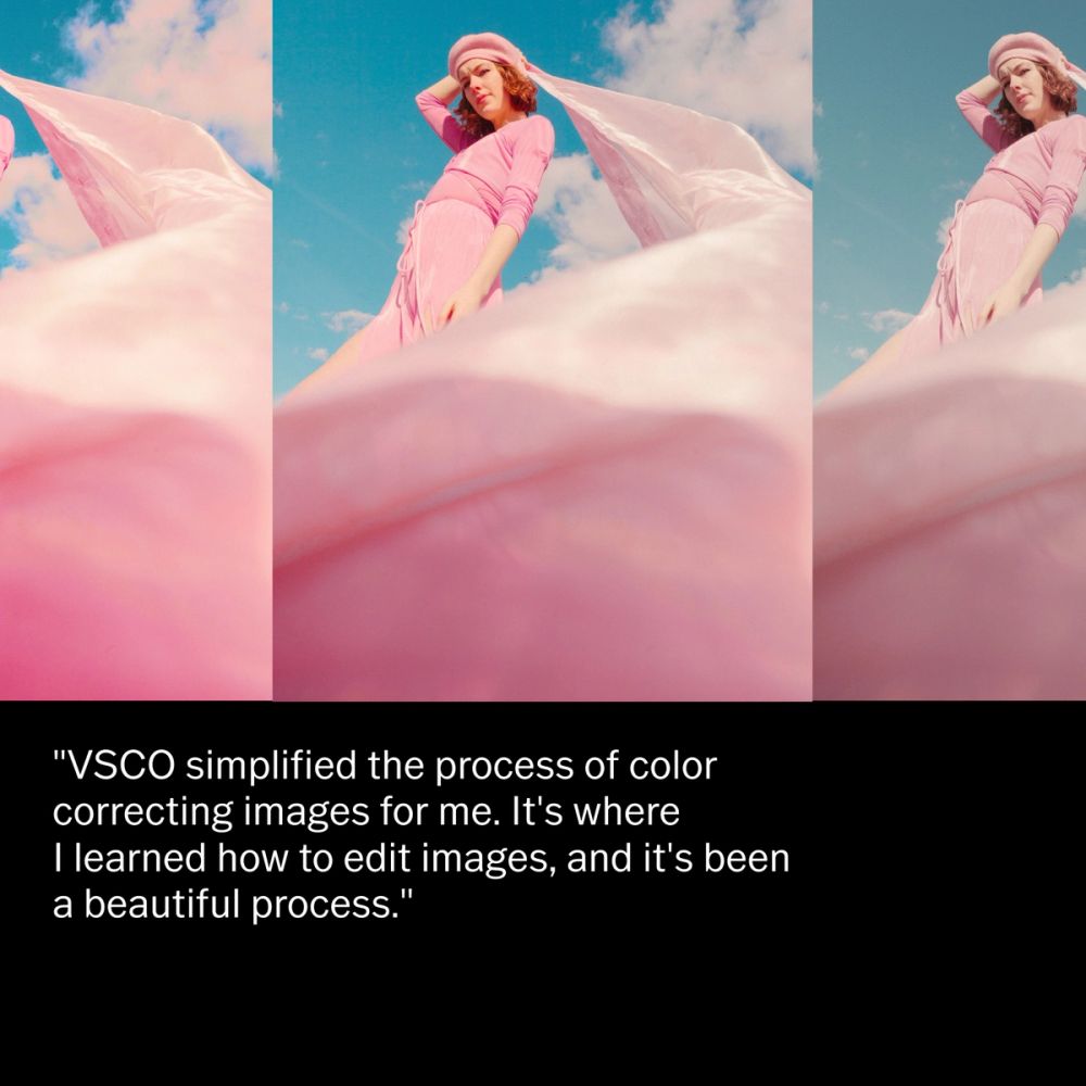
To transition content, we identify a filmstrip showcase motion for vertical and horizontal transitions alongside the more traditional and smooth ones like fading or hard cuts. However, translating a contact sheet view into a transition allowed us to communicate the idea of drafts and reiteration of any creator's process. Other transitions we identified as metaphors of photography were lens mechanical zoom, and developing processes "fade in" from dark rooms.
Typography
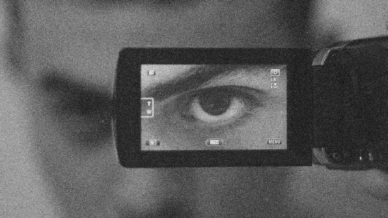
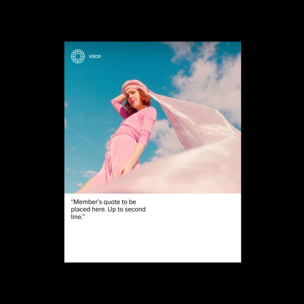
For headlines, we used horizontal movement inspired by the interaction with the camera when swiping through the images or the rotation of the settings wheel. In contrast, we use a more subtle yet mechanical animation for metadata and small type. We find inspiration in the camera's display interface. We purposely looked for steadiness to avoid over-decoration. We followed a more editorial approach for secondary-type treatments like quotes, as legibility was the main objective.
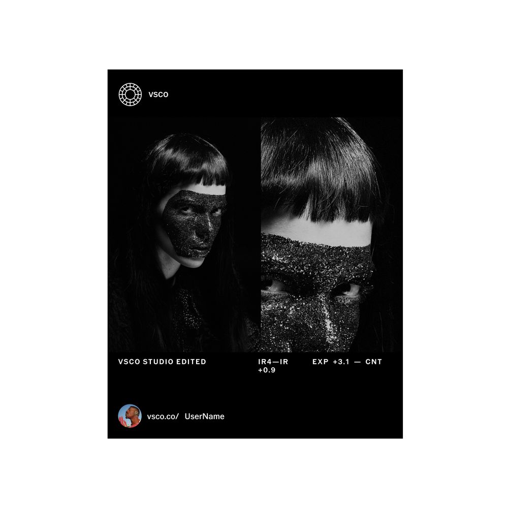
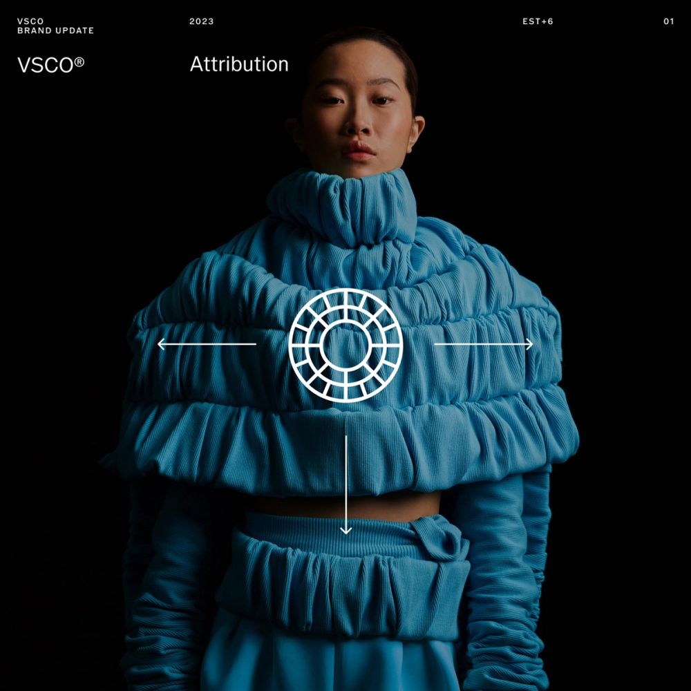
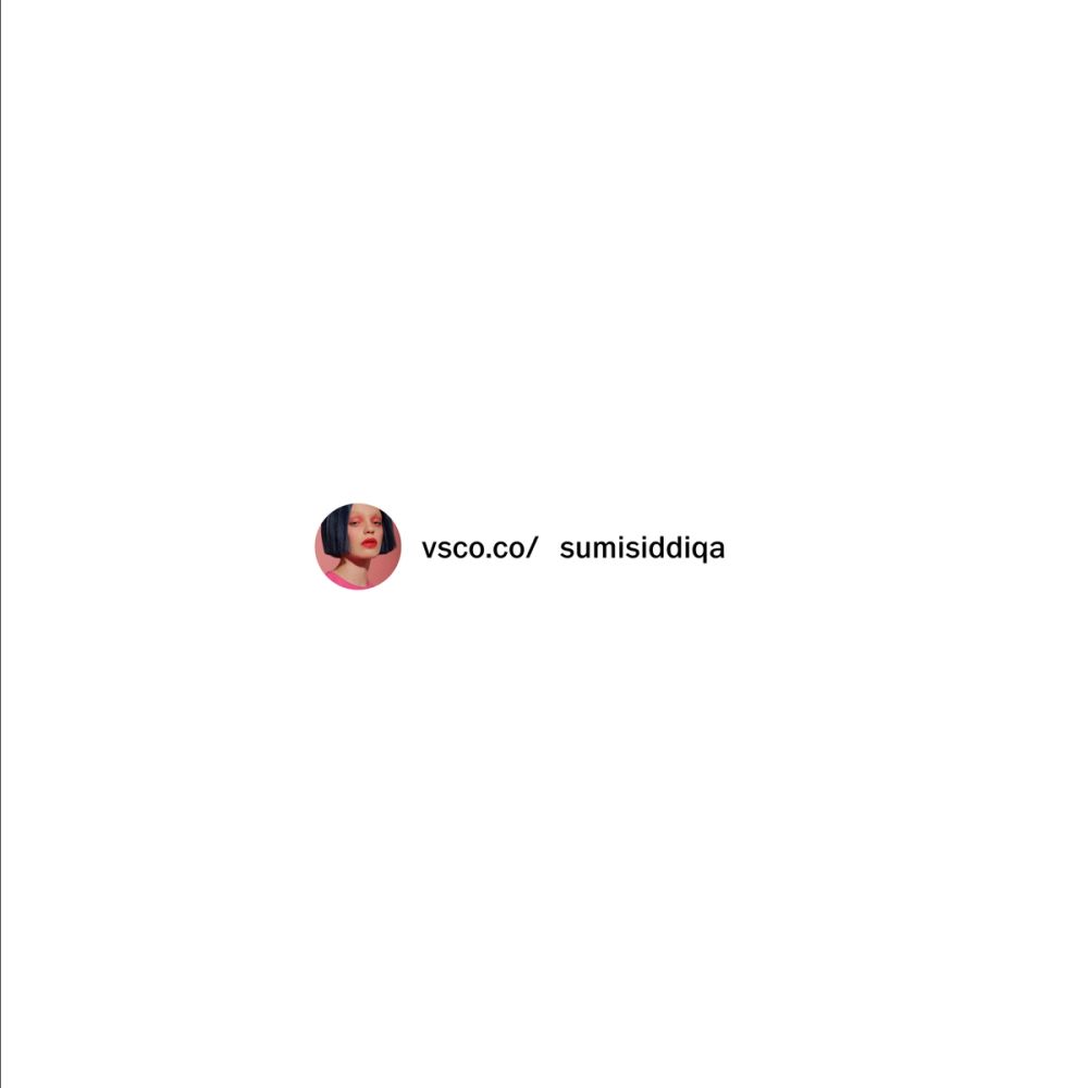
Attribution
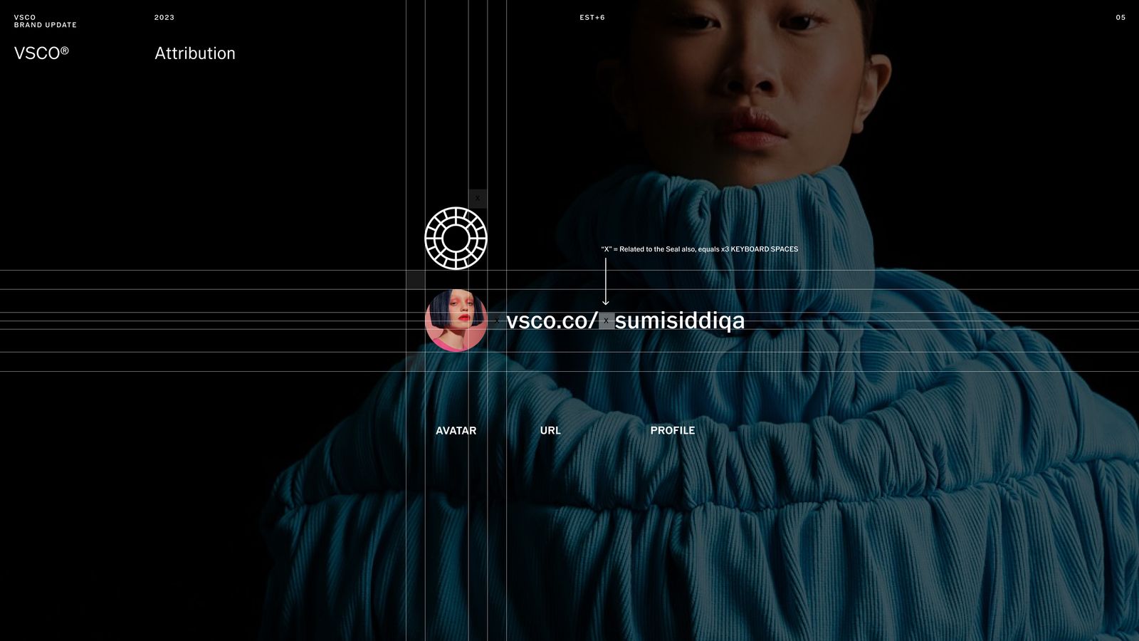
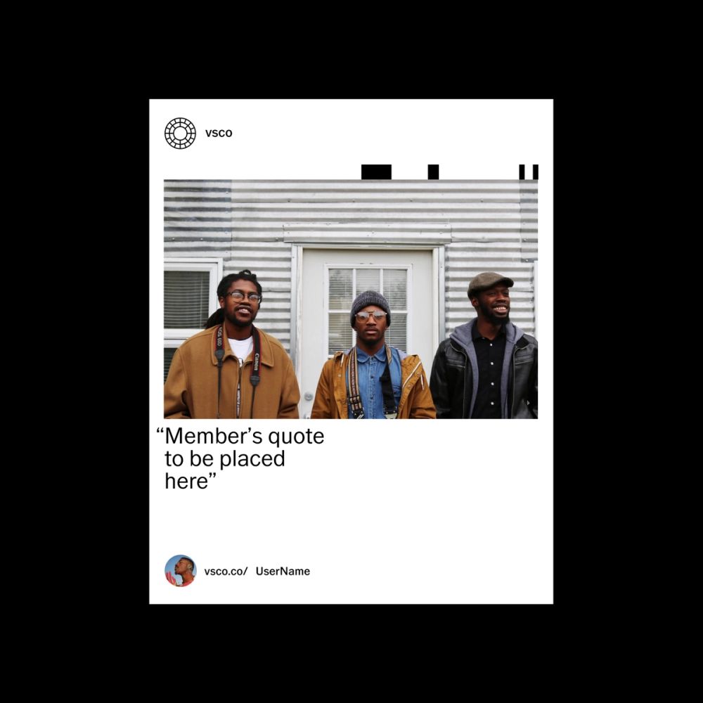
Attribution had to be a continuation of the wordmark review. We used a 'typed-in' inspired motion movement to display the creator's names to reiterate that attribution is, in fact, an interactive device (URL).
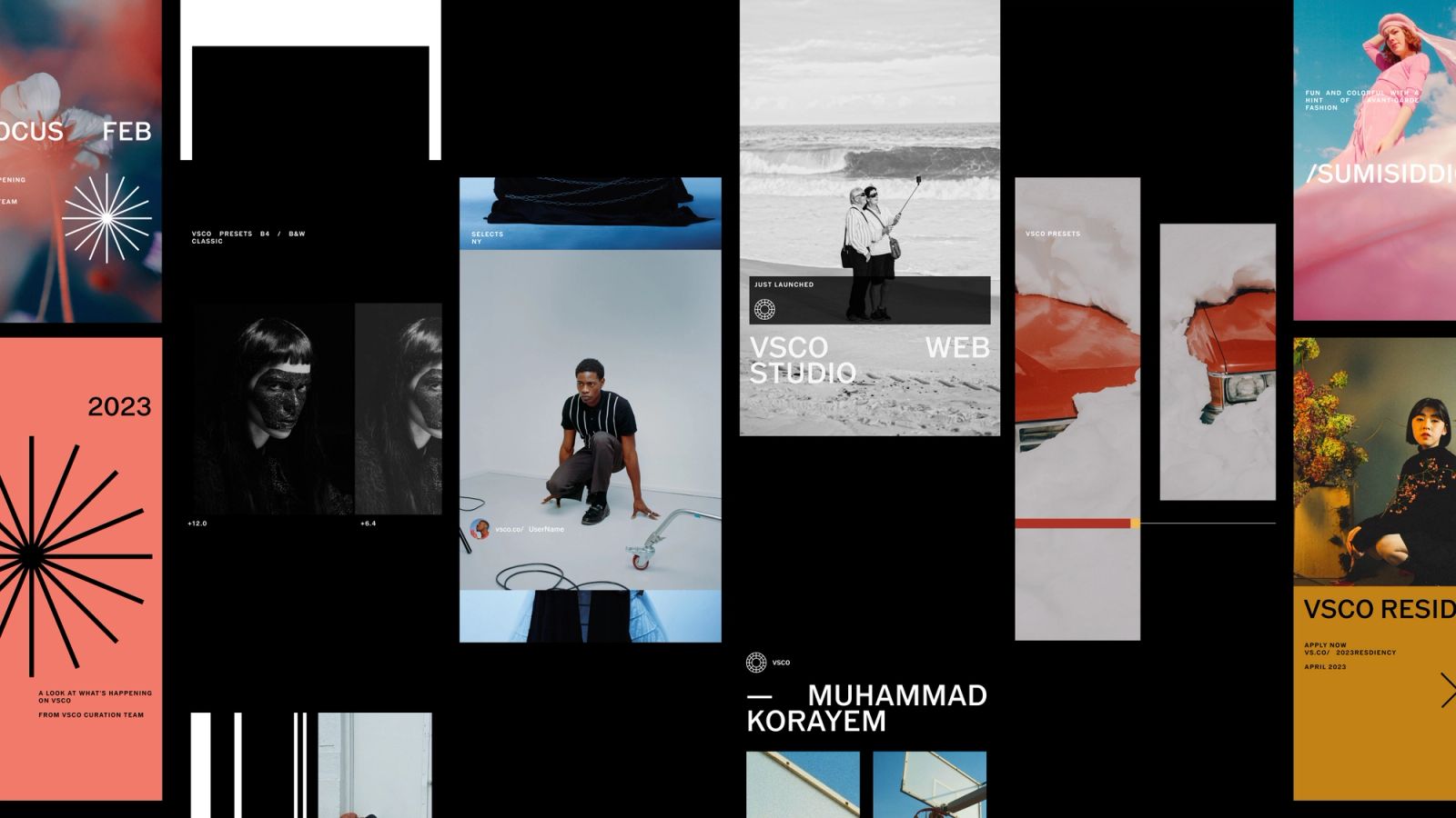
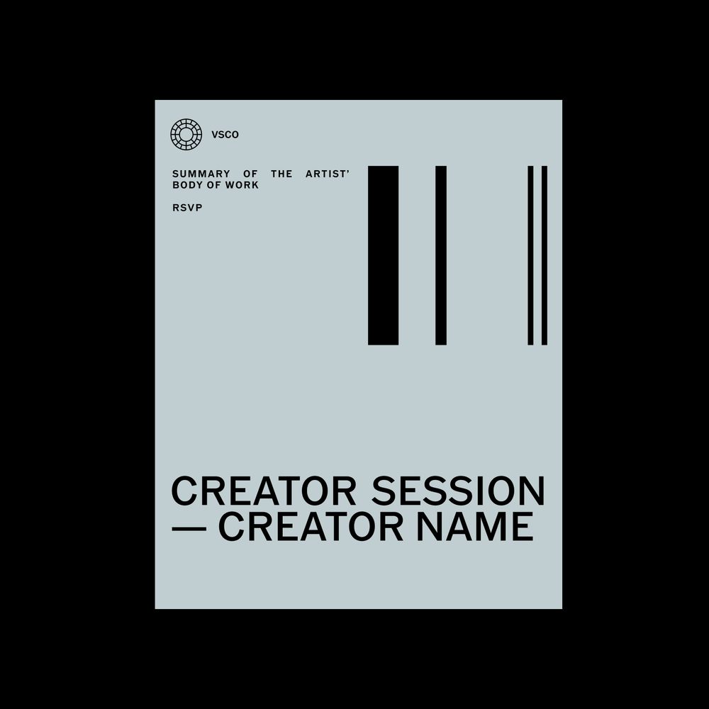
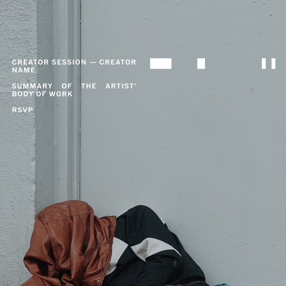
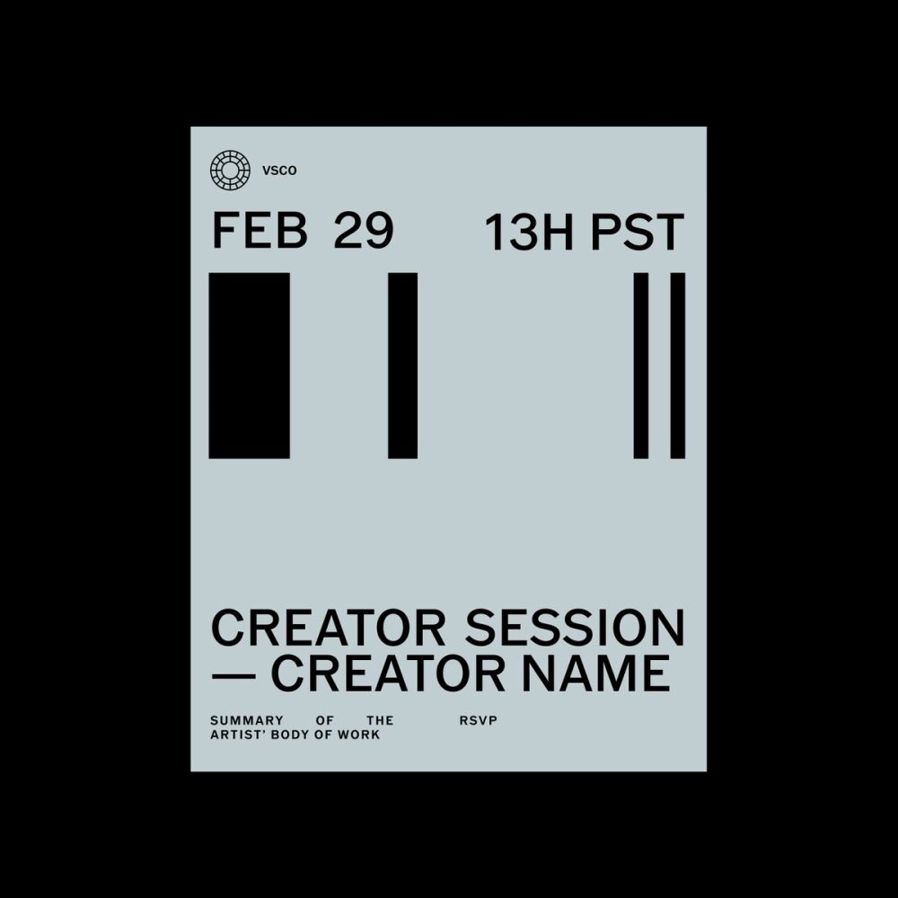
Programs
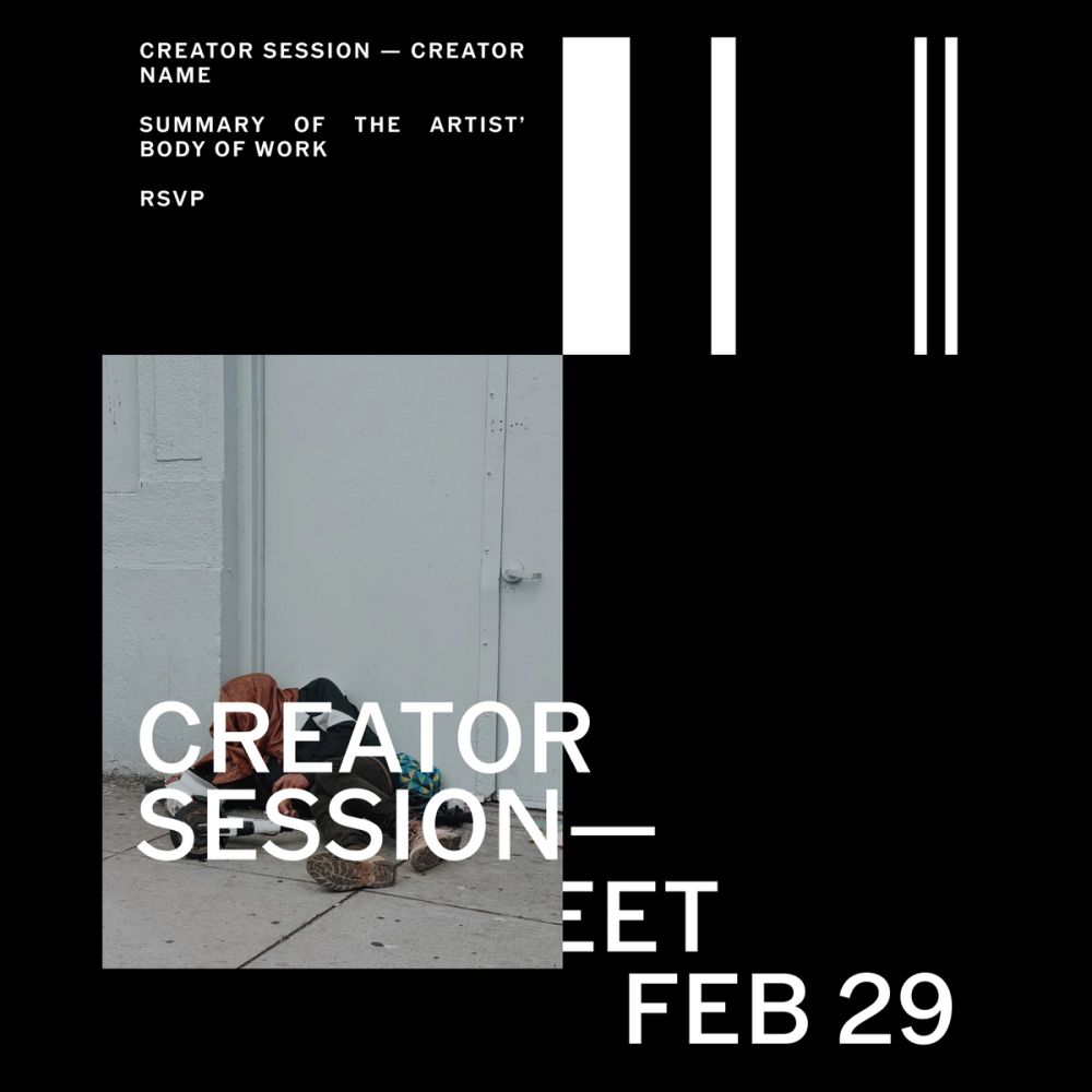
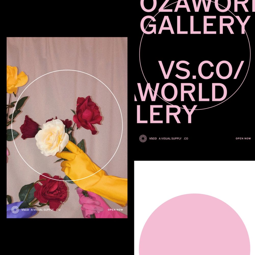
Marketing programs are one of the main manifestations of all the principles mentioned above. We developed a series of templates so that third parties could easily swap content and generate content as fast as they needed.

MD0004
Full Case Study
VSCO
Motion Design
2024
Along with Playlist Studio and the VSCO Brand Team, we developed a set of motion principles and studied how to apply movement and translate the system to VSCO's brand strategy. The result was a new chapter of the brand guidelines and motion templates for internal use and third parties as part of the creative toolkit.
The Analog Nostaligia
Analog photography and the photographer's behavior are the foundation for VSCO's motion principles: how we interact with a camera, process film, etc. VSCO's motion has the opportunity to create a unique point of view on Motion Design and Animation that communicates our brand strategy and allows content to be displayed harmonically. Following VSCO's brand principles: QUALITY Quality means using animations and transitions that elevate content as its main purpose. The creator's artwork must be protected. It also means using pauses when needed and letting viewers seamlessly enjoy content. TRUST By trust, we mean to avoid letting animation confuse viewers by using techniques that are irrelevant in a photography or mechanical context; using animations or transitions that allow you to read the content correctly, and avoiding too fast or over-decorative animations. CURATION And for curation; we mean to simplify the amount of animation used on screen. Using transitions when needed and embrace steadiness for proper legibility.
Symbol & End Cards The rotation of the camera lenses inspires the motion for VSCO's symbol. This rotation is also a metaphor for 'unlocking' the inner rings and all the possibilities of creative growth. The Seal's rings rotate until they find their ultimate position and reveal the wordmark next to it.
Transitions To transition content, we identify a filmstrip showcase motion for vertical and horizontal transitions alongside the more traditional and smooth ones like fading or hard cuts. However, translating a contact sheet view into a transition allowed us to communicate the idea of drafts and reiteration of any creator's process. Other transitions we identified as metaphors of photography were lens mechanical zoom, and developing processes "fade in" from dark rooms.
Typography For headlines, we used horizontal movement inspired by the interaction with the camera when swiping through the images or the rotation of the settings wheel. In contrast, we use a more subtle yet mechanical animation for metadata and small type. We find inspiration in the camera's display interface. We purposely looked for steadiness to avoid over-decoration. We followed a more editorial approach for secondary-type treatments like quotes, as legibility was the main objective.
Attribution Attribution had to be a continuation of the wordmark review. We used a 'typed-in' inspired motion movement to display the creator's names to reiterate that attribution is, in fact, an interactive device (URL).
Programs Marketing programs are one of the main manifestations of all the principles mentioned above. We developed a series of templates so that third parties could easily swap content and generate content as fast as they needed.
EST+6 NEW YORK, BARCELONA 2023/2024 FOUNDRY GÖRAN SÖDERSTRÖM, LETTERS FOR VSCO GOTHIC VSCO GOTHIC BOOK VSCO GOTHIC MEDIUM VSCO GOTHIC SEMI-BOLD
OUTPUT DESIGN STRATEGY BRAND DESIGN SYSTEMS BRAND GUIDELINES & CREATIVE TOOLKITS MOTION DESIGN
TEAM PLAYLIST STUDIO (MOTION DESIGN) MAGGIE JUROW (BRAND, VSCO) CRIS MASCORT (CREATIVE & DESIGN DIRECTOR, BRAND)